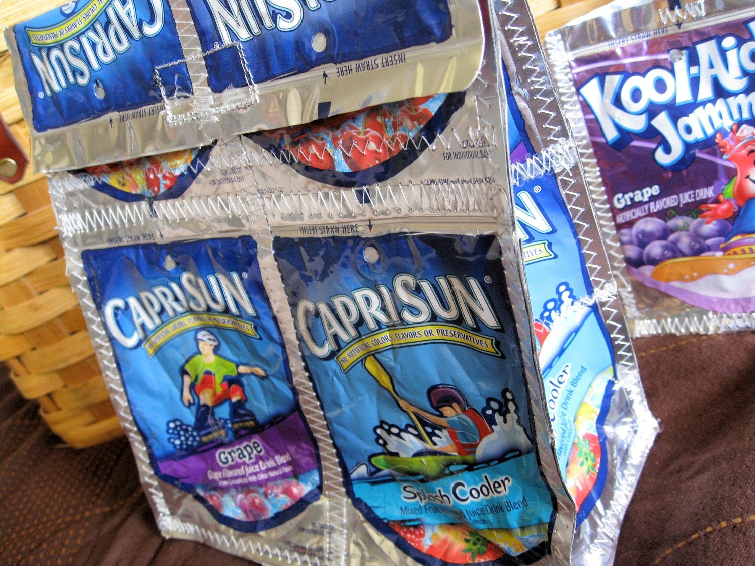
Etsy is an online community where people can by and sell vintage and hand-made items. i came across a fair few different interesting products on there. The website has a clean look to it again something we wanted to go for...
I have been looking at some other Big Cartel Recycling shops online just to get a feel to see what else is currently on the market in that field...
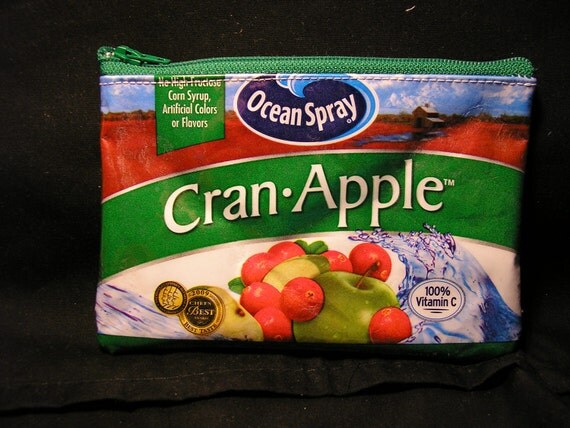
Uncommonly Beautiful Recycled Accessories.
mainly sell recycled accesories. Earings, Necklaces etc. Their design looks like it needs a bit of a re-vamp, looks to be cliche vintage look that was popular a couple of years ago. Seems to be all made by one person though, so has the personal feel. I think our design needs to look a little bit more professional while still maintaining the 'Handmade' approach to get more customers.
Make
(Recycled Craft Workshop)
More contemporary design, they look to be a little bit more professional than the last, but still have this handmade approach to their brand. The big button logo and curved san serif font matched with the pink background appeals mainly to girls i think, and looks like a friendly and approachable brand to buy from.
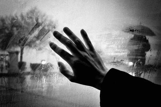
I have seen these designs before and really like them. it is a similar idea that i am trying to create but with the text made from dashed lines in between the rain dashes. It can look quite confusing and just like a pattern from close but the further away you stand, the clearer the image comes.
I have been looking at image layering with text, Kessels does a lot of this himself, so thats a starting point...
When researching Kessels, i knew for one of my posters i wanted to experiment with photography as he uses a lot of image and type layering in his work. I started to look into basic rain photography to see what i could find and just get a general idea.
I had the initial idea of taking a photo of raindrops on a window, or of heavy rainfall outside and blurring them as the background. Then adding and layer my text over the top. Something that could work successfully if i executed it right, and manage to take the correct photographs.
These are just some initial images found on google...
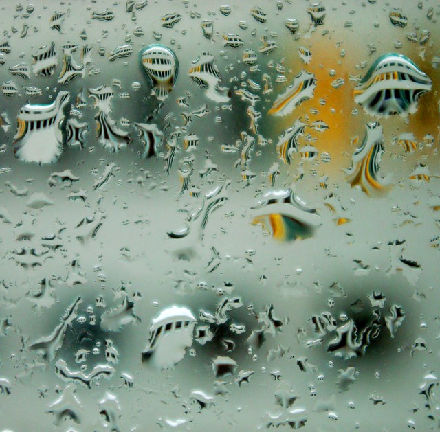
Rain on a window pane...
Warped Reflections? Warped Text?
I dont particularly like this image but i do like the concept of having a out of focus figure or subject behind the rain on a window pane...
Steamed up windows...
Possible couples walking together/matching umbrellas?
I decided to look further into the work of Erik Kessel to see what style i should be going for. It looks to be lot's of helvetica...
'a new kilo' is the poster that has been sent to us for the brief. It is lowercase Helvetica on fluorescent green paper.
I love the zines and publications he creates. Again, here there is lots of bold type used. Variations on layout of type. Experimental photography and layering photos with type. Almost collage like. Something i will think about when creating my posters.
He's also done some more experimental work in the past. This is an installation he created which consisted of a room full of postcards.
I did'nt know that he created the 'I amsterdam' sculpture. This is again lowercase Helvetica in all its glory, made massive!
This is an interesting interview with Kessels. He seems to be a bit of a joker and most of this interview is sarcastic which makes me wonder why the brief says not to be sarcastic about the rain in UK...
Some more work that i found on his website that caught my eye. I really like his clean cut and minimalist approach to design. All of his work is sleek and proffesional and that is also something i want to achieve with my posters. Here are some that inspired me...
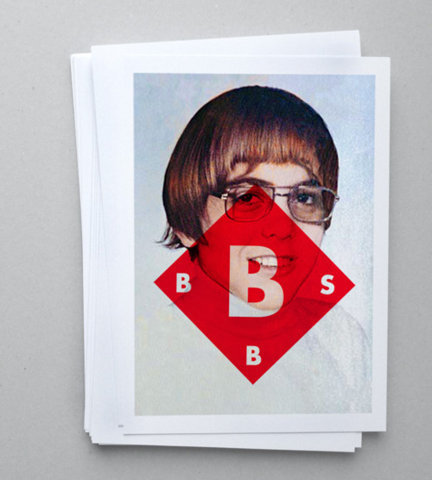
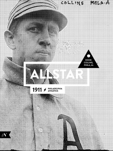
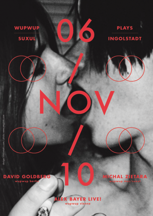
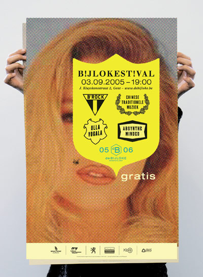
Here are some posters and designs i have been looking at for influence in the 'Rain' project...
The bottom of this poster is something i want to be going for. Keeping the information small and at the bottom. Leaving the largest part of the poster to be a little bit more mysterious. This will hopefully intrigue the view then engage them to read the little print.
I really like this poster and the concept behind it. I could experiment with paint or ink splatter to create a warped illusion of rain and see where this takes me.