Archives

Proverbally Yours - Branding Research

As i wanted to create a logo and branding for this fake business 'Safe Side' I have been researching other branding for business. Logos and illustrations and general composition etc.


Sourced : FFFFound


Proverbally Yours - Image Poster Research

MR BINGO


Sourced : MR BINGO

Mr Bingo works in a similar style to michael craig maritin. Clean black outline illustrations work really nice as murals on walls. Then added blocks of colour to certain parts, works well. 


Proverbally Yours - Image Poster Research

MICHAEL CRAIG MARTIN


Michael Craig Martin is one of my favourite designers. I love hi illustration work, how he uses simple black clean outlines of basic everyday objects and layers them up to create these beautiful works of art. I also like hs bold vibrant clashing colours, think they work well within his work. He usually works on large scale too, doing full scale walls with black tape, and if you ever get the chance to see some of his work in galleries it is truly amazing. 

Michael Craig Martin will be a big influence on me for this next project, i hope to create simple outline illustrations relating to the padlocks in order to link these to my proverb. 


Proverbally Yours - Typography PosterResearch


^ LIKE THE IDEA OF DIFFERENT PT SIZE AND FONTS
 TO GET THE POINT ACROSS ^


^ SLANTED ANGLE ^


^ NICE FOR THE 'SAFE SIDE' LOGO ^


^ LIKE THE BLUE AND RED COLOURS HERE ^


^ SWEET DROP SHADOW ^


^ LIKE THE IDEA OF HAVING LINES AND SEPARATORS ^


Lecture Three - Street Art - Notes


PERSONAL INVESTIGATION

On of my favourite films/mocumentry is Banksy's Exit Through the Gift Shop which i have on DVD. Raises some great questions about street art and the commercial side. Here is the trailer. It is definitely worth a watch in my opinion...


Really interesting video on Keith Haring and Graffiti...


I have started watching the universe of Keith Haring documentary online via youtube. So far, it is really interesting and i am learning more about the artist as well as street art in general. Here is part 1, again, like Exit through the Giftshop i would say this one is worth a watch!


This blog post is really interesting about NYC Subway Graffiti crews of 1970's...


Graffiti was one of those crimes that added to the sense of disorder and anarchy that both encouraged other crimes and made New York kind of a scary place to be. Crime in general was rising in the 1970's, and it was exploding in the subway. By the end of the decade, the number of felonies recorded each day in the New York City subway - including rapes and murders - made it the most dangerous mass transit system in the country.


More videos of 1970's graffiti crews...


A Film by Steve Siegel.

This is an excerpt from a film made in the 1980's. The film looks at 1980's New York City from a kid's point of view. This particular excerpt focuses on subway graffiti.

Proverbally Yours - Type Research

One of the ideas i had was to create a branding logo for 'Safe Side' to go with the locks. By approaching it in this way, i wanted to make it look like the company of the locks was called 'Safe Side' making the posters look almost like an advertising piece when you first look. Also with the proverb attached to this 'Its always better to be on the Safe Side', this reminded me of a company slogan and i'm considering patenting this before somebody steals my idea! haha!

I quite like this idea of having a double meaning behind the poster or at least hiding the proverb under some false identity for a lock company. At the moment, while it's fresh,  this seems to be the prominent idea in my head which i want to be developing further. This may change slightly or fully by the time i start putting some stronger ideas together into practice. 

I have started looking at some different logos/type that i can be influenced to create my own logo for 'Safe Side'. 


The Don't Panic logo, i really like. The combination of handwritten and neat and clean finish works well for this. definitely something i want to incorporate into my logo design. 


Similarly to the 'Don't Panic' logo, the 'Fender' logo also takes this slanted handwritten look, which i think works really well. 


Clothing brand, 'Stussy' is also a more scruffy, street art kind of style. 


I would like to make my logo quite neat also and cursive. The kellogg's is a very good example of this on such a massive corporate scale. 


Alphabet Soup - Typeface - Research - Si Scott

Love Si Scott's work. When i seen my work in progress it sort of reminded me of some of his work, even though his is also very different. I like the way he uses intricate lines, swirls and patterns to create these beautiful typefaces and images. He also mostly works black on white, which works the best for this style.


Source // Si Scott Studio


Lecture Two - Post Modernism - Notes


PERSONAL INVESTIGATION


This is a great book that i own about postmodernism in Graphic Design. It's pretty much the bible for it. I would definitely recommend this.


This is an intersting Article...


April Greiman 


I did some research into this particular designer because she is a pioneer of both design and post modernism.


April Greiman is a thinker and artist, whose transmedia projects, innovative ideas and projects, and hybrid-based approach, have been influential worldwide over the last 30 years. Her explorations of image, word and color as objects in time and space are grounded in her singular fusion of art and technology. Greiman has been instrumental in the acceptance and use of advanced technology in the arts and the design process since the early 1980s.

Greiman has had solo exhibitions at the Visual Arts Gallery at the School of Visual Arts, New York (2008) and the Pasadena Museum of California Art (2006). She has exhibited in varied cultural institutions, lectured academically and professionally, generated public artworks and participated in juries worldwide. Her ideas and work have appeared in articles, interviews, reviews and broadcasts in the media, ranging from Newsweek and Time, to The New York Times and USA Today to CNN, PBS and ESPN. Books have includedApril Greiman: Floating Ideas into Time and Space, Hybrid Imagery: The Fusion of Technology and Graphic Arts, It’snotwhatAprilyouthinkitGreimanis, andSomething from Nothing. April Greiman was born in Metropolitan New York City and studied at the Allgemeine Kunstgewerbeschule (General Arts Trade School) in Basel, Switzerland and the Kansas City Art Institute. She moved to Los Angeles in 1976, establishing her multi-disciplinary practice, currently called Made in Space.


Alphabet Soup - Typeface - Group Crit Feedback

The main thing i wanted to find out from my group crit was if i was taking the right route. Which style of font should i go for? which works best? which best describes josh as a person as well as just his hair?

Everyone in my group liked the more realistic style the best. Some things that people liked about the font was...

- The gaps left that had been created by the hair
- The seductiveness of the overall letterforms
- The realistic elements to the type
- The detail and intricate elements
- The way it works as a series (although unfinished)


I asked if my typeface was too literal, only showing what everyone would see about josh rather than his personality. I was then asked if i wanted to show Josh as a person by this, or if i wanted to include more detail about his personality? which would work best?

Overall i like the idea i have, i think it is a strong, unique idea that will work. It shows josh as a person and has a comical aspect but also with deeper meaning.

I have tried to make the font not only a literal translation of his hair, but also been influenced by other elements of his personality.

- He likes the sea and Caribbean islands, therefore i have moulded the hair to also react like waves, and think this is a natural link with the two anyway.

- He is also a chilled, laid-back character, which again is reflected in the waves and intricate wavy lines of the hair.

- He likes reggae music, which again links into both of these

- He also mentioned his family a lot, so i have taken influence from this, trying to include literal translations, roots grow and expand, much like roots of somebody's hair.

I am glad i had the chance of the group crit. It has given me  a strong idea of where i would like to take my font, and what i want my finished typeface to look like, and how this represents Josh. 


Lecture One - Modernity and Modernism - Notes


PERSONAL INVESTIGATION

This article explain Modernist style in depth and detail and is accompanied by imagery. 


Modernism
is a trend of thought which affirms the power of human beings to make, improve and reshape their environment, with the aid of scientific knowledge, technology and practical experimentation. The term covers a variety of political, cultural and artistic movements rooted in the changes in Western society at the end of the 19th century and beginning of the 20th century. Broadly, modernism describes a series of progressive cultural movements in art and architecture, music, literature and the applied arts which emerged in the decades before 1914. Embracing change and the present, modernism encompasses the works of artists, thinkers, writers and designers who rebelled against late 19th century academic and historicist traditions, and confronted the new economic, social and political aspects of the emerging modern world.

Lessons From Swiss Style Graphic Design


Also known as International Style, theSwiss Style does not simply describe a style of graphic design made in Switzerland. It became famous through the art of very talented Swiss graphic designers, but it emerged in Russia, Germany and Netherlands in the 1920’s. This style in art, architecture and culture became an ‘international’ style after 1950’s and it was produced by artists all around the globe. Despite that, people still refer to it as the Swiss Style or the Swiss Legacy.
This progressive, radical movement in graphic design is not concerned with the graphic design in Switzerland, but rather with the new style that had been proposed, attacked and defended in the 1920s in Switzerland. Keen attention to detail, precision, craft skills, system of education and technical training, a high standard of printing as well as a clear refined and inventive lettering and typoraphy laid out a foundation for a new movement that has been exported worldwide in 1960s to become an international style


Modernism and Graphic Design


From what I know, graphic design has been around since writing has been around. There has always been some kind of organization of image and text. For the most part, historically, text has been organized in a horizontal or vertical manner. 
However, the term “graphic design” has not been around since the invention of writing. It has only been around since 1922….less than a century. So it is a fairly new form. This was something I didn’t know. I just it assumed it had been around since the beginning of civilization.
Graphic design is really a product of Modernism. According to A History of Graphic Design by Philip B. Meggs, it was coined in 1922 by William Addison Dwiggins, a book designer, in 1922. He basically used the term to describe his activities. A graphic designer is someone who brings structural order and visual form to printed communications. 
Of course, today it is not just limited to print. Basically where ever one sees text and image, someone or some people have organized the visuals. The internet, television, film, computer graphics, clothing, and of course printed matter can be included in the definition of graphic design.

Graphic design as a product of modernism

 Visually, if you look at visual communication before 1900 and after 1900, there will be a noticeable difference. Modern graphic design’s roots can be found in Modern Art. 
In a sense, Modernism was a reductive movement. Form was simplified as a way to break from pictorial representation. 
Why this break? The beginning of the 20th century was fraught with radical political, social, cultural and economic changes. It was a revolutionary time. It was a time of radical scientific and technological advances. Life was being forever changed by the invention of the automobie, airplane, motion pictures, radio, high tech weapons (tanks, machine guns, chemical and biological warfare). WW1 shook Europe off of its foundations. New ways of thinking were needed. Marxist theory was the basis of some of there political, social and economic changes. There was a rise of radical political revolutions that spawned the rise of Nazi Germany, Fascist Italy, Communist Russia. The visual artist felt that the traditions of the past did not represent the time they were living in. Pictorial representation could not capture the changes of the times. Something new was needed. This may be too simplistic but it will do for now.
Movements in early 20th century modernism: Expressionism, Fauvism, Cubism, Futurism, Dada, Surrealism, De Stijl, Suprematism and Constructivism. 
Expressionism and Fauvism didn’t have much influence on graphic design. I suppose it was considered too primal or subjective. The other movements do seem to have some kind of analytical structure even if some of it looked crude or primitive. There was some kind of intellectual basis….a method to the madness.

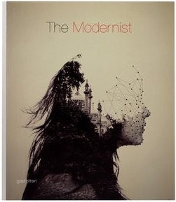
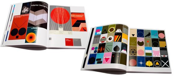
This book is Great! The Modernist by Gestalten...


Copyright 2010. All rights reserved.

RSS Feed. This blog is proudly powered by Blogger and uses Modern Clix, a theme by Rodrigo Galindez. Modern Clix blogger template by Introblogger.