Showing posts with label OUGD406. Show all posts

OUGD406 // It's Your Choice // Newspaper Club

I am going to be using  NewspaperClub.com to print my newspaper. This way i can assure that the quality will be the best possible and it will hopefully make for a successful product. 


I have seen work done through these guys before so i understand the quality and spec information needed.


I decided to check out their website and have a look around before submitting my work...


Here are the prices and how it works. It seems a little steep to me so i am hoping it will be worth it...


General Design Hints

We often get asked for advice on designing a newspaper and what sort of quality you can expect when printing with us. Below are some hints and tips which should help you to produce excellent results.
To get the best possible looking printed product you should always remember that you are designing artwork for a newspaper, not a magazine, glossy brochure or website.
Newspaper presses are industrial-scale machines designed to operate at very high speeds to allow publishers to produce and distribute large numbers of copies quickly and economically. They are not designed for perfect high-fidelity reproduction or to be able to match Pantones or exact colour mixes. You can achieve very good quality results with newspaper printing but only if you start the artwork design process with the print process in mind.

ext

Text works best if it’s black; colour can be used but it works best if only headings of font size 14 or above are in colour.
White text on coloured backgrounds should be used sparingly and only at font size 14 or above.
Small type (under 12pt, or 14pt if the font is a serif) should always be made up from only one of the inks. ie 100% cyan and not 50% cyan and 50% magenta to avoid registration issues.
Coloured text on coloured backgrounds should be avoided all together.

Blacks

On our Traditional Colour press, blacks should always be 100% K only, whether for text or solids; do not use ‘rich black’.
On our Digital Colour press, you can use rich black to get the most depth of colour out of text or greyscale images.

Colour

If you have large solid blocks of colour bear in mind the ink may rub off on facing pages (and your hands).
If you repeat a standard or corporate colour repeated on every page there will often be noticeable variation, as exact colour matching can’t be guaranteed.

Image quality

Images should be a minimum resolution of 150 DPI.
Photographs work best when they have a clear, strong subject and a lighter background; dark or ‘moody’ pictures will reproduce less well. (We mean moody like a Morrissey album cover not moody as in stolen.)

Blank spaces

If you have a blank page or space opposite heavy pictures or text it is possible that there will be a noticeable ‘ghosting’ impression on the blank area. It is also possible that you will notice ‘show through’ from the other side of the paper.

Paper Sizes

We print on two different presses (digital and traditional), depending on the number of copies and quality you require.
The page sizes for both types are 289mm × 380mm (spread size 578mm x 380mm) including any margins.

Margins

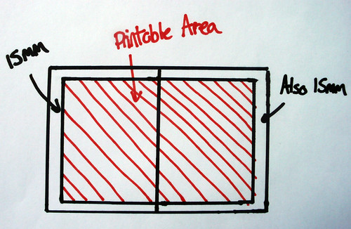
We require 15mm margins around all spreads. Like below. There aren’t any exceptions – we will have to send your newspaper back for adjustment if you spill over those margins. This is because the press grabs the paper at the edges and if you print beyond the margin the press will grab the printed area and make a right old mess.


You can also print across the central spine. 


I will make sure my InDesign document is set up correctly to match these proportions precisely before I go on to send my final design off.  


OUGD406 // It's Your Choice // Survey

I created an online survey using...


I sent a survey out across networking sites, both professional and social as well as through the college email and my personal email to try and get as many varied responses to this as i can.

The question was basically a tick box selection, giving the user a chance to select the quotes that they believe would be the most appropriate for our western culture...

Here is the question and multiple choice answers...


I chose to use these quotes as i cut them down from the hundreds i initially collected. These, to me, would be the ones that relate most to our western culture, or have any for of way of possibly relating. 
It will be good for me to get some responses so i can cut the quotes down even further and be confident in knowing that my publication will relate to my chosen audience. 

Here are some initial responses but i will be hoping to get much more to get a more accurate representation...


OUGD406 // It's Your Choice // Visual Research

Contemporary Newspapers

he 99% Conference is a yearly gathering of the most productive creative professionals today. This magazine features interviews and tips from top creative minds...

Every year, we curate the best interviews, articles, and tips from our research at Behance's 99% think tank to make a beautifully design newsprint magazine - which gets distributed at our annual 99% Conference.
This year's selection includes interviews with Persepolis artist and filmmaker Marjane Satrapi and Facebook designer Ben Barry, as well as tips on building a better biomaking big (bold) decisions, and getting into the creative flow.


Not the most relevant newspaper style to what i want to achieve but interesting none the less. I really love the use of experimental type mixed with type and grid here and also the red and black work well together. 

This next newspaper is a portfolio for a young graphic designer Matthew Crowe. Really nice idea...


Again, really nice use of type in this one.

Contemporary and Traditional styles clash...


This isn't really a newspaper but again a really beautiful put together collection of publications...


OUGD406 // It's Your Choice // Visual Research

2 X Elliot


Just some more publication layout designs i found by the same agency, i really like these. simple but beautiful. 


This style of newsprint really works well for this type of publication too, definitely something i will consider. 


OUGD406 // It's Your Choice // Visual Research

so i have come across a few artist who i like the style of, these will help me with inspiration and design ideas for the layout of my publication.

2 X Elliot


Two Times Elliott is a design consultancy based in Notting Hill, London. Two Times Elliott produces a diverse range of work across multiple disciplines including print design, identity and web. We help our clients communicate their message clearly and intelligently.

We deliver intelligent bespoke design solutions and advice to a wide range of clients, from individuals to large organisations, in a variety of different sectors.

We like to work with all our clients as creative partners and to this end we think it is important to involve them in the design process as much as possible. We also work hard to manage our design work intelligently alongside a clients budget.


Type Specimen Book

A small internal project to explore a few of our favourite typefaces. Using our in-house risograph we were able to produce three seperate type specimens exploring the dynamic and characteristics of our selected typeface.


A small internal project to explore a few of our favourite typefaces. Using our in-house risograph we were able to produce three seperate type specimens exploring the dynamic and characteristics of our selected typeface.

I love the simplicity of both of these little publications. The type speaks for itself and where necessary is accompanied by wonderful black and white imagery. 


Copyright 2010. All rights reserved.

RSS Feed. This blog is proudly powered by Blogger and uses Modern Clix, a theme by Rodrigo Galindez. Modern Clix blogger template by Introblogger.