Archives

Alphabet Soup - Font Research

Source // I Love Typography

I found this font on 'I Love Typography'. I think it relates to my word stretch, as the calligraphy style letters stretch out creating a pattern around the phrase. This is a really well thought out and presented design. 


Source // FFFFOUND

I really like the design of this. The font is made up of these shapes with some straight edges and some curved. The font sits in the middle of this and looks stretched vertically. Really n ice design and layout.

Source // FFFFOUND
Similar concept of stretching the font to the last design. 


Alphabet Soup - Font Research

Source // Only Font

When researching the word 'Stretch' i found more words associated with it. 'Expand' was one of these. When i thought of this word and how we had to fit our letters into a box shape. I thought about expanding the letter 'T' so it was fat a square like. Here is a font called 'Squares' by Peter Borup Lund. Here he has executed a similar idea to what i had in mind.

Alphabet Soup - Font Source Research


Source // Design Fetish


Source // Type Inspire

Another idea i had was based from chewing gum. One of the first things that came into my head when i thought of the word stretch was 'GUM'. The top two pictures are of a giant chewing gum sculpture by fine artist 'Simon Decker'. I like the stringy, stretched effect created and would like to apply this into a letterform. The bottom picture is a more cartoon style cliche chewing gum font which i will also use as influence.


Alphabet Soup - Font Research

Source // Jedi Charles

My next idea was to alter the perspective of the font, which would be stretching it to look like it was coming towards you. I had trouble finding a font that looked like this, but realised that the most recognisable piece of text that does this was from the beginning of the legendary films that is 'Star Wars'.

Alphabet Soup - Font Research


Source // FFonts

The top font is called 'Cube'. This is a really contemporary font that takes on a 3d form.  This bottom font is called 'Archer'. It's a 3D embossed font, making the letterforms looked raised. My plan is to create something similar but stretching the shadow backwards more, to emphasise how the font has been stretched.


Alphabet Soup - Starting Point


I chose to go with the letter 'Tt' for my project for a number of different reasons. The first reason being that it is one of the more interesting letters to look at, when you think about both upper and lower case. When you compare some letters like 'Ll' and 'Ii'. Upper case 'T' is made from straight lines which would be nice to work with under the describing word 'Stretch'. Also the lower case 't' has nice curves and straight lines in so this will also be nice to work with to see what results i can achieve. The other reason was that the letter 'T' also has a personal meaning to me and i would like to think that this would encourage me to create better things with this letter.

I started to look at some fonts, just in photoshop, to help me chose what kind of font i would like to use as my starting point before creating my own letterforms from this. Here are some different examples that i looked at.


I fairly quickly came to the decision that i wanted to keep my starting point pretty simple much like the basic  'Myriad Pro' font at the top of the post. This is the most common font that you would likely see and recognise and this way it gave me more scope with my letters to work under the word stretch.


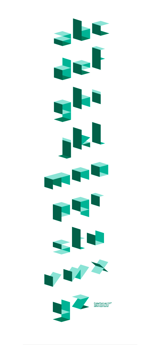
I did some basic skewing and stretching of some fonts in photoshop, just to give me a basic idea of distorting the original font by expanding and stretching it and also gave me some further ideas of how i could stretch my letters. I started to think of things that stretch and how to make a letter looked stretched.


  • Making the font stretch 3D, Downwards or behind to look like it is coming out of the page. 
  • Chewing gum, Stringy Font, Messy and stretched. 
  • Messing with the perspective of the font to make it look like parts have been stretched towards or away form you 
  • Elastic bands, long and stretchy 
  • Stretched across the square, so it does not fit properly. 

Alphabet Soup - Initial Response

I picked the word 'STRETCH' out of the randomiser and thought i would start by looking up the word in the dictionary. 


stretch

  [strech]  Show IPA

verb (used with object)
1.
to draw out or extend (oneself, a body, limbs, wings, etc.)to the full length or extent (often followed by out ): tostretch oneself out on the ground.
2.
to hold out, reach forth, or extend (one's arm, head, etc.).
3.
to extend, spread, or place (something) so as to reach fromone point or place to another: to stretch a rope across aroad.
4.
to draw tight or taut: to stretch the strings of a violin.
5.
to lengthen, widen, distend, or enlarge by tension: tostretch a rubber band.
6.
to draw out, extend, or enlarge unduly: The jacket wasstretched at the elbows.
7.
to extend, force, or make serve beyond the normal orproper limits; strain: to stretch the imagination; to stretchthe facts; to stretch food to feed extra guests; to stretchmoney to keep within a budget.
8.
to extend or strain (oneself) to the utmost, as by intenseexertion; tax.
9.
to increase the quantity of (a beverage, food, paint, etc.) bydilution or admixing: They caught the bartender stretchingthe gin with water.
10.
Radio and Television to prolong or slow down (action orpace) in order not to end too early: to stretch a show; tostretch the action two minutes.

Source // Dictionary\

I then drew a few more words that may help me when thinking about designing my letters:-
  • Expand
  • Draw Out
  • Spread
  • Elastic
  • Lengthen 
  • Widen
  • Extend
  • Tension
  • Strain
  • Tight


Copyright 2010. All rights reserved.

RSS Feed. This blog is proudly powered by Blogger and uses Modern Clix, a theme by Rodrigo Galindez. Modern Clix blogger template by Introblogger.