Archives

OUGD505 - What Is Good - Research - Iconography

I thought it was wise to research into exsisting iconography before I go away to create my own. It is important that any icons or pictograms that are used make instant impact and are easy to understand. clear and concise is the main focus before looking aesthetically pleasing.


Some of the icons i'll have to create are :-

A Film Reel (cinema)
Toilet Signs  (male and female)
Bar Sign (drinks / glasses)
Restaurant / Cafe (knife and fork)
Shop (bag)
Ticket Office (ticket stub)
Museum (something that represents old film)
Hall (trophy)


When designing the full set of icons, It's important to consider a consistent style. They have to work as a set as well as individually and this can be created by using the same line weight, simplicity or complexity of the icon itself as well as a consistent colour. Heres some of my favourite examples;-


Icons that can work large scale, but also at a very small scale are effective. 


These are very simple icons that use solid shapes filled in and also similar weight of lines which keeps a nice consistency about them. 


This is the kind of visual style that I would want to go for. It's extremely simple but I love the mix of bold weight of lines with parts filled in colour. I also think icons always work better one colour over another. (this case the white on bright orange background). I also like the curved edges of these. 


A Similar style to previous. These are stunning. Very simple, so effective. 


 I really like the simplicity of these again. The film camera one is very relevant to what i'm doing. 


Again good use of negative space and one colour. I like the look of the Ticket Stubs on this one. 


excellent food icons. menus etc.


OUGD505 - What Is Good - Way finding / Iconography Research

Here are a few more examples of how way finding, type and colour can work in the environment. 


Big and Bold is effective. If in doubt, go big with the number of what floor your on or even the text to go with it. 


A Nice little way of laying the information out. This would be great for something that isn't there permanently or is always changing. As you can se, the squares just clip on and off the wall at will. 


Nice use of just using paint around corners and section of a building to show information. 


Just a nice way of making something stand out. Playing with perspective and shape and placement. This works really well on the transparent glass. 


Again, bold, simple, to the point. Great use of bright colour on the white backdrop. 


Really innovative solution. Start thinking about all the surface areas around you, not just walls and how something can lead someone in a certain direction across the floor or even up steps in this case. 


One of my favourites. Again, something a little bit different, using this elongated sign as oppose to printing onto a wall. 


OUGD505 - What Is Good - Map / Wayfinding Research

Maps / Plans


I started to collect different maps that are used for events and exhibitions as visual research for my own. I wanted to create a map that stood out and was also really easy to understand. My festival will be half cinema / half exhibition so I need to create room for small cinema screens (at least 3 or four) and then the layout for the rest of the festival...


Tate


The Tate Map is a perfect example of a stand out but easy to understand map. I love the fact that it's 3 dimensional showing the layout of the building and including the stairs and elevators etc. In my eyes, a style like this works much much better than a flat over the top view. However, an over the top view works well sometimes when looking at the different floors, so maybe a combination of the two, like used here would be perfect. 

Iconography and numbered / colour coded sections is also really important when making information easier to understand. I will need to create a full set of pictograms for my festival way finding and maps and 


These simple boxes with the escalator icons show each floor of the tate in a very basic, easy to understand fashion, that is also really effective. 


Another map here takes a similar layout to that of the tate. simple but really effective. I particularly like the lifts and steps on t his one. 


another approach, very simple but taking a bird eye view look. This isn't as interactive as the 3d version but still does the job sufficiently. Not as visually pleasing though, so maybe i'll stay clear of this style. Colour Coding areas again works well though. 


This is a really nice approach. I hadn't thought about the map actually being part of the wall environment but in this case it works really well. The different sections have been broken apart and spread out and the lines of text help reassure which areas hold which things. 


Another way of showing the map in the environment at a 3D level. 


I love this one, one of my favourites. The colours effectively disect each floor and the perspective is great as well as the clean lines and lettering. 


London City Map


Obviously on a much larger scale than what I plan but these hold a lot of detail so need to be simplified and do this well. The colour coding works really effectively to show the rivers water roads and buildings. 


This is the way-finding for Bristol City Museum. Again, this is really effective using the 3d layered sections like the tate which is probably the most effective method i've seen . It is also colour coded into different sections.


Just another example of how the map has been used in the environment again with the chosen colour scheme, use of numbers and pictograms. 


A really clever way of showing the map in a 3D way. Using built up sections to represent different areas of the building. Harder to create, but very effective. 


Simple layout, brilliant simple colour scheme. 


Text Signage 


A few examples of how colour, numbers and type is used to separate each floor of the building and to guide people to where they need to be. 


OUGD505 - Research - British Sayings / Slang

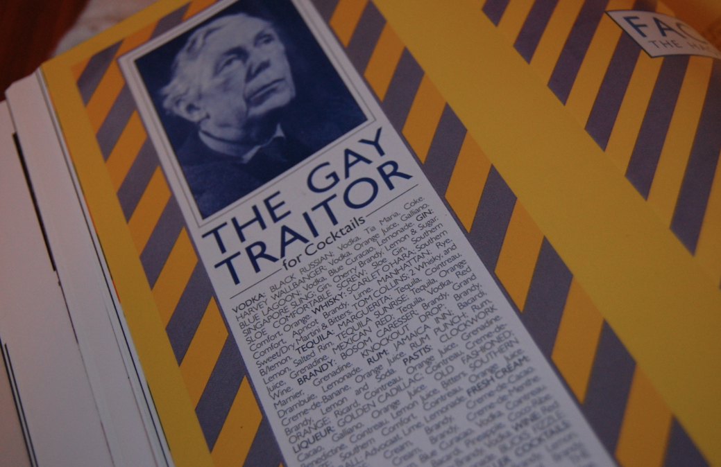
I looked into British Slang and the best of British sayings. Going along with the concept which was chosen in the first crit. I want to use 'we are' in front of everything throughout the branding to make the British Public proud to be British.


100 Best British Slang Words 


1. Tosser – Idiot
2. Cock-up – Screw up
3. Bloody – Damn
4. Give You A Bell – Call you
5. Blimey! – My Goodness
6. Wanker – Idiot
7. Gutted – Devastated
8. Bespoke – Custom Made
9. Chuffed – Proud
10. Fancy – Like
11. Sod Off – Piss off
12. Lost the Plot – Gone Crazy
13. Fortnight – Two Weeks
14. Sorted – Arranged
15. Hoover – Vaccum
16. Kip – Sleep or nap
17. Bee’s Knees – Awesome
18. Know Your Onions – Knowledgeable
19. Dodgy – Suspicious
20. Wonky – Not right
21. Wicked – Cool!
22. Whinge – Whine
23. Tad – Little bit
24. Tenner – £10
25. Fiver – £5
26. Skive – Lazy or avoid doing something
27. Toff – Upper Class Person
28. Punter – Customer/Prostitute’s Client
29. Scouser – Someone from Liverpool
30. Quid – £
31. Taking the Piss – Screwing around32. Pissed – Drunk
33. Loo – Toilet
34. Nicked – Stolen
35. Nutter – Crazy Person
36. Knackered – Tired
37. Gobsmacked – Amazed
38. Dog’s Bollocks – Awesome
39. Chap – Male or friend
40. Bugger – Jerk
41. Bog Roll – Toilet Paper
42. Bob’s Your Uncle – There you go!
43. Anti-Clockwise – We Say Counter Clockwise
44. C of E – Church of England
45. Pants – Panties
46. Throw a Spanner in the Works – Screw up
47. Zed – We say ZZZZZZZ
48. Absobloodylootely – YES!
49. Nosh – Food
50. One Off – One time only
51. Shambles – Mess
52. Arse-over-tit – Fall over
53. Brilliant! – Great!
54. Dog’s Dinner – Dressed Nicely
55. Up for it – Willing to have sex
56. On the Pull – Looking for sex
57. Made Redundant – Fired from a job
58. Easy Peasy – Easy
59. See a Man About a Dog – Do a deal or take a dump
60. Up the Duff – Pregnant
61. DIY – Do It Yourself home improvements
62. Chat Up – Flirt
63. Fit – Hot
64. Arse – Ass
65. Strawberry Creams – Breasts
66. Shag – Screw
67. Gentleman Sausage – Penis
68. Twigs & Berries – Genitalia
69. Fanny – Vagina
70. Bollocks – Balls
71. Ponce – Poser
72. Don’t Get Your Knickers in a Twist – Don’t Get worked up
73. The Telly – Television
74. Bangers – Sausage
75. Chips – French Fries
76. Daft Cow – Idiot
77. Do – Party
78. Uni – College/University
79. Starkers – Naked
80. Smeg – From Red Dwarf
81. Bits ‘n Bobs – Various things
82. Anorak – A person weirdly interested in something
83. Shambles – bad shape/plan gone wrong
84. I’m Off to Bedfordshire – Going to bed
85. Her Majesty’s Pleasure – To be in prison
86. Horses for Courses – Won’t work for someone else
87. John Thomas – Penis
88. Plastered – Drunk
89. Meat and Two Veg – Genitalia
90. Knob Head – Idiot/Dickhead
91. Knob – Penis
92. Chav – White trash
93. It`s monkeys outside – it is very cold
94. Stag Night – Bachelor Party
95. Ace – Cool!
96. Plonker – Idiot
97. Dobber – Penis
98. BellEnd – Penis
99. Blighty – Britain
100. Rubbish – Garbage or ‘That’s crap!’


Favourites


chin wag - Another word for chat
bob’s your uncle - it’s like saying ‘that’s it’.
bees knees - amazing
Arse over tit - Head over heels
chuffed - pleased/proud
knackered - really tired
off your trolley - mad or crazy
rat arsed - drunk
rumpy pumpy - like ‘hanky panky’, I think you can guess what this means
snog - making out
spend a penny - go to the toilet
toodle pip - goodbye
wonky - not aligned/unstable


This website has hundreds of British Slang terms and meanings which would be used in context. Heres some of my favourites of this list that I feel I could fit into my festival somehow:-


All right? - This is used a lot around London and the south to mean, "Hello, how are you"? You would say it to a complete stranger or someone you knew. The normal response would be for them to say "All right"? back to you. It is said as a question. Sometimes it might get expanded to "all right mate"? Mostly used by blue collar workers but also common among younger people.


Any road - Up north (where they talk funny!!) instead of saying anyway, they say "any road"! Weird huh?


Bollocks - This is a great English word with many excellent uses. Technically speaking it meanstesticles but is typically used to describe something that is no good (that's bollocks) or that someone is talking rubbish (he's talking bollocks). Surprisingly it is also used in a positive manner to describe something that is the best, in which case you would describe it as being "the dog's bollocks". Englishmen who live in America take great delight in ordering specialised registration plates for their cars using the letters B.O.L.L.O.X. Good eh?


Chin Wag or Gassing - This is another word for a Chat. You can probably tell why!


Chuffed - You would be chuffed to bits if you were really pleased about something.


Clear off! - This expression brings back memories of being a kid and stealing apples from people's gardens. Sometimes we would get caught and some old bloke would come out and shout "oi clear off you lot". It basically means get lost.


Easy Peasy - A childish term for something very easy. You might say it's a snap.


Full of beans - This means to have loads of energy. It is a polite way of saying that a child is a maniac. I was often described as being full of beans as a kid and now it is my wife's way of telling me to keep still when she is trying to get to sleep. Strangely the same expression in some parts of the US means that you are exaggerating or talking bollocks!


Grub - Food. Similar to nosh. I remember my Dad calling "grub's up", when dinner was ready as a kid. A grub is also an insect larva. Not usually eaten in England. Actually is available in some Australian restaurants!


Gutted - If someone is really upset by something they might say that they were gutted. Like when you are told that you have just failed your driving test!


Hard lines - This is another way of saying hard luck or bad luck.


Khazi - Another word for the toilet. Our version of your bathroom.


Kip - A short sleep, forty winks, or a snooze. You have a kip in front of the telly on a Sunday afternoon.


Knees up - If you're having a knees up, you're going to a dance or party.


Luvvly-jubbly - Clearly another way of saying lovely. Made famous by the TV show Only Fools and Horses.


Mate - Most chaps like to go to the pub with their mates. Mate means friend or chum.


Not my cup of tea - This is a common saying that means something is not to your liking. For example if someone asked you if you would like to go to an all night rave, they would know exactly what you meant if you told them it was not exactly your cup of tea!


Owt - This is Yorkshire for anything. Similarly nowt is Yorkshire for nothing. Hence the expression "you don't get owt for nowt". Roughly translated as "you never get anything for nothing" or "there's no such thing as a free lunch".


Pear shaped - If something has gone pear shaped it means it has become a disaster. It might be preparing a dinner party or arranging a meeting, any of these things can go completely pear shaped.


Smashing - If something is smashing, it means it is terrific


Sorted
- When you have fixed a problem and someone asks how it is going you might say "sorted". It's also popular these days to say "get it sorted" when you are telling someone to get on with the job.


Taking the biscuit - If something really takes the biscuit, it means it out-does everything else and cannot be bettered. Some places in America they said takes the cake.


Taking the mickey
- See taking the piss. Variations include "taking the mick" and "taking the Michael".


Toodle pip - This is an old expression meaning goodbye. However, I only hear it when Americans are doing impressions of Brits as it has fallen into disuse, along with steam trains and gas lights.


Wacky backy - This is the stuff in a joint, otherwise known as pot or marijuana!


Whinge - Whingers are not popular in any circumstance. To whinge is to whine. We all know someone who likes to whinge about everything.


Yonks - "Blimey, I haven't heard from you for yonks". If you heard someone say that it would mean that they had not seen you for ages!


Northern Terms

Northern Terms are a bit less known worldwide, but it might be clever to disguise signage in a northern or southern slang and terms, so that you might have to ask somebody what it means. This is an idea thats slightly in homage to Train spotting, the book and how it is written in scottish dialogue. Here are some of my favourite Northern Terms. 


Now Then - A phrase commonly used in northern England, it derives from Old Yorkshire dialect.
It is a phrase used for greeting, although it is laregely unknown as to why the terms "now" (meaning this instant) and "then" (meaning in the past) were put together to form another way of simply saying "hello". Usually pronounced "Nah-then".

Thee - in modern times in northern england, mainly in the yorkshire counties, the word thee means the. it is mainly a regional dialect and can mostly be found in the Sheffield, Barnsley, Rotherham, and DONCASTER, areas of south yorkshire.

Gerron - proceed, make progress, make friends. Dialect version of "Get on" Used in Northernmidlands of england. He doesno' gerron wi' his boss. He'll never gerron with t'job unless pushed.

T'internet - t is oftern placed in front of words in more northern areas of the UK such as "He's bin on t'internet again"


A cuppa - (widespread all over England) = a cup of tea

What's gooin off? = What's going off? = What's happening?

Ah'm gooin om = I'm going home.

Ay-up = hello
Tarrah Love = goodbye and love is added to the end for someone you care about. (usually men to women and vice versa) 


hinny, pet, love, chuck, marra, flower, bonny lad/lass.


Cockney Ryming Slang


Apples & Pears - Stairs
Would you Adam & Eve it? - Would you believe it?
Give us a butchers - Give us a look 
Barnet - Hair
Dog and Bone - Phone
Jack Jones - Alone
Jimmy Riddle - Piddle (wee)
Pat Cash - Slash (wee)
Richard the Third (turd)
Ann Boleyn - Gin (drinks menu)
band of hope - soap
bacardi breezer's - geezers
bubble bath - or bubble for short - laugh 
cream crackered - kanckered


OUGD505 - What Is Good - Peter Saville Research

Peter Saville is probably my favourite Designer, hailing from Manchester and being heavily involved with the 'Factory' movement. I have always wanted to experiment with work that's heavily influenced by him but never really had an appropriate opportunity. I think with the kinds of work i'm currently looking at such as paperwork etc, his work is a perfect thing to look at. I particularly like die cuts in posters, publications and folders...


Factory Records : The Complete Graphic Album


This is probably my most treasured graphic design book. It is the complete graphic album of Factory Records which is mainly design from legend Peter Saville. I love his style of the design and how different from everything else it was at the height of Factory Records and how different is still is now. 

It amazes me how innovative unique and still so contemporary all the old school Factory designs still look in this present day and age. That to me, is what makes an amazing design. The fact that the design can stand head and shoulders above most things still to this day. 

I picked out bits of design from this book to look further into and to see where i can take influence from Peter Saville and Factory in y own work...


Pictograms


Simple pictograms are something that are used frequently throughout the work of Saville for Factory. The bold colours and simplified imagery is a good way to get an instant message across through image as oppose to type. Simple but effective. 


Type, Colour, Space


Blank Space, Bold Colour and Bold Type is again used effectively consistently throughout Savilles design, especially for Factory. I feel that when trying to grab attention, using lots of colour and bold type are often the most effective way of communication. 


Interior / Spacial Design


Something I love about factory is the whole atmosphere and spacial design plays a massive part to how you interact and take in your surroundings. Factory is amazing and innovative in the way the design was all drawn from the idea of making a nightclub and record label based on an industrial 'Factory'. This would be black and yellow stripes, large metal poles and structures, very industrial machine looking interiors. 


Pattern / Brand Idenitity


The 'Factory' style industrial brand is brought through into all aspects of design for the Hacienda. As you can see in the images above, this pattern and bold colour scheme is used throughout a range of different designs applied to various different products to bring a real shock value identity to the record label and nightclub. 


Juxtaposed Imaagery


I also really appreciate the juxtaposition of really 'old' style imagery both photographic and 'oil-painting-esque' that when placed with these really swiss style hard hitting bold patterns. The effect this gives again is a stark constant that is innovative, especially for the time. 


Another thing that made Factory stand out as well as the industrial design, there was also the juxtaposition of imagery of workmen and very much 'Factory' driven aspects. This helped create a buzz around this new thing, nobody really knew quite what to make of it. It's important to shock or intrigue the target audience to achieve effective design. 


Record Sleeves


the industrial theme starts to come through with some of the record covers...

I particularly like the bright yellow with the very marbled like pattern on the inside of it. This has been crafted and well though out for effective design. 

Another favourite is the vinyl cover above for the band 'Section 25'. The industrial theme is carried though and is enhanced with these very architectural like drawings printed onto opaque tracing paper, which enhances the 'plans' idea. 


Type & Grid / Experimental 


More experimental type within a grid layout. Simple. but amazing results. 


Clean Typography


Love this. Very simple serif typeface over the bright yellow colour of the Factory brand. 


New Order Vinyl 


Another one of my prize possessions is an original pressing of the New Order Substance double LP, designed by peter saville. This is just another example of simple communication. Ju


Copyright 2010. All rights reserved.

RSS Feed. This blog is proudly powered by Blogger and uses Modern Clix, a theme by Rodrigo Galindez. Modern Clix blogger template by Introblogger.