STAR GRID POSTERS
I have seen these designs before and really like them. it is a similar idea that i am trying to create but with the text made from dashed lines in between the rain dashes. It can look quite confusing and just like a pattern from close but the further away you stand, the clearer the image comes.
I have been looking at image layering with text, Kessels does a lot of this himself, so thats a starting point...
Som work from Kessels website...
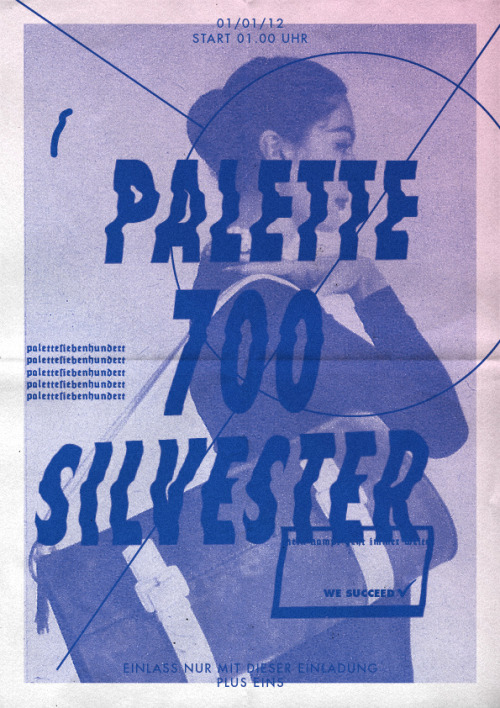
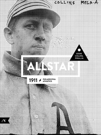
Other Various type over image work...








Leave your comment