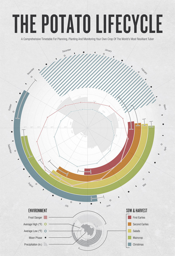
Part One - Systematic Colour

An interesting experiment to show how the brain works. Most people can read this paragraph without any problems just because the first and last letter of each word are in the same place, every other letter is mixed up.

If we now look at this with green text on a red background it all starts to become wobbly and gives us a bit of a headache. This is due to the fact that the colours are contrasting colours on the colour wheel. When placed on top of each other they start to battle with each other for our attention and this is the result.


Colour Spectrum and how the eye perceives colour.

The eye contains two kinds of receptors, rods and cones. Rods let us see tones (shades of grey) and the cones allow us to see colour. The cones work off the RGB colour spectrum. One cone is sensitive to RED light, one to BLUE light and one to GREEN light. when each cone is stimulated this is what colour we see and this also works mixing colours such as green and red will make us see yellow.

Primary colours differ between the two different colour modes RGB and CMYK.

Colours that are shown with light shone through a prism are called spectral colours. These colours are
Red, Orange, Yellow, Green, Blue, Indigo or Violet.
Secondary colours are the colours created by mixing any two primary colours. for example...
Red and Yellow make Orange
Red and Blue make Violet
Yellow and Blue make Green.
Then theres mandatory colours. These are created when mixing two secondary colours together. These are all shown on the diagram above. Mandatory on the outside ring. Secondary on the three middle triangles and primary on the centre three triangles.
 RGB (top) and CYMK (bottom)
The eye cannot differentiate between spectral yellow and a combination of red and green (forming yellow). This also has the same effect with perception of cyan, magenta and every colour in between spectral colours.
This means our eye is fooled into seeing a whole range of colours just my mixing the three primary colours, RED, GREEN and BLUE (see below).

 Subtractive Colour
 Additive Colour
Primary colours are the base of the additive colour system. The spectral colours are reduced to Red, Green and Blue.
 Territory Colours
There are also Territory colours. These are browns and greys that are created by mixing all three primary colours or mixing a primary and a secondary colour.
The territory colour created by mixing the primary colour Green with the secondary colour blue would be called 'Green-Blue'. Thats the easiest way to remember the names.
Part Two - Systematic Colour
Dimensions of Colour

Cyronmnic Value = HUE + TONE =SATURATION


HUE
 SHADE and LUMINANCE
Desaturation through Chromatic Value.

SHADE, TONES, TINT and LUMINANCE.
Desaturation through both.


SATURATION
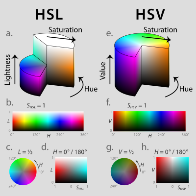
HSL (a–d) and HSV (e–h). Above (a, e): cut-away 3D models of each. Below: two-dimensional plots showing two of a model’s three parameters at once, holding the other constant: cylindrical shells (b, f) of constant saturation, in this case the outside edge of each cylinder; horizontal cross-sections (c, g) of constant HSL lightness or HSV value, in this case the slices halfway down each cylinder; and rectangular vertical cross-sections (d, h) of constant hue, in this case of hues 0° red and its complement 180° cyan.
Source //
Wikipedia
Subjective Responses
This is when the background that the colour sits on changes your interpretation of the colour.

For example, we all know that this is a vibrant red sitting on a grey background below.

However, This is the same red but now sitting on an even more vibrant red background. The original red, now looks really dull because of the brighter red behind it.

The red and orange placed together on this grey background. Bright red, Bright orange.

When a brighter red is placed behind the original red, next to the orange this now looks really pink.
PANTONE
PANTONE IS A GRAPHIC DESIGNERS BEST FRIEND


WHAT ARE PANTONE COLOURS?
"Pantone colours are an agreed, industry standard set of colours that can be matched to accurately over a variety of processes, equipment and materials. They are identified as a series of numbers instead of names (except with fashion colours), so you will hear the reference PANTONE 2985 C instead ofSky Blue. This helps a great deal as one person's idea of what Sky Blue is may be very different to another person, but with a number you can refer to the chart and you know exactly what you are getting. Keeping colours consistent is a big issue with Infiniti Mixed Media and is very difficult to do over different systems like print and the web. A certain amount of colour shift is inevitable, but I work hard to try and keep this to a minimum"
Text Sourced From PANTONE
PANTONE COLOUR MATCHING SYSTEM
The Pantone Color Matching System is largely a standardized color reproduction system. By standardizing the colors, different manufacturers in different locations can all refer to the Pantone system to make sure colors match without direct contact with one another.
One such use is standardizing colors in the
CMYK process. The CMYK process is a method of printing color by using four inks—cyan, magenta, yellow, and black. A majority of the world's printed material is produced using the CMYK process, and there is a special subset of Pantone colors that can be reproduced using CMYK
[citation needed]. Those that are possible to simulate through the CMYK process are labeled as such within the company's guides.
However, most of the Pantone system's 1,114
spot colors cannot be simulated with CMYK but with 13 base pigments (15 including white and black) mixed in specified amounts.
[6]The Pantone system also allows for many 'special' colors to be produced such as metallics and fluorescents. While most of the Pantone system colors are beyond the printed CMYK gamut, it was only in 2001 that Pantone began providing translations of their existing system with screen-based colors. (Screen-based colors use the RGB—red, green, blue—system to create various colors.)
[7] The Goe system has
RGB and
LAB values with each color.
[8]Pantone colors are described by their allocated number (typically referred to as, for example, 'PMS 130'). PMS colors are almost always used in branding and have even found their way into government legislation (to describe the colors of flags). In January 2003, the Scottish Parliament debated a petition (reference PE512) to refer to the blue in the Scottish flag (saltire) as 'Pantone 300'. Countries such asCanada and South Korea and organizations such as the FIA have also chosen to refer to specific Pantone colors to use when producing flags. U.S. states includingTexas have set legislated PMS colors of their flags.
If you want to work with colour in design it has to be SYSTEMATIC
Part Three - Colour and Contrast


The eye can be fooled into seeing a whole range of visible colours through the proportionate adjustment of the three primary colours; Red, Green and Blue.
Ittens 7 Contrasts
- Contrast of TONE
- Contrast of HUE
- Contrast of SATURATION
- Contrast of EXTENSION
- Contrast of TEMPERATURE
- COMPLIMENTARY Contrast
- SIMULTANEOUS Contrast
Contrast Of Tone
The contrast of TONE is formed by the juxtaposition of light and dark values. This could be monochromatic (see below)
The grey background is the exact tone in between white and black. Therefore the white and black 'wprd' stadn out the same against this tone as they are the same distance away from the grey in tone.
The orange and red colours are very similar in tone, thats why it is hard to see the word on the background.
Red and blue also have similar tones. The blue stands out on red as it is far away on the colour wheel but again we start to get this hazy, fuzzy, blurred effect and this is because the tones of red and blue are very similar.
Contrast of Hue
This is formed by the juxtaposition of different HUES. The greater the distance between hues on the colour wheel, the greater the contrast.
Here, the yellow sits back and the red and blue jump forward on a white background.
When placed on a black background, the yellow now jumps forward as it is the furthesy away from black out of the colours.
when all colours are placed together, to me, they all start to battle for your attention.
Shown here with words on different backgrounds.
Contrast of Saturation
This is formed by the juxtaposition of light and dark values and their relative saturations.
Blue on a grey background
When a brighter blue is added, the other blue appears way more saturated, and looks slightly grey now.
When an even brighter blue is added, the other two look more saturated. Now the previous bright blue does not look so bright.
This carries on.
Contrast of Extension
This is formed by assigning proportional field sizes in relation to the visual Weight of the colour. Also know as contrast of proportion.
As you can see, the amount of one colour and how the colour is placed can determine how you perceive the colour. For example, the bottom image with the lines spread out is hard to view, it starts to get messy and blurry but the top two work okay with more yellow and purple at one side. The middle is also pretty hard to view with the purple line splitting up the yellow.
Contrast of Temperature
This is formed juxtaposing hues that can be considered warm and cool. Also known as the contrast of warm and cool.
Red on Grey
By addind a red more towards pink to the left of the red this seems cooler than the warmer red.
Again by adding a warmer red on the other side makes the other two look cooler.
We can see that each colour is a separate colour and tone from the others with these black dividers in place.
When we take them away, the colours seem to work as one gradient. Each box looks like it is darker on one aide than the other but we know it isnt. This is or eyes fooling us because o f the colours placed next to it, it changes our perception of colour due to temperature.
Complimentary Contrast
This is formed by the juxtaposition of complimentary colours from a colour wheel or perceptual opposites.
Equal amount of black and white fighting for our attention = headache.
Red and green / blue and yellow are complimentary colours. They again fight for our attention which = a headache.
Simultaneous Contrast
formed when boundaries between colours perceptually vibrate.
Part Four - Subjective Colour
choice of type, position and how much space it is taking up affects the perception of it.

Green on yellow.

When the green is added to the background middle image looks like it had a gradient from green to yellow even through we know its the same colour.

Darker the colour, the more this looks yellow.

Dark grey letter on light grey background.

Top grey word starts to look purple with the introductory of green. purple being the complimentary colour.

We know its the same colour but it seem like a gradient.

Even more visible here. Grey word looks green.

Even more so with both the colours now.

When we join them we can see the grey is the same colour.

If you stare at the black dot in the middle of this cross for a minute then look at a clear surface, the red cross will be temporarily burnt into your retina. Therefore you will continue to see the cross for up to an hour after viewing it.