Archives

Mutton Quad - Product Research

House Wine

I decided to look at some contemporary designs for house wine as this is one of the products that I will be including within my brand. I wanted something that looked traditional enough but also with a clean contemporary edge which made customers want to buy it...


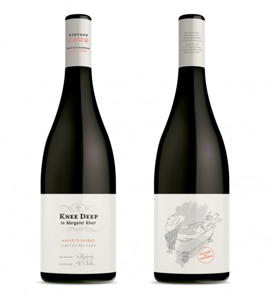
Knee Deep is an award-winning winery and restaurant based in Wilyabrup, Margaret River, Western Australia. We were commissioned by the owners, Phil and Sue Childs, to help them improve their packaging and strengthen their positioning in the marketplace.”


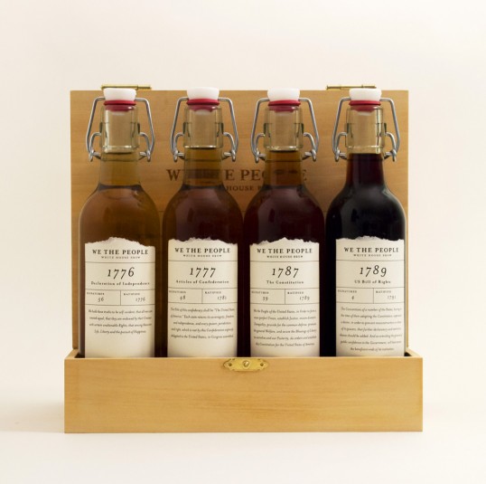
“This is a branding and packaging project for beer being brewed in the White House. Instead of being sold in stores, honorary guests receive this as a limited edition four-pack sampler from the President.  This fictional brand is named We the People, drawing inspiration from the historic documents on which our nation is founded on. The labels on each bottle pay tribute to a different document. Similar to how these documents are displayed in the National Archives in Washington DC, the packaging is meant to be utilized as a display case.”


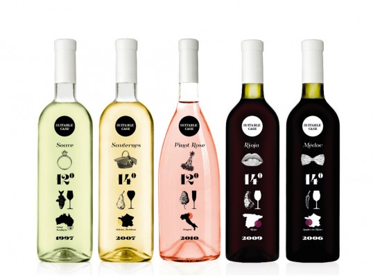
“The idea was to create the wine for those, who love wine, but every time the person goes to the shop, doesn’t know which to choose. On the pack you can find the best suitable case for drinking it, the best temperature, which food best suits etc.”


This project defines various aspects that concern those elements of communication, through its naming, voice and visual communication throughout. Within this are the brand’s signature (symbols, logo, typography), institutional colors, palettes and patterns, labels, and packaging among others.
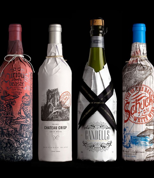
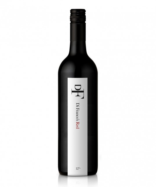
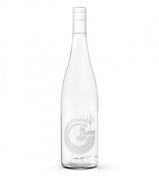
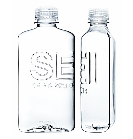


Table Water


85% of the maple water harvested is returned to nature immediately after filtering to concentrate its sugars in the maple syrup production process. Élodie and Mathieu Fleury, a sister and brother whose parents are maple syrup producers, decided to take a different look at this natural resource and recover this maple water, separated from its sugars, to create the world’s only still water of its kind, a made in Quebec product of irreproachable quality: an innovative idea in a traditional sector with a sustainable development approach.”


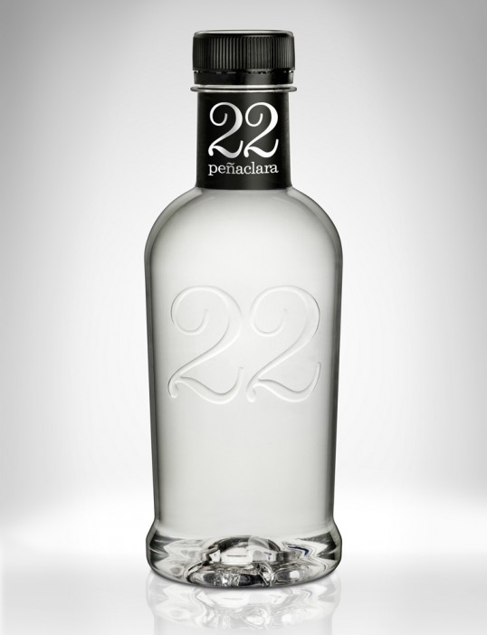
Sidecar recently completed a total makeover of the 150 years old mineral water brand, 22 Peñaclara. The brand’s name comes from the fact that the water flows at a constant 22 degrees celsius.
The first design of the range is the new PET bottle. Sidecar was responsible for the new label design as well as the industrial design of the bottle.


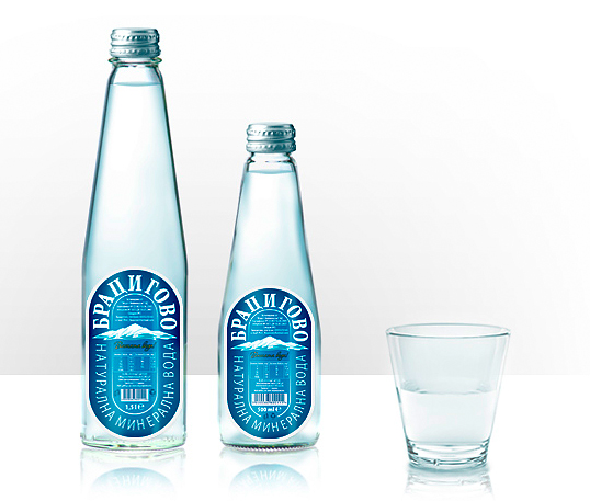
Designed by Dreamworx | Country: Bulgaria
“The task was to create a very elegant and interesting label that would make this stand out on the shelf and attract people to grab it among all the other bottles around.”


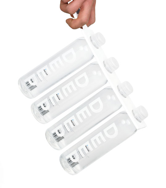
Designed by Jesse Kirsch | Country: United States
“Elegant and clean typography along with a  unique caddy design allows Deep Water to stand out from its competition. The large white letters of DEEP along with small droplet in pale blue allow the clear water inside the bottle to remain prominent and appetizing. The caddy, which features a self-holding joint, needs only a small sticker on the other end to remain closed. The sticker not only acts as a means to keep the caddy closed, but also serves as its label including a barcode, price and other information. Two small notches in the caddy allow the customer to hold the 4-pack comfortably.”


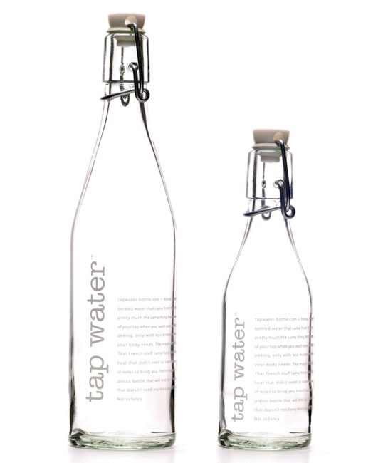
Designed by Racquel Youtzy | Country: Canada | Font: ITC American Typewriter
“Racquel Youtzy (founder of tap water bottle) of Toronto, Canada designed this in response to the growing demand for safe refillable water bottles. Everything on the market seems to be geared towards the sports side of the business. Even the high end metal water bottles still have an obvious “sports feel” about them with the wide neck and stubby appearance. If you want a bottle that can be used on your table during a dinner party, on your desk at work, or even used when you are out shopping the “tap water bottle” is the product that is needed. The bottle is stylish with both a modern clean design and a retro flip cap giving it a universal appeal.


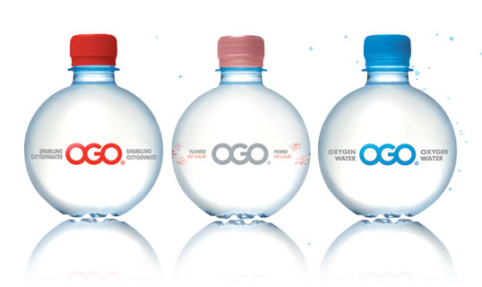
Designed by ORA-ÏTO | Country: France
“The man behind the unique design of the highly distinctive OGO water bottle is Ora-Ito, the brand name of the designer Ito Morabito. In 2002 Ora-Ito received the ‘Oscar for the best packaging’. His style is described as ‘simplexity’; simple in it’s complexity .
The OGO brand belongs to the world of style, inspiration, fashion and sport. OGO has appeared in London Fashion Week shows by Julien Macdonald and Michiko Koshino.  Avant-garde designer Jeremy Scott has used OGO in Paris. In sport, OGO is a natural for stars like English rugby international Olly Barkley. The press frequently link OGO with top celebrities.”


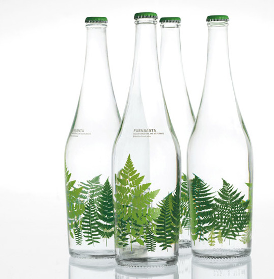
esigned by Pati Nunez Associats | Country: Spain
“Aguas de Fuensanta has commisioned us a series of designes to be printed on 75cl glass bottles and sold in restaurants and gourmet shops.


Country: United States | Buy it
“The bottle shape, inspired by the military canteen, is designed around the principle of portability and utilization of space while maintaining a subtle harmony of form and function. The bottle is useful and fashionable; and the taste of SEI natural spring water is pure and crisp.”
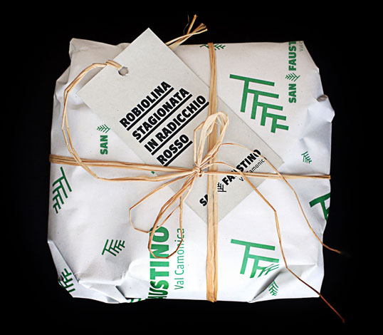


Food Wrap


Design Production - App Design - Research

I decided to do some more thorough research into app design because I would be proposing designs both for Design for Web and Design for Print & Web. I will look at a wide range of Iphone & Android App Interfaces as well as the Iphone Interface itself to give me a clearer of idea of user interaction, what works and what doesn't work.

I also researched into existing apps on my own Iphone, this was it gives me user interaction and the physical experience of seeing what works well and what doesn't.

My Iphone


Iphone Interface


as you can see from the image above, this is the general design for the Apple Iphone interface. As my app would be primarily for the Iphone, I would want it to fit seamlessly in with this design. This would include the 'blue' highlight when sections are selected. The use of Helvetica bold for the main body copy text. This is just most commonly easiest for readability and legibility on screen.

Also, most of the buttons have a gradient over the top to add a three dimensional shine making the button look more physical than just flat on screen. This is something that works really well in all apps and adds to the user interaction. 

As far as the navigation bar at the bottom goes. This usually included links that are used the most and therefore need to be within easy access. They usually are grey on black when not selected then light up with a chosen colour when selected and in use to make again add to clarity and user interaction. 


UI App Design


App Design for a Wine Tasting Cellar. I particularly like the red black and white colour scheme. There is not too much colours making it confusing and hard to navigate and I think this is one thing that can make an app successful. 

It is also based around cuisine which is relevant to my Restaurant. I can take some pointers of some of the selections. 


Android Restaurant App


This is a really good informative video about a template for a Restaurant App. Gives me an idea of user interactivity within the application. Also ideas for what to include within an app and how this can enhance the physical experience of dining in a Restaurant.


More creative app design within the boundaries of user interactivity. Using more colours and bright colours works well for this particular purpose but depends on the particular use of the app. This is for editing photographs in a very much 'fun' light hearted way so is perfect for this concept.


Flud News App 


Well put together app. Simple clean design that fits in well with the Iphone interface and also a really nice advertisement to go along with this.


Arles Festival


Like this interface design too. Simple icon pictograms and another 3 colour scheme, white, black yellow. I think that I wouldn't really include any more colours then 3 because this hinders interactivity by quite a lot. 


Forq App


Really like the design of this App for Ipad. It links up with the Restaurant creating a larger in house experience. The colour scheme is clean, Orange White and Black (again 3 colours). Also a layout which is a little bit different but also very easy to navigate. Includes full colour imagery of the meals which is also a nice touch to include in a restaurant enviroment. Gives a 'try before you buy' kind of feel. Also the option to create your own meals and recipes and take this away from the restaurant environment. 


More Experimental Ipad/Iphone Layouts 


Nice colour scheme. Using brighter 'web safe' colours. 


Very clean, well designed logos for application interface. 


Design Production - Mutton Quad - Toilet Signage / Further Interior Research


Toilet Signage at Umbro HQ. These guys like football. Really clever concept on a tradition sign. 


Simple signage with the slight differentiation between male and female using larger at the top for shoulders and skirt at the bottom. 


Large scale toilet signage, clever idea but a little bit inappropriate for my restaurant possibly. 


Quite clean cut simple design that is a little different from the average icons. Works well here. 


These are nice signs, incorporating the log of the business into the actual shape of the male a female. 


This signage is quite clever i suppose but almost definitely innapriate for my cause. I quite like the idea though, of using the single rectangular boxes for the bodie. If I can incorporate this in somehow it could work well. 


Design Production - Mutton Quad - Existing Restaurant Competition

I felt that it would be appropriate to research into existing restaurants, both physically and online presence to give me both inspiration and to also review the competition in the segment of the market that I will be targeting.

My Restaurant is English Italian and Contemporary, so this is a good field to research in to see direct competition .


Jamies Italian


Interior/Exterior


The interior and exterior is again very homely. Bright Red chairs, Modern Fittings with a contemporary feel. Not too clean cut. 


Menu / Identity


The logo combines the modern sans serif typeface with the classically serif 'Italian' underneath. I think this gives off the message that the Restaurant is quite contemporary but also classical in the food it serves. 


The Menu is not too formal, it's quite contemporary design that is also very welcoming and homely to make the customer feel comfortable. 


Website


The website keeps the consistent colour scheme following on from the menu. It is quite contemporary design but also really light hearted. Using modern typographic styles, appealing to a younger audience. 


Ask Italian

Interior/Exterior


As you can see here from the Interior of both these Italians. Very Similar. Both Contemporary. both use lot's of Red, White and Earthy tones too to add the homely feel. 


Menu / Identity


Logo is Fresh looking, Very modern. More so than Jamie s Italian, but this also goes fro the Interior. Good play on words and placement of type can reach out to quite a broad audience, whilst remaining fresh and up to date. 


Again, similarities between Jamies Italian and Ask Menu. similar Price range for a start which is what I will be entering at. They both use this antique white background colour which adds to the 'homely' feel and similar colours are used in general. Orange and Red a reoccurring colour palette. 


Website


Again, very similar to Jamies Italian, which the modern typography and colour scheme. 


Prezzo

Interior/Exterior


Prezzo seems generally a little more 'classier' than the other two. Less homely but still gives off Italian vibes. The black and white colour scheme is clean cut and builds an identity for the company. I want to find a balance between this and the more 'homely' approach. 

Menu / Identity

Logo is very clean cut again. Looks Sophisticated but also inviting enough to not be too expensive. 


Surprisingly the price range is slightly lower than the other two italians but this doesn't really come across int eh branding which I'm not sure is a good or bad thing. The menu itself resembles that of wetherspoons so this is where the design has let the branding down. 


Website


Website also lets the brand down more. I was expecting more of the black and white colour scheme to add a touch of class as a pose to this bright, clean cut but very 'common' style of branding, which could be linked to any cheap high street gastropub. 


Pizza Express

Interior/Exterior


Menu/Identity


I really like the black and white Pizza Express Logo. It is timeless in one sense because it looks really old, very greek, handcrafted but also fits really well within a contemporary environment. I think they have found a perfect balance here. It's also very different to anything else around so instantly stands out. 


The menu compliments this design perfectly. Much cleaner with white space with black text, still using this colour scheme. Introducing accents of this lime green to freshen it up, fit in with the colour seen in the photographic imagery, and to also highlight certain areas.


Website/App


Again, the website and App compliments the branding. I really like the use of the white horizontal lines in the logo and even in the uniforms as you can see in the image above. I feel that it's important to keep a constant brand that can be applied across various different product ranges. This is probably the most successful brand out of the ones I have research further into. They use the same colour scheme as Prezzo, but in a much more successful way in my opinion. 


Various Other Competition


LEON Restaraunts


Wagamama


Strada


Copyright 2010. All rights reserved.

RSS Feed. This blog is proudly powered by Blogger and uses Modern Clix, a theme by Rodrigo Galindez. Modern Clix blogger template by Introblogger.