Archives

OUGD401 // Publication // Film Theory / Hitchcock Re-Cap

I have tried to break down some techniques that Hitchcock used to see which i could role with for poster designs.

Dolly Zoom 


The dolly zoom is an unsettling in-camera effect that appears to undermine normal visual perception. It is part of many cinematic techniques used in filmmaking and television production.
The effect is achieved by using the setting of a zoom lens to adjust the angle of view (often referred to as field of view or FOV) while the camera dollies (or moves) towards or away from the subject in such a way as to keep the subject the same size in the frame throughout. In its classic form, the camera is pulled away from a subject while the lens zooms in, or vice-versa. Thus, during the zoom, there is a continuousperspective distortion, the most directly noticeable feature being that the background appears to change size relative to the subject.
As the human visual system uses both size and perspective cues to judge the relative sizes of objects, seeing a perspective change without a size change is a highly unsettling effect, and the emotional impact of this effect is greater than the description above can suggest. The visual appearance for the viewer is that either the background suddenly grows in size and detail and overwhelms the foreground, or the foreground becomes immense and dominates its previous setting, depending on which way the dolly zoom is executed.
The effect was first developed by Irmin Roberts, a Paramount second-unit cameraman, and was famously used by Alfred Hitchcock in his film Vertigo.


A dolly counter zoom is also variously known as:
  • The "Hitchcock zoom" or the "Vertigo effect"
  • "Hitchcock shot" or "Vertigo shot.


The animation above shows the dolly zoom being performed. 

At the top is the image we see, the cubes stay the same and the teapots grow bigger. 

the bottom shows how this is achieved. The camera moves back while zooming in at the same time. 


Humour 


"For me, suspense doesn't have any value if it's not balanced by humor." – Alfred Hitchcock

Borgus.com -- Filmmakers who attempt to use Alfred Hitchcock's techniques often overlook comedy, a vital component to his works.  Even the most deadly situations depicted in his films have an undercurrent of facetious wit.  Hitchcock’s own public persona was built on the foundation of his sophisticated British deadpan humor, and it’s not surprising this sly attitude permeates his craft.

“In the mystery and suspense genre, a tongue-in-cheek approach is indispensable,” said Hitchcock. (Truffaut)  He felt this was the ingredient which kept audiences coming back begging for more.  It is the equivalent of a roller coaster ride in which the passengers scream wildly on the way down but laugh when the ride rolls to a stop. (Gottlieb)

In one of his most popular films, Psycho (1960), a hotel owner's angry mother kills visitors at night, and there are no obvious laughs in the film.  But, Hitchcock often described Psycho as a practical joke. (Truffaut)  Other films such as Shadow of a Doubt (1943) and Strangers on a Train (1951) are sprinkled with macabre humor.  The Trouble With Harry (1955) is purely a deadpan comedy.


According to Hitchcock, humor does not diminish the effectiveness of dramatic suspense.  In fact, he argued that humor heightens the drama and makes it even more potent. “For me, suspense doesn’t have any value unless it’s balanced by humor,” said Hitchcock.  (Gottlieb)
Through his quirky characters, ironic situations, whimsical settings, and a complex balance of laughs and tension, Alfred Hitchcock had found a way to make his suspense unbearably fun for his audiences.


Sound

Hitchcock’s Third Dimension

"I think what sound brought of value to the cinema was to complete the realism of the image on the screen. It made everyone in the audience deaf mutes." -Alfred Hitchcock

Borgus.com - Because he is known for his visual techniques, Alfred Hitchcock’s unique use of sound is a topic which receives less attention. While his first several films were silent,Blackmail (1929) started him on a path of aural manipulation that continued through his later works. Blackmail showcases Hitchcock’s instinctive styles of soundscaping during a time period where little was yet known about the cinematic powers of sound. Blackmaildemonstrates ongoing tactics, such as: withholding sound from the viewer to pique curiosity, exaggerating sound as a form of narrative emphasis, and creating tension through both ambient noises and silence. Further, in a world where music was the dominant form of narrative accompaniment, he stripped music score away from his scenes and instead used the act of singing (and whistling) as a suspense device. Lastly, Hitchcock’s manipulation of human speech ranged from technical malfunctions of telephone calls to dizzied audio abstraction of the characters’ subjective thoughts. This article will outline the major uses of sound in Hitchcock’s Blackmail, and demonstrate that it is an essential foundation to his usage in later works.


At the time of Blackmail’s release, most theaters still didn’t have speakers, only 22% having sound. Nonetheless, Hitchcock was keen to consider those 5,200 theaters worldwide which did have sound, and knew that more would follow (Belton 1999). Film scholar Elizabeth Weis wrote The Silent Scream in 1982, a thorough examination of the use of sound in Hitchcock films. According to Weis, Hitchcock saw the arrival of sound technology as a ‘new dimension of cinematic expression’ (Weis 1982, p.14). This dimension enabled him to break away from the flat plane of the visual and create cinematic worlds more deeply entrenched in realism.

Ambient Sound as Suspense Device
In Blackmail, Hitchcock used the ambient sounds of his settings by manipulating them for the purposes of suspense, as a way of expressing character emotion. In order to enhance the feelings of guilt from Alice after she murdered The Artist, Hitchcock used surrounding sounds to amplify those feelings. As Alice is slowly walking through quick-moving crowds in a daze of shock, car horns enhance the counterpoint between the busy world and her stoic stake of shock. She soon walks through a crowd of theater goers who are laughing under a billboard which reads: ‘a new comedy.’ The sound of laugher increases the tension as Hitchcock plays this humorous tone against her guilt. Each of Hitchcock’s car horns are taunting her to snap out of it. As she wakes up in bed the next morning, caged song-birds in her room whistle happily to the extent that they become intrusive, further escalating her frantic mental state. Later, while she sits down to eat at her family’s shop, the door chime rings abstractly instead of its recognizable quick burst. The sound of the chime is stretched out over several seconds resembling the long protracted tone of a tuning fork. This abstracted reality, created purely through sound manipulation, brings the viewer into her subjective state of mind – ultra sensitive to the sounds around her as she sinks further inward, hoping to hide from what she has done.

When Tracy comes into the shop to intimidate them, saying, ‘what a chance for blackmail – I could never do a thing like that,’ the door chime sounds and a delivery man walks in with a newspaper. The ambient sounds of the street spill into the room. Car horns, honking happily, further counterpoint the seriousness of the line just spoken.
 
Then, as the delivery man walks back outside, he shuts the door behind him silencing the street sounds. At this point we know the line was spoken ironically, because of course Tracy does intend to blackmail. The sudden burst of comic energy from the delivery man’s entrance is Hitchcock’s way of indicating this irony. It is also a reminder that the outside world is ready to intrude on their private conversation, and that if Alice is implicated in the murder she will have to face public scrutiny.

When Tracy finally does escape through the window and flee for his own life, he crashes through with the sound of shattering glass, immediately letting in the ambient street noises once again. This time the car horns seem to be screaming out, rather than being comic. As the chase sequence begins, Hitchcock switches to silent-film mode with full music score, but adds rhythmic sound effects to further propel the tension. The beeping Morse code from a telegraph creates a sense of frantic urgency, and as Tracy makes his way to the British Museum, car horns add to this sense of panic.


OUGD401 // Publication Idea

From the workshop we did with Jo, My idea became clearer. I had already had the idea pretty much in my source material and the ideas i had written down in the workshop, i just had to draw it from them.

For my publication i have decided to focus on two topics from two different lectures and merge them together to form my own design. I was really interested in Modernism and the whole movement and also with the film lectures, especially Alfred Hitchcock. Bringing in the personal side, i wanted to experiment with modernist design and see what i could create when trying to merge this with something else. In this case Film Theory.

My idea was to create minimalist modernist film posters for Hitchcock films and Theory. And possibly create some for cult classics, as that would be something i would enjoy.

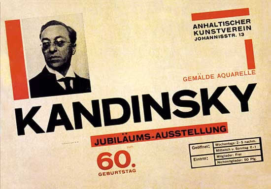
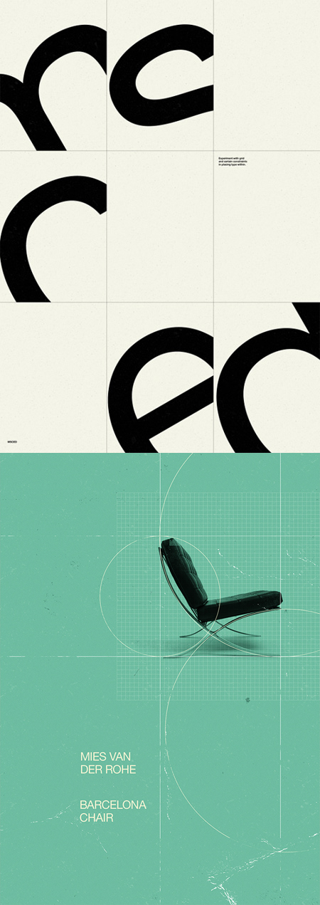
I wanted to look at symbols and trying to re-create scenes or just titles of films through symbols. Here is some inspiration i have been looking at...


I really like these two posters above. One of my ideas was to used imagery similar to this to help document the theory and turn it into poster form. 


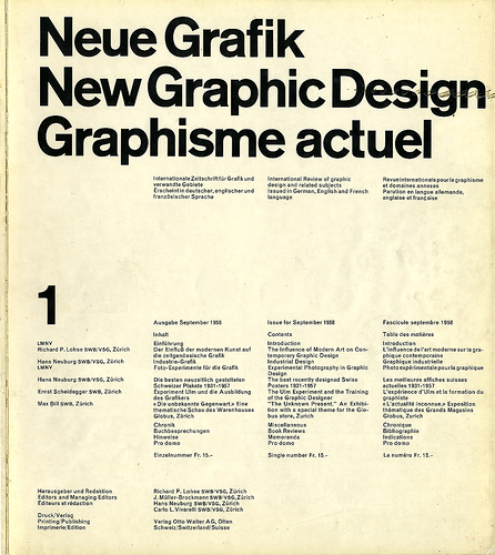
I really like a lot of the layout styles of the modernist movement, i want to try and replicate or just be influenced by them when creating the posters. I want to portray both modernist design, my own personal style and the information on films. 


To link it more to film theory, i was thinking of making posters in the same style but including all the different techniques and film terms that Hitchcock lived by. To do this i will have to further research into Hitchcock and also re-cap myself on the Lecture. 


I have also been looking at contemporary designs for film posters, to see what has already been done. i really like these by designer Olly Moss. His style almost mimic that of Saul Bass.


Lecture 13 - Visual Communication - Notes

Visual Communication:


'The Rhetoric of the Image'

Dr Jill Fernie Clarke

Popular Culture - things we come across every day.


The Only Way Is Essex


Roland Barthes / Semiotics 

exploring different layers of meaning and how they relate to images and the way the culture we live in effects our perception.

A photograph of young men and women smiling, enjoying themselves, sat on a chez long.

Our ideas change when we look at it in the context that it was published - Telegraph Online.

The connotations come with our understanding about the program. The cultural connotations can expand depending on your cultural capital and context.


Denotation - is the level of meaning which describes something. The simple meaning of a sign.


Panzani Pasta


Semioticians are people who are involved in semiotics. The study of signs. They try to unpack and explain the meaning behind images.

The sign is the image. The signifier is what you can see. The signified is what is actually conveyed by looking at the image. It could be happiness


Match Magazine


A uniformed boy saluting we see but on other levels it is conveying ideas of patriotism and Frances position within the world. Imperialism.

Denote/Connote 


Barack Obama


A man dressed smartly infront of a building, blue sky. It connotes power, confidence.

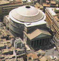
Classical building is symbolic - Symbolises that Country should be run by a government. comes from the ancient rome ideas. The reason for the style of building is because it connotes these ideologies. The dome of the building is something the romans brought to europe which then went to america. Using domes in political buildings has meaning. The romans had power and structure.


Dome structure, fed by natural light. It is referenced throughout the world. Including in Leeds. Buildings reference Rome and Ancient greece.


Richestag, Germany - Built as an expression of power. Holds Nazi Connotations.


Visual practitioners interveen to change the symbolism of a building. Christo - wraps the building fully in silk. It no longer held the Nazi Connotations, it became the building that a well known artist had 'wrapped'.  This gave it new meaning, and a new future for Germany.


Rudolf Wittkower. Allegory and the Migration of Symbols. 


Look at in different times and places we use the same symbols to identify things.

World Of Warcraft - we recognise the images and text and we might decode the image. Thinking back to Lord of the Rings and Aragon which is very similar connotations. We look at the red mist to remind us of hell and fire.

Cultural Context


He looked at people who had privileged lifestyles could access high culture art and he drew conclusions about how our culture is stratifies in terms of our education and how people are equipped to understand the meaning of images.


Welsh Flag - Dragon is used in a different context and conveys a different meaning. 


a Saint slays a dragon. we recognise the Saint because of the stained glass. The dragon is used as a symbol of evil and the devil. Saint is fighting a good fight. Angels are included at the top and other symbols of Christianity. 

'How does meaning get into the image? Where does it end? And if it ends, what is there beyond?'
Roland Barthes 

Barthes tries to argue that the culture in which you are situated gives the image meaning. To that extent the image can be used in different contexts and cultures which will give the image different meanings. 


Jagermeister Logo

We know what it is but someone who doesn't might mistake it with spiritual meaning. 


'Another difficulty in analysing connotation is that there is no particular analytical language corresponding to the particularity of its signified - how are the signifieds of connotation to be named?'
Roland Barthes


Can we look at this image without realising what it symbolises. The Nazi's. How do we unpack all these different connotations. 


we recognise the women are painting and sculping. The roman laurel wreaths that was given to champions. 

PERSONAL INVETIGATION


This video isn't really relevant but i found it really interesting and well made. It's interesting to see how Pop Culture has changed over the years. 

Contemporary and historic footage - teenagers, fads and fashions throughout the decades, dating and romance, political demonstrations, cars, surfing, skateboarding, drugs, nightlife, dancing and more.


Another interesting video. Stephen Sewell talking about how popular culture is turning us into slaves. I like how he is really strong in what he believes in but I don't really agree with him. He raises some interesting points however.


OUGD406 // Stamp It // Outline Illustration

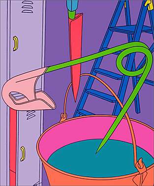
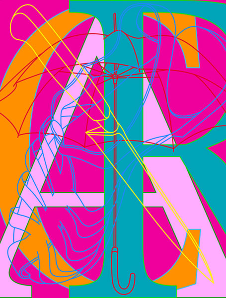
I wanted my illustrations to be clean cut outlines similar to the style of one of favourite designers, Michael Craig-Martin. I think that the cleanness and vibrant colours used in his work would work perfectly on a small stamp. The designs are clear to see and would work really well for what i wanted to do.   Here is some of his work...


Illustrations including Shoes...


Other styles of illustration - Shoes. 


Poster i found someone had done for nike in a similar style to MCM


i also came across this vans shoe box design. I love the illustration on this also, something i will look at when experimenting with illustrating my shoes. Not entirely sure what style i'll be going for yet.


Love these illustrations for nike. Something different. 


Fubu / Reebok Illustrations


OUGD406 // Stamp It // Walk to Work // Workplace Footwear Research

I came across some things for 'Walk To Work'. So i thought this may be an interesting thing to focus on fo rthe designs of my stamps. I thought it would be better than just sticking to your bog standard recycling campaigns and may be more interesting for people to see on a stamp and actually want to do it.

here is some research and imagery i found on 'Walk To Work'...

I found that a few businesses and organisations have tried a 'walk to work' day so maybe i can link this into my idea. Most of the design for ideas like this i have come across is pretty bad. I do like the first logo of the man though, but i was thinking i may focus on footwear. Workplace Footwear.


I found this online and realised that the British Walk to Work official Week this year will be on the 14-18 May. I was thinking i could link in my stamps to this by creating a et of stamps for the week and also promotional material...

Walk to Work Week 2012 will be taking place on the 14 to 18 May 2012 as part of theGreat British Walking Challenge.

Make sure that you join the thousands of employees across the UK who will be walking to, from and during work as part of one of the healthiest workplace challenges around. You can sign up your workplace for free on our My Living Streets website; where you and your colleagues will be able to log your miles, minutes and steps walked and see individual as well as collective totals of miles walked, calories burnt and potential carbon dioxide savings.
We'll be sending out more information over the coming months in the run up to the challenge so make sure you keep checking back or keep up to date with our eBulletin.


 As i decided to go down the route of illustrating different footwear from different workplaces, i did some more research into this. I needed at least six easily recognisable kinds of shoe that you would instantly relate to a job. Here is some research i did into that to try and match the shoes with the jobs...


Caterpillar Boots - Builders 


Brogues - Business Men


Stilettos - Business Women 


Wellies - Farming


Running Shoes - Sports 

Converse - Laidback / Creative


Desert boots / Laidback Proffesional


Copyright 2010. All rights reserved.

RSS Feed. This blog is proudly powered by Blogger and uses Modern Clix, a theme by Rodrigo Galindez. Modern Clix blogger template by Introblogger.