You Are Reading

OUGD406 // Stamp It // Outline Illustration

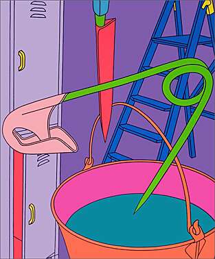
I wanted my illustrations to be clean cut outlines similar to the style of one of favourite designers, Michael Craig-Martin. I think that the cleanness and vibrant colours used in his work would work perfectly on a small stamp. The designs are clear to see and would work really well for what i wanted to do.   Here is some of his work...


Illustrations including Shoes...


Other styles of illustration - Shoes. 


Poster i found someone had done for nike in a similar style to MCM


i also came across this vans shoe box design. I love the illustration on this also, something i will look at when experimenting with illustrating my shoes. Not entirely sure what style i'll be going for yet.


Love these illustrations for nike. Something different. 


Fubu / Reebok Illustrations


Comments for this entry

Leave your comment


Copyright 2010. All rights reserved.

RSS Feed. This blog is proudly powered by Blogger and uses Modern Clix, a theme by Rodrigo Galindez. Modern Clix blogger template by Introblogger.