Showing posts with label Publication. Show all posts

OUGD401 // Publication // Final Crit


Final Crit Feedback & my comments on this

What is the publication trying to communicate?

The concept has been put across well from the comments i have recieved. My audience have seemed to grasp the idea of the publication which is the representation and ideologies of modern architectures in cult classic films. 

Strengths 

They have noticed that there is a clear modernist style aesthetic and have said this is relevant and really works for the purpose of the publication. 
improvements 

Improvements 

It was mentioned that a brief film synopsis of each film could be a benefit but they have also put in brackets (this isn't relevant if its targeted at film students or fanatics.)

How is the format of the publication relevant to the content?

Strengths 

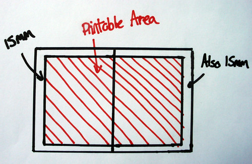
They have noticed my reasoning for the newspaper format and respected it. "The newspaper is a relevant. reference to print techniques and type and grid system of modernism. Large scale allows for large amount of content that is included in the publication, but also with enough room for blank space which also follows the modernist theme."

Improvements 

It was hard to judge the format because i only presented a mock-up smaller version. "Can't wait to see it as a newspaper!"

Comment on the practical, conceptual and/or symbolic consideration of colour?

Strengths 

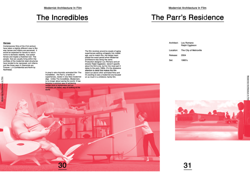
- Very colourful but respectfully so. 
- One colour per page theme works well.
- Colour keeps the publication interesting. 

Improvements 

- Some of the blues look to be a little dark (this could be due to the inkjet printer)
- Black on introduction page may bleed through to front cover. 

I'm really happy that they critiques appreciated the colour co-ordinated sections for each film and that they agreed with myself that it makes the publication interesting and work well as a consistent theme. 

I'm slightly concerned with the black bleeding though to the front cover. This wasn't something that I considered and overlooked when making the publication. It is now went off so i will just have to see how it goes. Fingers crossed. 

Who is the target audience?

" Designers / Creatives / Architects / Film Fanatics

People interested in modern architecture, cinema or in fact them both combined. Or designers and people who like well put together, contemporary publications."

I'm happy with this response. The target audience seems to be who i had in mind too, so i'm glad that this translates well through the publication. 

Assuming the role of audience, what is you reaction to the publication? 

"wow, this publication perfectly suits me as the target audience!

Very well designed. Nice use of colour and type and layout. 

Very thorough information that is clear and understandable. 

People may appreciate full colour images of buildings if interested in architecture."

Again, on the whole great feedback. I'm glad the use of colour, type and layout is appreciated for this kind of publication. The comment on the full colour images i'll take on board for future reference but i feel for the aesthetics of this particular publication, it was important for me to use the half-tone to work well with the block colours. 

Do you think this is the intended response?

Newspaper format suits context of publication. It would make more people interested in film. 

What context would this publication be appropriate for?

" An exhibition / Film History Galleries / Memorabilia / Independent Art Shops / Picture Houses (Hyde Park Picture House) / Independent Cinemas / Architecture Shops? / Libraries? / Supplement that comes with an architect magazine or film magazine. "

A good selection of contexts have been covered here which is good. Some of them I had in mind, others not so much which is good to hear a larger variation. I like the idea of maybe a supplement or something bought in a independent art shop cinemas and picture houses. It sort of reminds me of a creative newspaper which is found in places like that as well as bars, shops and clubs recently.

Would it be appropriate to be viewed world-wide?

Yes, for film fans. 

Overall, i am very happy with the feedback, on the whole it is great and there seems to be a lot of interest in my publication. there is a few concerns, mainly over printing issues but i will have to wait and see how that comes out. Fingers crossed. 


Final Crit Feedback Sheets.

OUGD401 // Publication // Newspaper Club

I have chosen to go with a newspaper for my final publication. The main reasons for this is that it will work well with my very modernist layout but also keep things quite contemporary.

I started to think about how architects would like to read the magazine, and originally though about creating the book in a style of blueprints that come folded up inside a folder. Then i realised that this would be too difficult and awkward for the user to navigate around it and also, I'm not really designing this for Architects. they could be just a small section of my target audience.

By creating a newspaper, I still maintain the original concept of having large sheets like that of what an architect would design on, but it also accessible and in a format that would be relevant to the theme of the publication while also being relevant to todays audience. A newspaper is a format that is instantly recognisable but by making my content more contemporary and not something you would find normally in a newspaper, this makes it a little bit different and innovative.


Newspaper Club


 A really good company I have used before to achieve a professional final product. They print great looking and quality newspapers using industrial machines. 

I'm hoping the half-tone i have used will come out okay, so it's a bit of a game but it should work really well for this particular subject. 


As I had already put together my publication in Indesign, it was so easy for me to change the margins and bleed lines to suit the specifications of Newspaper Club. I sent a hi-res PDF for them to print. 


OUGD401 // Final Publication // Mock-Up // Printed Images


I decided to print a mock-up of my publication a quarter of the size that it will be so I could have a hardcopy. By doing this, I can see if there are and typo's and also to see if it was going to work in the order and sequence I had placed it in. I am really happy with the outcome. I checked over and highlighted any mistakes made before sending it off to be printed as a full size a3 newspaper.

Here are some images of the mock-up (click to enlarge)


OUGD401 // Final Publication // Digital Version

Here is the digitalised version of my final publication. It is 44 pages long. I have used website www.newspaperclub.com to print my final newspaper.


OUGD401 // Publication // Layout Ideas / Development

IDEA GENERATION


LAYOUTS


FORMATS?


DEVELOPMENT


This was an idea i came up for the film L.A. Confidential. Loosely based of the modernist architecture magazines and also by swiss design in general. I Knew i wanted to layer colours and image together and the use of Helvetica to really emphasise the modernist approach. 

I really like this design but it looks more like a poster as appose to a publication at the moment.


Design for a possible front cover. A couple of variations. Layering half-toned images with Helvetica to create the classic Modernist look.  I wanted to add the type around the edges, influenced by modernist magazine 'The shopping-hour Magazine'. I think this relates well to the publication itself as well as the style that i am basing my newspaper from. 


I moved onto to possible layouts for the inside of my publication. I wanted to keep the style and layout of each page pretty consistent. I just added the textured background to emulate what it may look like when printed as a newspaper. 


I created an initial grid of three column in Indesign so that my designs were consistant throughout the publication. 


I will be using the columns to sit my body copy in like this. I want the layout to be simple, minimalist but effective and keep with the strict type and grid rules. This is a direct reflection of my chosen topic of modernism.

I decided i will be using images i have sourced online and in book and then half-toning then to get the is gritty, monotone, newspaper print look. This should hopefully work really well when printed as a final publication, especially on newsprint. 


Some examples of Half-toning the images...


As you can see here, on the close up, the tone that comes through on the images work really well, and are what traditional newspapers used to print photographic images. 


I wanted to create a title page for each of the films I would be focusing on and I come up with a few ideas for that based off my initial design sheets.  Using the grid as a template, -50 Kerning on Helvetica for the underlined title's, and also including my half-toned image. I gathered my images i wanted to use together in the research stage so it was just a case of editing them and droping them into my template...

Here was the development of the title page template...


Levelling up the images look okay, but i prefer where it overlaps onto the previous page 


I tried a few different layouts but in the end wanted to keep it as minimalist as i could. The cantered text on the left hand side with the full block shape of colour seems to work best...


I went on to create title pages for all ten films. Each page slightly different placement of the images and the colours relating to that particular film. In this case, yellow is a reoccurring colour in the film The Big Lebowski, and I tried to watch most of the films that I was focussing on, therefore picked the most appropriate colours. 


I then moved onto the second sections for each of the films. I decided to create a double page spread for each film using a very similar template also, to keep the publication consistent. 

Here are my initial experiments for layouts before i finally settled on a result. 


I realised that the content I have written for the essay is going to be much shorter, so used smaller paragraphs and varied the placement of each bit of text. 

Big Lebowski


Dimaonds Are Forever


L.A. Confidential


North By Northwest 


Ferris Bueller


The Incredibles


Sleeper


Twilight


A Clockwork Orange 


Copyright 2010. All rights reserved.

RSS Feed. This blog is proudly powered by Blogger and uses Modern Clix, a theme by Rodrigo Galindez. Modern Clix blogger template by Introblogger.