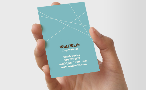
Showing posts with label message and interpretation. Show all posts

Proverbally Yours - Mailing List Research

I was struggling on the mailing list slightly just to how to present. I knew i had to keep it really professional, legible, simple and easy to read but wasn't sure on the spacers, dividers and logos etc so had a browse around for some inspiration...


Image Source  INKD

This is a letterhead for a nutritionalist. Its basic. uses nice pastel colours. It has the logo at the top with a nice open space for the information to go. This one also includes a border around the whole thing and some more logos at the bottom. Works really well, is quite quirky but also proffesional. I would like to go for something a little more minimalist and clean cut but do like this idea. 


Image Source INKD

I love this one. It is much better than the last one. The logo is really suitable for the company. The light blue stock also works with this and the simple text at the bottom and dividers across the page make this mailing list look really professional. 


IMAGE SOURCE INKD

Another neat, professional looking mailing list/letterhead for a law business. I'm liking the simple colours used and how the blocks come out from the right hand side top and bottom. A nice contemporary professional look to the document. 


All Images Sources at INKD

After looking at a few different design for these letterhead/mailing list kind of a4 documents, i have come to the conclusion that simpler works better in my opinion. 

I like the idea of including the logo at the top and maybe at the bottom. However, overall i want to keep my design pretty simple, not too fussy. I will be using my two colours to include, spacers and line dividers throughout my mailing list. I think i will keep the large majority of the middle section open for all the addresses to fit into. I will use the top and bottom for logos and light decoration. 

Proverbally Yours - Message and Interpretation - Research

Vet Business Cards Ect...


Source // Inked

I like the design of this. The green and blue colours are relevant and work well in this case. The logo is quirky of the sausage dog and also relevant because of the cross inside it. Clean and very professional looking business card. 

I would more likely to be going for a design like this much more than the mainstream pet insurance tacky designs. 


Really like this design. The green representing the medical side of it. The design is sleek, clean cut, professional  looking and works much better than the others. 


Source // Inked

Again the brochure is pretty professional looking. I'm not mad on the cheesy photographs and the blue gradient but i do like the simple pictograms used in this one, much like the idea i will be going for.


Source // Inkd

Much like the business card, professional clean cut design. Really like this one. 


Letterhead


Source // Inkd


Love this design. Much more contemporary design to the last. Nice colours used. silhouettes of animals working well. Simple clean shapes and a bit of texture. 


Source // MOO

I LOVE these ones. simple outlines of the animals. relevant turquoise blue colour works well. simple font, professional composition. 


Source // MOO

ANIMAL THOUGHTS  - SPEECH BUBBLES

Again i really love this design, sticking with the simple pictograms silhouette illustrations but making it a little bit more quirky with the thought bubbles and the thougths of the animal themselves. 


Source // MOO
Again, really clever and contemporary design for a dog walkers company. I really like this one aswell.


Source // MOO


Proverbally Yours - Message and Interpretation - Research

I thought it would be wise of me, before creating my work, to have a look at some existing advertising for pet insurance/chipped. I gathered that a lot of the stuff i find would be tacky stuff but, even though, its worthwhile to look at some of it to get an understanding.


Source // Joanne Shum

quite quirky advertisement for sainsburys pet insurance.  

Source // F G D

Tesco Pet club also uses silhouette like illustrations on the images near the bottom of the page as well as the paw print for the logo. I like the silhouettes but i think the logo and the general type as well as the composition is horrible. 


Compare Pet Care website. Logo is recognisable which works well. colours are bold but not something i would go with, they're a bit garish. Other than that, compositionally everything is placed well and easy to read, also quite professional looking. 


Source // Vets Medi Care

Again, not the best design. Logo works really well on this one though, and the light blue colour represents a vet more i'd say than the other colours. Just because of the uniform. 


Copyright 2010. All rights reserved.

RSS Feed. This blog is proudly powered by Blogger and uses Modern Clix, a theme by Rodrigo Galindez. Modern Clix blogger template by Introblogger.