Showing posts with label Proverbally Yours. Show all posts

Proverbally Yours - Envelope Research


While i was browsing across this website, i also decided to have a look at some envelope design. I want to make sure all my components for this brief tie in well together.


I really like the idea of the imagery or text overlapping the sides or corners of the envelope and maybe onto the back. This could fit in quite well with my idea of having a dog lead and the customer following the lead around the envelope until they find what is inside. GREAT IDEA!


Simple combination. Logo in the top corner, address in the middle. Probably the most basic of envelope layouts but also one of the most effective. The quickest way to get your message across and also neat and professional.


This envelope uses a bigger bolder logo, making the business presence more know straight away. This is a good idea because it makes the envelop recognisable from a distance and also really stands out as appose to just a regular plain envelope with a bit or writing on it. 


I like the idea of containing imagery on the envelope. This one works well. It's a good way to keep the viewers interested and maybe make them looks at this particular envelope over a different one. 


I really like the design on this envelope in particular. Its quite abstract in the shapes and patterns used across the envelope, but also quite subtle at the same time, using different shades and tones of the same colour. 

I also wanted to look at the seal types of an envelope. I was thinking of keeping it simple just with the classic lick and stick down but i though i would have a look into some of the different methods before settling on an final idea. 

STICKERS


Source // S D DIRECT

WAX SEAL


Source // CLASSIC S
I'l probably stick with the simple stick down technique. I don't want to go over the top when it is really not necessary for what i am creating. 

I also had a quick look at types of envelopes. I had the idea of having a landscape envelope because i thought it would work better for my booklet but i had a look at some different types and the meanings/reasons behind them/why they are used...

Pocket Envelopes

With pocket envelopes, the opening flap is positioned on the short edge which is what defines the envelope as a pocket. These envelopes are commonly used in all applications.
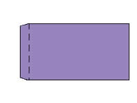
Pocket Envelope Diagram

Wallet Envelopes

The wallet envelope normally has a trapezium shaped flap which is suitable for automatic mailing machines and can come in straight or slightly curved variations.
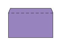
Wallet Envelope Diagram

Banker Envelopes

The banker envelope has a triangular flap which is traditionally used in the greeting card industry and for personal use note/letter paper and cards. They can often be referred to Greeting Card or Invitation Envelopes which you may have heard of.
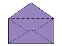
Banker Envelope Diagram
SOURCE // ENVELOPE SIZES

After further reseach, my idea is to go with the standard 'WALLET' envelope. 


Proverbally Yours - Mailing List Research

I was struggling on the mailing list slightly just to how to present. I knew i had to keep it really professional, legible, simple and easy to read but wasn't sure on the spacers, dividers and logos etc so had a browse around for some inspiration...


Image Source  INKD

This is a letterhead for a nutritionalist. Its basic. uses nice pastel colours. It has the logo at the top with a nice open space for the information to go. This one also includes a border around the whole thing and some more logos at the bottom. Works really well, is quite quirky but also proffesional. I would like to go for something a little more minimalist and clean cut but do like this idea. 


Image Source INKD

I love this one. It is much better than the last one. The logo is really suitable for the company. The light blue stock also works with this and the simple text at the bottom and dividers across the page make this mailing list look really professional. 


IMAGE SOURCE INKD

Another neat, professional looking mailing list/letterhead for a law business. I'm liking the simple colours used and how the blocks come out from the right hand side top and bottom. A nice contemporary professional look to the document. 


All Images Sources at INKD

After looking at a few different design for these letterhead/mailing list kind of a4 documents, i have come to the conclusion that simpler works better in my opinion. 

I like the idea of including the logo at the top and maybe at the bottom. However, overall i want to keep my design pretty simple, not too fussy. I will be using my two colours to include, spacers and line dividers throughout my mailing list. I think i will keep the large majority of the middle section open for all the addresses to fit into. I will use the top and bottom for logos and light decoration. 

Proverbally Yours - Message and Interpretation - Research

Vet Business Cards Ect...


Source // Inked

I like the design of this. The green and blue colours are relevant and work well in this case. The logo is quirky of the sausage dog and also relevant because of the cross inside it. Clean and very professional looking business card. 

I would more likely to be going for a design like this much more than the mainstream pet insurance tacky designs. 


Really like this design. The green representing the medical side of it. The design is sleek, clean cut, professional  looking and works much better than the others. 


Source // Inked

Again the brochure is pretty professional looking. I'm not mad on the cheesy photographs and the blue gradient but i do like the simple pictograms used in this one, much like the idea i will be going for.


Source // Inkd

Much like the business card, professional clean cut design. Really like this one. 


Letterhead


Source // Inkd


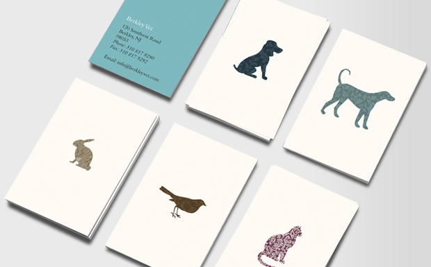
Love this design. Much more contemporary design to the last. Nice colours used. silhouettes of animals working well. Simple clean shapes and a bit of texture. 


Source // MOO

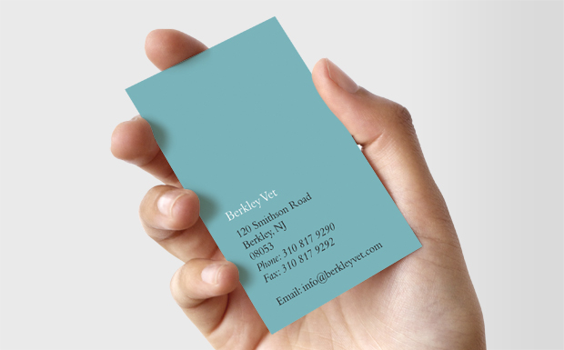
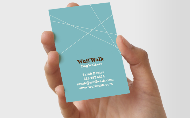
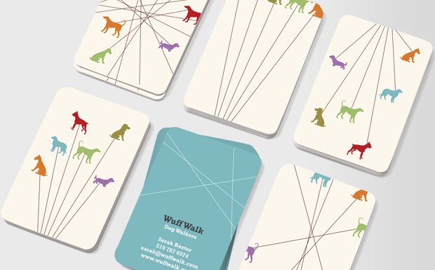
I LOVE these ones. simple outlines of the animals. relevant turquoise blue colour works well. simple font, professional composition. 


Source // MOO

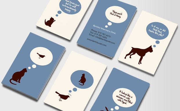
ANIMAL THOUGHTS  - SPEECH BUBBLES

Again i really love this design, sticking with the simple pictograms silhouette illustrations but making it a little bit more quirky with the thought bubbles and the thougths of the animal themselves. 


Source // MOO
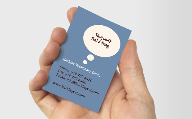
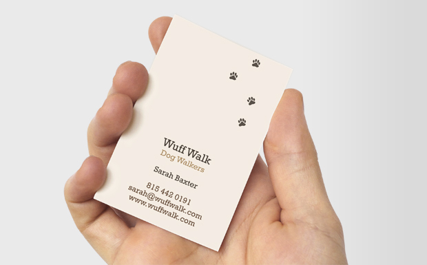
Again, really clever and contemporary design for a dog walkers company. I really like this one aswell.


Source // MOO


Copyright 2010. All rights reserved.

RSS Feed. This blog is proudly powered by Blogger and uses Modern Clix, a theme by Rodrigo Galindez. Modern Clix blogger template by Introblogger.