IDEA GENERATION


LAYOUTS


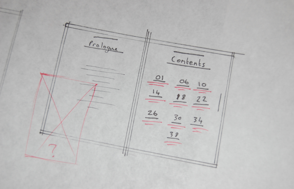
FORMATS?


DEVELOPMENT

This was an idea i came up for the film L.A. Confidential. Loosely based of the modernist architecture magazines and also by swiss design in general. I Knew i wanted to layer colours and image together and the use of Helvetica to really emphasise the modernist approach.
I really like this design but it looks more like a poster as appose to a publication at the moment.


Design for a possible front cover. A couple of variations. Layering half-toned images with Helvetica to create the classic Modernist look. I wanted to add the type around the edges, influenced by modernist magazine 'The shopping-hour Magazine'. I think this relates well to the publication itself as well as the style that i am basing my newspaper from.
I moved onto to possible layouts for the inside of my publication. I wanted to keep the style and layout of each page pretty consistent. I just added the textured background to emulate what it may look like when printed as a newspaper.
I created an initial grid of three column in Indesign so that my designs were consistant throughout the publication.


I will be using the columns to sit my body copy in like this. I want the layout to be simple, minimalist but effective and keep with the strict type and grid rules. This is a direct reflection of my chosen topic of modernism.
I decided i will be using images i have sourced online and in book and then half-toning then to get the is gritty, monotone, newspaper print look. This should hopefully work really well when printed as a final publication, especially on newsprint.
Some examples of Half-toning the images...

As you can see here, on the close up, the tone that comes through on the images work really well, and are what traditional newspapers used to print photographic images.

I wanted to create a title page for each of the films I would be focusing on and I come up with a few ideas for that based off my initial design sheets. Using the grid as a template, -50 Kerning on Helvetica for the underlined title's, and also including my half-toned image. I gathered my images i wanted to use together in the research stage so it was just a case of editing them and droping them into my template...
Here was the development of the title page template...


Levelling up the images look okay, but i prefer where it overlaps onto the previous page
I tried a few different layouts but in the end wanted to keep it as minimalist as i could. The cantered text on the left hand side with the full block shape of colour seems to work best...

I went on to create title pages for all ten films. Each page slightly different placement of the images and the colours relating to that particular film. In this case, yellow is a reoccurring colour in the film The Big Lebowski, and I tried to watch most of the films that I was focussing on, therefore picked the most appropriate colours.


I then moved onto the second sections for each of the films. I decided to create a double page spread for each film using a very similar template also, to keep the publication consistent.
Here are my initial experiments for layouts before i finally settled on a result.


I realised that the content I have written for the essay is going to be much shorter, so used smaller paragraphs and varied the placement of each bit of text.

Big Lebowski

Dimaonds Are Forever

L.A. Confidential

North By Northwest

Ferris Bueller
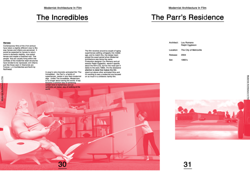
The Incredibles

Sleeper

Twilight

A Clockwork Orange

Leave your comment