Showing posts with label how to. Show all posts

How To // Basic FACTUAL information on the Diamond Buying Guide


This is more basic information on the four c's and other information regarding buying diamonds. We know it is factual - it is from a trusted source. What we need to do is re-word the information in a much more simple, friendlier tone to make it fit within our app and website...


4 Cs Of Diamonds

Various characteristics of diamonds are graded and categorized by the diamond industry. Learning about diamonds is first learning about the "four Cs" of diamonds which are considered the most important grades and categories:
  • Cut
  • Clarity
  • Color
  • Carat weight
These are the criteria jewelers use when grading diamonds, and they're the ones you'll need to understand to buy the right diamond for you.
And then there's the "Fifth C":
  • Certificates

Cut

Cut is probably the most important, and most challenging, of the four Cs to understand. The brilliance of a diamond depends heavily on its cut.

Clarity

Most diamonds contain some inner flaws, or inclusions, that occur during the formation process. The visibility, number and size of these inclusions determine what is called the clarity of a diamond. Diamonds that are clear create more brilliance, and thus are more highly prized, and priced.

Color

Colorless diamonds are the most desirable since they allow the most refraction of light (sparkle). Off white diamonds absorb light, inhibiting brilliance.

Carat Weight

A carat is the unit of weight by which a diamond is measured. Because large diamonds are found less commonly than small diamonds, the price of a diamond rises exponentionaly to its size. Read this guide to get a better understanding of what a carat is and how it affects the appearance of a diamond.

The Fifth C: Certificates

The diamond certificate, which is sometimes called a grading report, is a complete evaluation of your diamond that has been performed by a qualified professional with the help of special gemological instruments. Each stone bears its own recognizable, individual characteristics, which is listed on the certificate.

How to // App Interface Design Research

Iv'e been looking through some apps on an iphone just to see what overall aesthetics, composition and layout is used throughout. This way i can get some basic ground rules and inspiration before i go to create my own.

A lot of the things between different apps are varied, such as buttons are in different places. some are more interactive than other like games for example. I looked at various different types of apps to get an overall view. I realised that for most apps, and what will be needed in the one i create in particular is a nav bar at the bottom. This bar stays consistent throughout every page of the app and usually contains buttons so that the user can easily return to different parts of the app.

I decided this would be the best option to take. To have a navbar at the bottom, with maybe a 'Home\Page' button and a 'Back' arrow button.


FACEBOOK APP


Image Source // L QUID

See here the nav bar at the bottom has forward and backwards buttons as well as a bookmark button. That is the standard internet buttons on safari iphone. 

The buttons that remain consistent are at the top of this app. These are clear, easy to see and easy to use which is something i will have to think about. 


Again the icons used here are clear and easy to understand. Easily placed and layed out on the page. Another thing i will consider carefully. 


Image Source // APP BITE

The 'Log In' page is simple. does the job. 

The body copt is helvetica here i think. It needs to be legible and readable for everybody to use with no problems. Other fonts are used for titles etc. which will be okay for the idea i have. 


Image Source // G B M

Here is ust an image showing some of the buttons used. They need to be big enough so the user can click the touch screen easy enough and not press another button by acciedent. They also need to be clear, easy to read but also quite astheticlly plasing.

I like the way that a gradient is usde in order to make the buttons look 3D. Also, you cant see this here but when the button is pressed on the app, it changes appearance so it looks like a 3D button has been pressed in. This is a nice touch and it also lets you know which button you have clicked. 


US ARMY INFOMATION APP


This is an information app much like what i will be creating. 

The simple imagery used here is good. It is simple, clear, gets the point across, yet is still quite stylish and aesthetically pleasing.


Source // SQSPACE

This is an app for Square Space. 

This is definitely what style we would want to go for. Keeping it simple and elegant. Black and white 

I also like the black and grey info graphics that are included on this app, maybe something we could work into our project. 

NAVIGON GPS APP

Image Sources // IPHONE COUNTRY


These buttons are nice for the 'Navigon' GPS system App for your car. 

The buttons again are big and bold. The type is really legible and stands out. 

I like the black buttons on black background. By using the white gradient on the buttons they really stand out but still look quite sleek and elegant for an interface design. 


When we come to the actual use of the App. The big space has been left, rightly so, for the actual GPS map. The top buttons and type again is consistent and easy to use. The black bar at the bottom again works well in the interface with the white gradient.


Here you can see the really simple pictogram icons at the bottom. They are easy to understand, easy to recognise and also easy on the eyes. 

The black on white again is simple but so classy. You cannot go wrong with this design. 

Type works well. It stands out and is big enough to read clearly. 


Introducing the grey boxes now, still works well. 

I really like the design for the buttons used for the on/off switch and the volume control. 

Finally i will just touch on interactions. 

The more interactive an app, the better it is to use in my opinion. 


This app for the clock for example. It is still really simple but the fact you can scroll through the times and turn on the red lights to mark dates is really good. I find bringing the user more into the app this way can make it a much more exciting experience for them. 

I will take on the board all the differetn factors when creating the interface for my own app. 

The main things to think about are. 

  • Interactiveness
  • Button Sizes (being big enough)
  • Ascetics (Sleek and Classy)
  • Legible and Readable Type 
  • Simple Layout and Composition
  • Navigation Bar at the bottom is a MUST!

How to // Simple Imagery Icon Research

As i am creating simple pictograms for the app and all the icons throughout, i thought i would look at some inspiration for this. I decided to work in black and white as this seems the be the easiest understood, it's clear and sleek in design...


Source // Web Design


Source // Genuis Artist


Looking more at app or desktop icons. I like the style of the square with the curved edges. A nice white gradient across it makes it look more like a 3D button, which i think will work well in this case.

Source // Deposit Photos


I also ilke this idea of the bottom set of icons. They look embossed into the blue texture. This could make for a nice design within my interface. 

Source // FF PSD


Found these on a blog and thought they was really interesting. Easy to understand symbols for cooking. 


Design for packaging needs to be easily understandable, simple and clear which i really like. 

Source // Vectory Lab


How to // Basic Diamond Imagery Research

Just a collection of diamond logos and imagery that i have found that i find aesthetically pleasing.

This can help me create the diagrams and pictograms and any other imagery i wish to generate for this project...


I really like the logos, imagery and type that clothing company Diamond Supply Co use throughout their work and merch. 


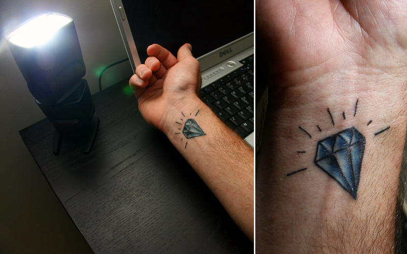
Really like the traditional aspect of this diamond tattoo with the scrolls and roses. something to think about. Image Source // Tattoos With Meaning


Another nice traditional tattoo. Image Source // Blogspot


I also like the lines of light reflecting from this design. I think that is a really nice touch. 
Image Source // Deviant Art


How To // The Four C's Research

After looking for more or just more relevant research on 'The Four C's' i came across this jewellers website for 'James Allen'.

Here, they have this really neat little interactive diamond search where you can click on which type of diamond you want to narrow your search....


Source // James Allen


How to // Engagement Ring Research

I just found some interesting statistics on engagements and rings...


Want to know what is socially acceptable for the engagement process?  Here is a list of some things to keep in mind before you go popping that question. 
  • 25% of women view the proposal as more important than the actual wedding ceremony. Guys, take notes, the proposal is your time to shine since you typically have little or nothing to say about the wedding (except the I do). This means 75% of the women have beenplanning the wedding of their dreams to be one of the biggest moments in their life.

  • 99.4% of men and women view digital proposals as impersonal and unimaginative & would say “No” even if it was followed by an in-person gesture. With so many people now meeting their spouse on popular social sites like MySpace, Facebook, YouTube, & text messaging one could incorrectly assume this was OK, IT”S NOT! 

  • 37% of women are OK with popping the question to the guy. Long gone are the days of women waiting for men to propose marriage as many are taking on the responsibility themselves. And interestingly enough, more men than women are accepting of this shift in responsibility.

  • 60% of men who responded would still ask their future father-in-law permission for his daughter’s hand in marriage before popping the big question. This does help future relations with the in laws.  It’s important at first to act like you care what they think.

  • 33% of dating couples said they thought it would be OK to have their proposal broadcast to the world…… as long as it was recorded for it’s awesomeness, not like “the lamest proposal ever..” and the TV show added funds to help beef up the proposal

  • 50% of women would rather a man splurge on the diamonds rather than the proposal as most would be satisfied with a simple, inexpensive, romantic proposal at a park. Understand that women will embellish the story to their friends about HOW you proposed BUT the diamond on her hand is seen by the world.

  • 49% of men prefer to plan and execute the proposals themselves.

  • 38% of men would consult their friends and family for advice on the perfect proposal.

  • 83% of men & women agree that dropping to one knee is the best approach when popping the actual question. You can’t go wrong with the classics!

  • *The engagement research was conducted by an independent national research firm and responses were solicited from individuals who have recently entertained the idea of becoming engaged, have recently become engaged or who have recently been married.  On an annual basis, 1 to 2 percent of the population in the United States becomes engaged.  The responses in this survey make up a sample that is statistically accurate +/-6% at 95% confidence.

How To // Engagement Ring Research

As we are using diagrams and information throughout our booklet, i decided to look at some existing guides and diagrams to source some correct information and to also see what is already out there...


Source // Diamond Vues


Source // The Diamond Club

Diamond Terminology. 

RING SIZES
How to determine your ring size
1. Wrap a piece of string or a strip of paper around your finger.
2. Mark the point where the two ends meet.
3. Measure the string against a ruler to get the circumference.
4. Divide that by 3.14 to get the diameter of your finger.
5. Look up your ring size using the table below.

Alternatively, please Email us and we will send you a FREE ring sizer (UK Residents ONLY!)
Helpful Hints
  • Measure your finger at room temperature because cold fingers tend to be smaller.
  • If you are considering a wide band (e.g. 6mm), you will need to move up 1/2 size for a more comfortable fit.
  • The average finger size for a woman in the UK is L-M.
  • If you are purchasing a ring as a surprise, try asking the intended recipient's friend or family if they know their ring size.
  • Ring sizes are not like shoe sizes, a size T for a man is the same as a woman's size T.

US
Diameter
inches
Diameter
mm
UK
1/2
15/32
11.95
A
1
31/64
12.37
B
1 1/2
1/2
12.78
C
2
33/64
13.21
D
2 1/2
17/32
13.61
E
3
35/64
14.05
F
3 1/2
9/16
14.45

4
37/64
14.86
H 1/2
4 1/2
19/32
15.27
I 1/2
5
5/8
15.70
J 1/2
5 1/2
41/64
16.10
L
6
21/32
16.51
M
6 1/2
43/64
16.92
N
7
11/16
17.35
O
7 1/2
45/64
17.75
P
8
23/32
18.19
Q
8 1/2
47/64
18.53

9
3/4
18.89

9 1/2
49/64
19.41

10
25/32
19.84
T 1/2
10 1/2
51/64
20.20
U 1/2
11
13/16
20.68
V 1/2
11 1/2
53/64
21.08

12
27/32
21.49
Y
12 1/2
55/64
21.89
Z
13
7/8
22.33


If you're buying the ring as a surprise
Ask your partner's mother or one of their friends if they know their finger size. Borrow one of your partners rings and slide it down a tapered candle. Then measure according to the ring sizer you received in the mail or using the chart abov
e.
Tips on getting an accurate ring size
After sliding the ring sizer on, make sure it slides off easily over the knuckle. Don't measure cold fingers, as this is when fingers are their smallest. For the most accurate reading, measure the finger at the end of the day when the finger is the largest.


I'm thinking we could maybe we could cut the ring size holes out of our booklet, or just draw the rings and ruler sizes on there. To help the male decipher which size ring his girlfriend has.


Source // Daniel Prince
THE FOUR C's


Source // Solitare Rings


Engagement Ring
Diamond Clarity Guide


The clarity grade of a diamond is determined by the number, and visibility, of its natural inclusions. These inclusions can exist inside the diamond, or on its surface, and may be present in various forms: pinpoints (white dots), carbon (black dots), feathers, bubbles, crystals, cracks, scratches and chips.
Diamonds are graded under 10x magnification (a jeweler's loupe), and are classified according to the following scale:
FFlawless
IFInternally Flawless
VVS1-VVS2Very Very Slightly Included
VS1-VS2Very Slightly Included
SI1-SI2Slightly Included
I1-I2-I3Included


Flawless diamonds have no internal or external flaws, while Internally Flawless diamonds have only slight external flaws. Both of these types of diamonds are very rare and very expensive; they are not typically found in engagement rings.
VVS1-VVS2 diamonds have inclusions that are very difficult to see under 10x magnification by a gemologist. VS1-VS2 diamonds have inclusions that are difficult to see under 10x magnification by a gemologist. The untrained eye would not be able to tell the difference between these grades; and you certainly could not distinguish between them without magnification! Therefore, VS stones are usually a better value for your money; they look as beautiful as VVS stones, but are less expensive.


SI1-SI2 diamonds have inclusions that are easily detected under 10x magnification, yet still invisible to the naked eye. These diamonds can be a good choice if you are on a budget, and are willing to sacrifice a little bit of quality for size. There is, of course, a range of SI stones. Some strong SI1 stones are only a pinpoint or two away from being VS stones, and only a trained expert can tell the difference. SI2 stones have more visible inclusions, but they are still "eye-clean."
I1-I2-I3 diamonds have inclusions that are visible to the naked eye. Unless you are out to get the biggest diamond possible at a rock-bottom price, it is best to steer clear of these stones. The flaws can be spotted without a jeweler's loupe, and will also affect the brilliance and general appearance of the stone.
So which clarity grade should you choose? Most people in the engagement ring market are not going to pay the super-high premiums for F and IF stones, nor the high premiums for VVS stones. Yet, most would like to present their beloved with something better than an I stone. That leaves the VS and SI grades as the most popular, and most available, choices; which one you choose will depend on personal preference and budget.
To put it simply:
Buy a VS diamond if you'd like a very nice stone, with inclusions that are difficult even for an expert to see under magnification
Buy an SI stone if you'd like a nice (SI1) to fair (SI2) stone, with inclusions that can be seen easily under magnification but not to the naked eye


Diamonds are priced according to four major factors: color, cut, clarity, and carat weight, known as "the four C's."


Color: Colorless diamonds are graded on a scale of D to Z, ranging from truly colorless to barely yellow. The highest grades, D, E, and F, are genuinely colorless. G to J are near-colorless, K to M are faint yellow, and N to Z are very light yellow. Prices drop accordingly until you get to Z. (Note: Even the lowest-grade diamonds will look colorless to the untrained eye, especially under incandescent light; daylight and special diamond lamps are more revealing.) After Z-grade stones, you move into a completely different category: diamonds with truly noticeable color (like fancy yellow diamonds or J.Lo's pink rock), which are the rarest kind of diamond and are very expensive. Jewelers like Tiffany will not sell colorless diamonds with a grade lower than I, but most dealers stock stones through grade L.

Cut: Cut refers to the faceting of a diamond, which is calculated to produce maximum brilliance. When the cut is ideal, all light that enters a stone is refracted from facet to facet and through the top, and no light is lost. Emerald- and cushion-cut stones do not have as many facets as the "brilliant" cuts (round, princess, heart, oval), so they sparkle less.

Clarity: Almost all diamonds have natural flaws or inclusions. The highest-clarity grade is "flawless," but as soon as a stone is set, minor imperfections appear on its surface, and it becomes "internally flawless." Very, very slight imperfections—graded VVS1 and VVS2—are extremely difficult to see under ten-power magnification. Ones that are very slight—VS1, VS2—are easier to detect under magnification. Slight inclusions—SI1, SI2—are defects you can just about see (with magnification). But remember: All these flaws are often hard to spot when a diamond is set, except on I1 or I2 stones, which have fairly obvious inclusions.

Carat: A carat is one fifth of a gram. Each carat is in turn divided into 100 parts, called points. Small side-stones are often described in terms of points.

Source // NY MAG


Source // Diamonds & Co


Copyright 2010. All rights reserved.

RSS Feed. This blog is proudly powered by Blogger and uses Modern Clix, a theme by Rodrigo Galindez. Modern Clix blogger template by Introblogger.