Showing posts with label Design Production. Show all posts

Design Production - Mutton Quad - Toilet Signage / Further Interior Research


Toilet Signage at Umbro HQ. These guys like football. Really clever concept on a tradition sign. 


Simple signage with the slight differentiation between male and female using larger at the top for shoulders and skirt at the bottom. 


Large scale toilet signage, clever idea but a little bit inappropriate for my restaurant possibly. 


Quite clean cut simple design that is a little different from the average icons. Works well here. 


These are nice signs, incorporating the log of the business into the actual shape of the male a female. 


This signage is quite clever i suppose but almost definitely innapriate for my cause. I quite like the idea though, of using the single rectangular boxes for the bodie. If I can incorporate this in somehow it could work well. 


Design Production - Mutton Quad - Further Branding Research


Iv'e started to look further into the branding of the Restaurant across other fields, in particular, items such as aprons, food and other stationary as well as the Interior & Exterior of the Restaurant. 


___Fat Cow 


I really like this idea of etching into the wood and can find this may fit really well in with my theme already. I think that I will give this process a go in order to push the branding into different methods to see what results I could possibly achieve. 


____Mercado 1143


Starting to think more about interior and exterior of the Restaurant and how the products interact with their environment. I could possibly expand the design into products and placement. 


Classic Burger joint Branding 


This is useful to look at more interior of the Restaurant and how the brand can be portrayed throughout.  Signage is something else that could be a possibilty. For instance, the 'No Smoking' sign in the image above links in well with the whole brand of the business. 
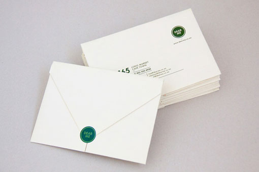
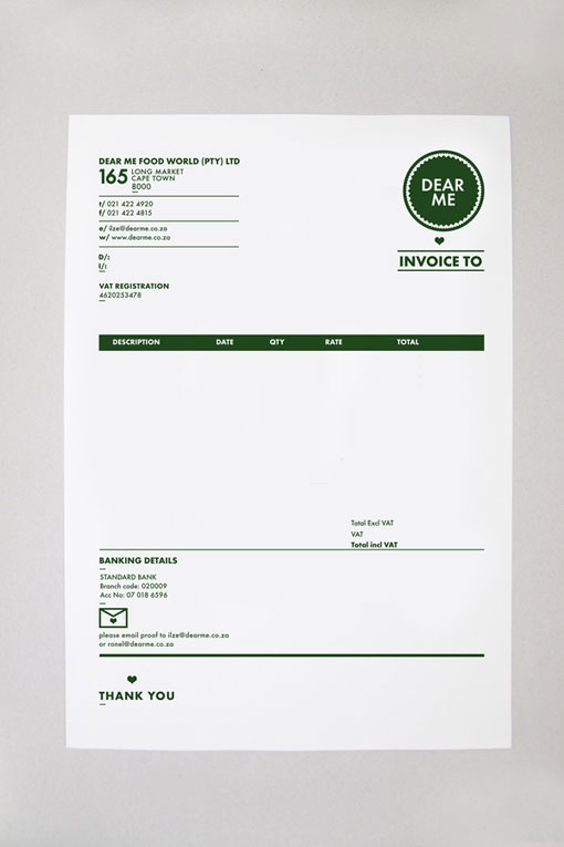
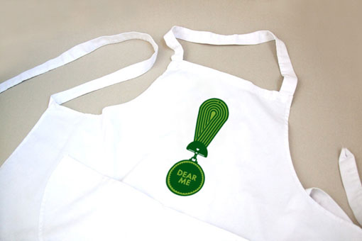


Dear Me Brasserie


Here, you can see how the branding and colour can be portrayed throughout a larger product range. You can also see how the colour interacts with the eating environment, which is something else to consider.  


Nonna Rossa


This Branding I found for Nonna Rossa is very useful for inspiration on stuff to mock up. I didn't think of some things such as the clothing and van. this could help reassure the brand across more platforms and give a more realistic interpretation of how it might function in the real world.


Reuben Hills


Possibly across coffee cups, signage and food products? 


Mutton Quad - Menu / Receipt / Stationary Research

I've been researching a few different ways that I can present my menu. This would be an important aspect of the whole identity of the restaurant and is one of the most important things to look right to get customers to order. I considered different material to print on? antique stock, coloured stock, plastic or even wood and hand painting. I also looked at different binding methods. 

I particularly like the idea of having a clipboard with loose page leaves or using the metal binding technique to bring the whole thing together. 


Clipboard?


Metal Binding?


Stock Consideration?


Wood?


Thinking about how it can transfer to a wall? or interact with the interior in a more distinguished way than just a printed menu that you hold. 


Different Methods - Thinking outside of the box. The possibility of creating something more physical or a different format. This could be a paper bag or something else. 


Cardboard or different Print Methods. Screen printed onto cardboard or unusual stock. Maybe even laser cutting the menu onto wood?


Cinema Style Board - with pins?


Copyright 2010. All rights reserved.

RSS Feed. This blog is proudly powered by Blogger and uses Modern Clix, a theme by Rodrigo Galindez. Modern Clix blogger template by Introblogger.