

Factory Records : The Complete Graphic Album

This is probably my most treasured graphic design book. It is the complete graphic album of Factory Records which is mainly design from legend Peter Saville. I love his style of the design and how different from everything else it was at the height of Factory Records and how different is still is now.
It amazes me how innovative unique and still so contemporary all the old school Factory designs still look in this present day and age. That to me, is what makes an amazing design. The fact that the design can stand head and shoulders above most things still to this day.
I picked out bits of design from this book to look further into and to see where i can take influence from Peter Saville and Factory in y own work...
Pictograms

Simple pictograms are something that are used frequently throughout the work of Saville for Factory. The bold colours and simplified imagery is a good way to get an instant message across through image as oppose to type. Simple but effective.
Type, Colour, Space


Blank Space, Bold Colour and Bold Type is again used effectively consistently throughout Savilles design, especially for Factory. I feel that when trying to grab attention, using lots of colour and bold type are often the most effective way of communication.
Interior / Spacial Design


Something I love about factory is the whole atmosphere and spacial design plays a massive part to how you interact and take in your surroundings. Factory is amazing and innovative in the way the design was all drawn from the idea of making a nightclub and record label based on an industrial 'Factory'. This would be black and yellow stripes, large metal poles and structures, very industrial machine looking interiors.
Pattern / Brand Idenitity

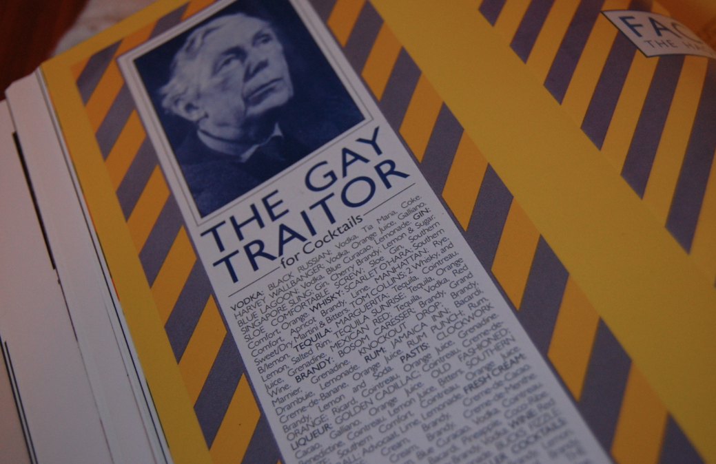

The 'Factory' style industrial brand is brought through into all aspects of design for the Hacienda. As you can see in the images above, this pattern and bold colour scheme is used throughout a range of different designs applied to various different products to bring a real shock value identity to the record label and nightclub.
Juxtaposed Imaagery

I also really appreciate the juxtaposition of really 'old' style imagery both photographic and 'oil-painting-esque' that when placed with these really swiss style hard hitting bold patterns. The effect this gives again is a stark constant that is innovative, especially for the time.


Another thing that made Factory stand out as well as the industrial design, there was also the juxtaposition of imagery of workmen and very much 'Factory' driven aspects. This helped create a buzz around this new thing, nobody really knew quite what to make of it. It's important to shock or intrigue the target audience to achieve effective design.
Record Sleeves


the industrial theme starts to come through with some of the record covers...
I particularly like the bright yellow with the very marbled like pattern on the inside of it. This has been crafted and well though out for effective design.
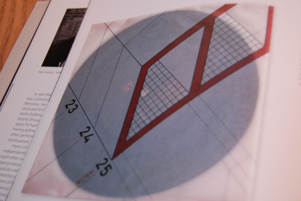
Another favourite is the vinyl cover above for the band 'Section 25'. The industrial theme is carried though and is enhanced with these very architectural like drawings printed onto opaque tracing paper, which enhances the 'plans' idea.
Type & Grid / Experimental


More experimental type within a grid layout. Simple. but amazing results.
Clean Typography

Love this. Very simple serif typeface over the bright yellow colour of the Factory brand.
New Order Vinyl

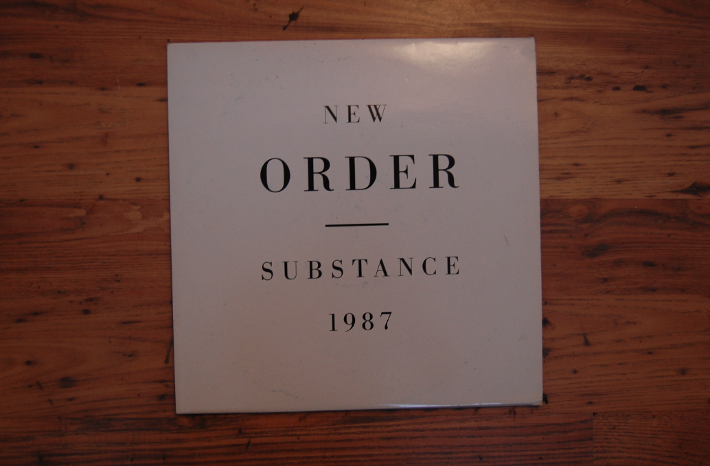
Another one of my prize possessions is an original pressing of the New Order Substance double LP, designed by peter saville. This is just another example of simple communication. Ju

Leave your comment