100 Things // Categorise & Communicate // Native Font

i have been looking at some native american fonts in which i can use on my design. I am still unsure about using a regular font for the titles or to use something more like this. i am even conisdering creating a typeface of my own because i have a few ideas. I may just 


Source // DevRoye


CampGranadaNF


Camp Nawanna

Source // QBN


100 Things // Categorise & Collect // Info-graphic Research

As my information i have collected is based mainly around facts it is hard to find info-graphics that are solely based on this. Most have some sort of graphs, tables and statistics and thats where a lot of the design goes into the way of presenting the percentages and figures. I have found some however that look good and work well with just facts that i could use as influence for my ideas.


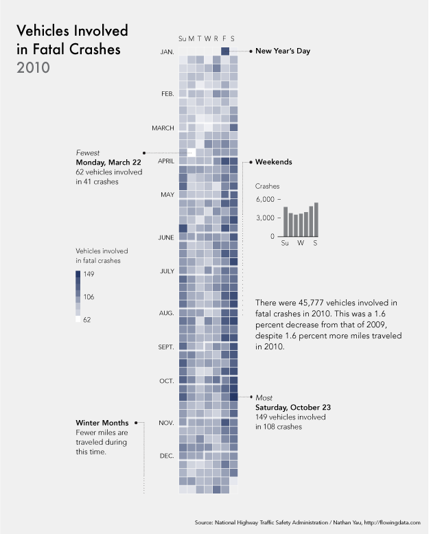
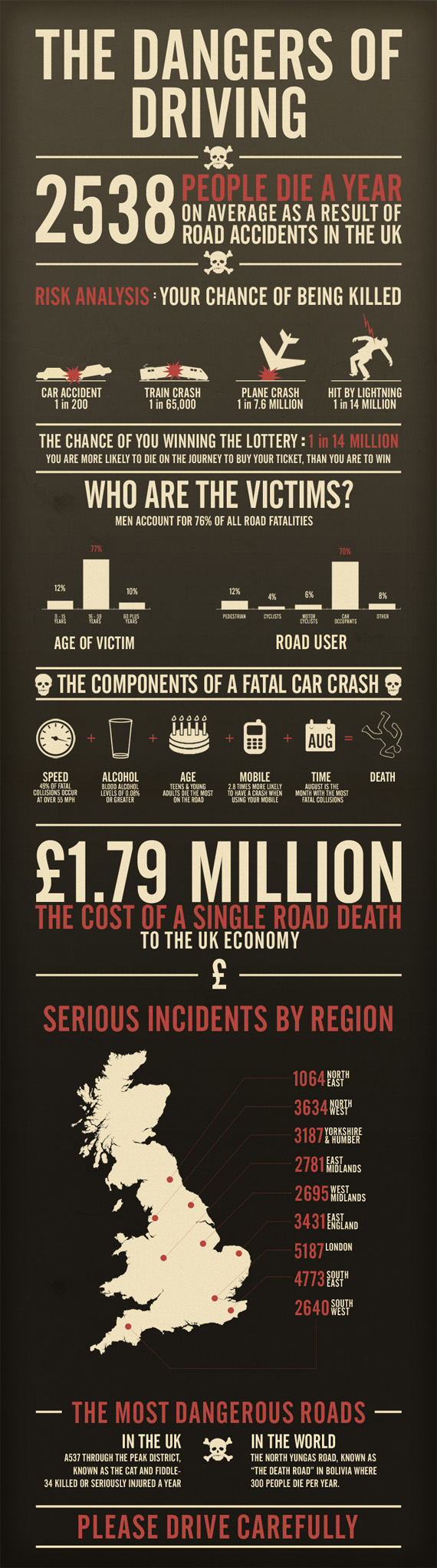
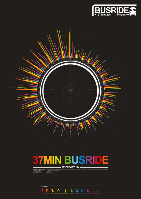
This piece for example. I like the way the colours represent the number of people involved in fatal crashes but then also there is sections coming from this with more information. The ideas of this i could evolve for my totem pole section, place the pole down the middle with the information layed out around it. 


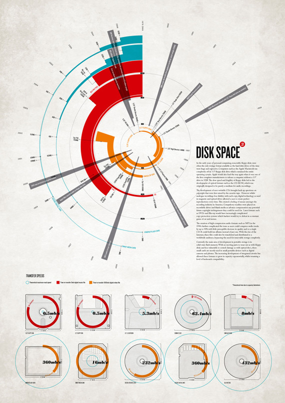
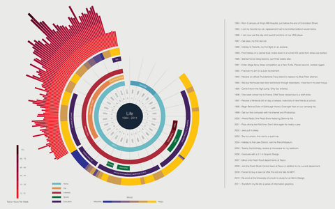
I like the way this info-graphic uses the illustrations to create a timeline of both text and image to help get the information across. This is something i will more than likely be doing as appose to graphs and stats.


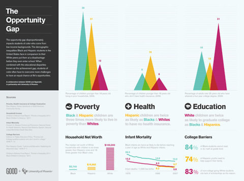
Again in this one, simple pictograms of the different dangers in the house. really like the colour scheme and it all fits together nicely to get the message across. 


Also, a change in colour for the different sections which creates a nice division between pages or segments of this piece. A good idea. 


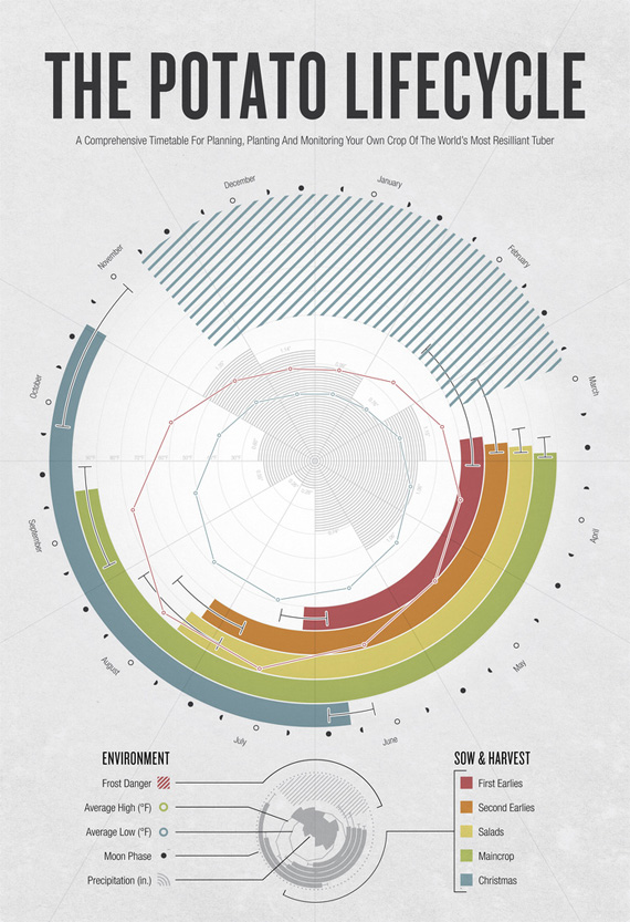
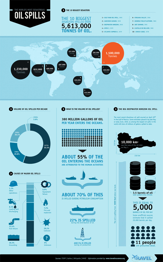
 I like the variation between the simple pictograms and diagrams to the large circles to represent the most serious outbreaks. This is a really successful piece. 


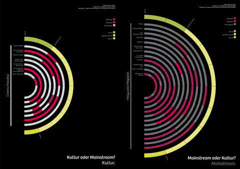
Like the idea of the 3d element bringing all the pieces together. This is something i could look at with the structure and different elements of the totem pole or maybe something else within my designs. 

100 Things // Categorise & Communicate // Info-Graphics

Awesome Info-Graphic Video!


The Value of Data Visualization from Column Five on Vimeo.

100 Things // Categorise & Communicate // Icon Research

I had this idea of keeping the imagery very simple so i could create useful information that is easily understood and kept consistent throughout through the use of pictograms and icons alongside illustrations. This always seems to work well when working with Info-Graphics to help get the information across in the best possible way.

TIM BOELAARS


I really like the work of Tim Boellars. He creates nice corporate,modern logo designs and also has these really neat icons which fit together as a set beautifully...


Logo Design...


Other...


These designs kind of remind me of the totem pole designs. They have very similar qualities...


I also really like the simple pictograms used here. This is something that i would be going for. Simple but classy design that is easy to understand and will sit nicely with the information i will be putting in.


All Work Sourced At // http://timboelaars.nl/

100 Things // Info-Graphic Research

Various Info-Graphics i have been inspired by and collected on my personal blog over a period of time. I will be looking back over these for inspiration in this project...


source // web designer


source // coolinforgraphics


source // ffffound

100 Things // Info-Graphic Research

just some info-graphics i have been looking at to help me get some ideas of how to possibly layout my information into easy and interesting things to look at at and take in...


Info graphic for Turks&Caicos. I think this relates to what i want to do more as instead of statistics an graphs i'l be focusing more on information with consistent icons and imagery fitting with it to help it all flow together. Much like the ones here...


I like how this design below has the image at the top of the wires connecting to each section further down the piece. It's a nice touch!


I don't particularly like this design but it is a good idea using something to connect each section together to create a sort of timeline...


Nice simple consistent pictograms used again here to get the information across. Really like this idea...


This seems to have some relation to what i'm doing. 


Love the General style of this!


Also really like the simple style and colour scheme of these!
 

Copyright 2010. All rights reserved.

RSS Feed. This blog is proudly powered by Blogger and uses Modern Clix, a theme by Rodrigo Galindez. Modern Clix blogger template by Introblogger.