I have seen work done through these guys before so i understand the quality and spec information needed.
I decided to check out their website and have a look around before submitting my work...
Here are the prices and how it works. It seems a little steep to me so i am hoping it will be worth it...
General Design Hints
We often get asked for advice on designing a newspaper and what sort of quality you can expect when printing with us. Below are some hints and tips which should help you to produce excellent results.
To get the best possible looking printed product you should always remember that you are designing artwork for a newspaper, not a magazine, glossy brochure or website.
Newspaper presses are industrial-scale machines designed to operate at very high speeds to allow publishers to produce and distribute large numbers of copies quickly and economically. They are not designed for perfect high-fidelity reproduction or to be able to match Pantones or exact colour mixes. You can achieve very good quality results with newspaper printing but only if you start the artwork design process with the print process in mind.
ext
Text works best if it’s black; colour can be used but it works best if only headings of font size 14 or above are in colour.
White text on coloured backgrounds should be used sparingly and only at font size 14 or above.
Small type (under 12pt, or 14pt if the font is a serif) should always be made up from only one of the inks. ie 100% cyan and not 50% cyan and 50% magenta to avoid registration issues.
Coloured text on coloured backgrounds should be avoided all together.
Blacks
On our Traditional Colour press, blacks should always be 100% K only, whether for text or solids; do not use ‘rich black’.
On our Digital Colour press, you can use rich black to get the most depth of colour out of text or greyscale images.
Colour
If you have large solid blocks of colour bear in mind the ink may rub off on facing pages (and your hands).
If you repeat a standard or corporate colour repeated on every page there will often be noticeable variation, as exact colour matching can’t be guaranteed.
Image quality
Images should be a minimum resolution of 150 DPI.
Photographs work best when they have a clear, strong subject and a lighter background; dark or ‘moody’ pictures will reproduce less well. (We mean moody like a Morrissey album cover not moody as in stolen.)
Blank spaces
If you have a blank page or space opposite heavy pictures or text it is possible that there will be a noticeable ‘ghosting’ impression on the blank area. It is also possible that you will notice ‘show through’ from the other side of the paper.
Paper Sizes
We print on two different presses (digital and traditional), depending on the number of copies and quality you require.
The page sizes for both types are 289mm × 380mm (spread size 578mm x 380mm) including any margins.
Margins
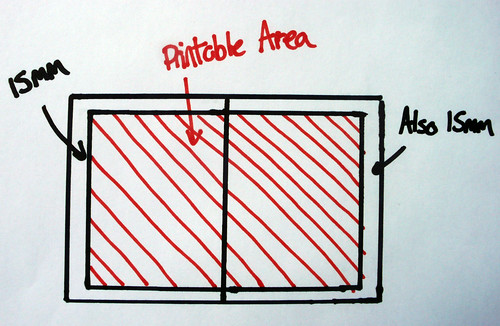
We require 15mm margins around all spreads. Like below. There aren’t any exceptions – we will have to send your newspaper back for adjustment if you spill over those margins. This is because the press grabs the paper at the edges and if you print beyond the margin the press will grab the printed area and make a right old mess.
You can also print across the central spine.
I will make sure my InDesign document is set up correctly to match these proportions precisely before I go on to send my final design off.


Leave your comment