Imagery

I started by creating distorted images using my chosen colour scheme along with patterns and textures as well as mainly Facebook screenshots I generated then further manipulated. I juxtaposed imagery in order to create a distorted vision which would enhance the users experience when interacting with the publication itself. I wanted to create the sense of being brainwashed which is what again relates directly to the subject.

I took a similar approach when creating the heading page for 'This Rise of Social Media' section of the book which will look at how Social Media websites such as Facebook have grown into the biggest institutions in the world. Again using the two colours really creates dramatic contrast whilst also giving the book a clear identity and referring to the original colours scheme which was drawn from Facebook. I used different numbered images scattered around the page which relates to each topic raised in that section.


I wanted to use nostalgic imagery such as the very vintage computer here, which will be printed A2. I wanted this to try and emphasise how much the world has changed since the invention of computers and the internet, and it's only been just over 10 years. I thought I would do this by trying to get people to remember life before Facebook or even the internet and using very nostalgic imagery throughout might be a subtle way of doing this. The image has been half toned and will be printed large scale.


More distorted imagery, this time juxtaposing nostalgic imagery with modern technology. These pieces are meant to look sort of like a computer virus which in turn will unsettle the user of the publication slightly. It will also be quite confusing for them which again relates directly to my original concept. As this will be placed at the back of the publication, I added the pop up which lets people know that they haven't checked their Facebook in over an hour, so they must return immediately. This is a final idea that will hopefully get people to realise how much they spend social networking.
I think by juxtaposing the vintage interface design with the modern mac window displays, it not only reassures the effect of creating a computer in printed form but also merges the two styles to see how far we have come since then.

incorporating 90's style when computers and the internet had just taken off and people was starting to get access to to this in their own houses. Pamela Anderson is a massive image of the 90's and things happening around this time.
Facebook Profile


I used the design styles of the Facebook Profile to help emphasise certain sections of my publication. Again, this reassured my idea of creating the internet in printed form and although it was the most obvious way to depict, it also seemed to be the most effective for the purpose.
I used exact typefaces and imagery that would be found on the website along with the layout to create my very own version of the website. I then replaced various sections with bits of text or imagery that relating to the content of the book.
Quotes

Various quotes are used throughout the publication at intervals. I used different techniques to help make them stand out. This one I have highlighted certain areas in a rough way to appear like it has been done with a british through the serif typeface. This helps emphasise certain areas of the text but also adds a sense of unjust as it emphasises what is happening with social media.

A slightly more serious topic is simple emphasised by created a box for the type to sit on. This section will be printed on acetate, so the bold red blocks will be effective when placed over the separate pages behind it.

Again this is to try and through the reader off. It appears to be some sort of coding but is really just brail printed over the top of the text. Nether the less, it distorts the type, making it harder to read, but all for good reason, relating to the topics raised about concentration and how the brain read information online.
Bodycopy

With the body copy, I wanted to create sections of type that would stand out against the very confused layout. I figured that the most effective way of doing this might to create 'windows' or 'pop-ups' that you might get on a computer screen. I created these myself like the one above, simple lines to appear like an older version of a pop up window.

I also took influence from more modern day pop up windows. This is a version of a macbook window which I have re-designed to help fit my text. I included buttons that relate to the piece of text. A yes or no question is asked and the buttons are their for the user to make the decision based on information they've just read.


I created various other ways of placing body copy as I wanted the style to be a very eclectic mix. This type here has been placed in a version of a Facebook Timeline, with different boxes containing the different paragraphs. This is again a direct reference to Facebook.

Infographics


Here are some original inforgraphics that I come up with sticking with the red and blue colour scheme along with basic shapes and graphs to help keep the information clear and easy to digest. I wanted the graphics to be very simple and easy to understand, which is a bit of a contrast to other elements within my book.
Percentage Statistics


Again, these simple bar graphs create structure within the publication. They are nothing too fancy, but I wanted the look of these inforgraphics in particular to be like they would appear in some sort of case report. Quite professionally and simply presented whilst also sticking to the theme of my book to some extent.
Senior Facebook Members Graph

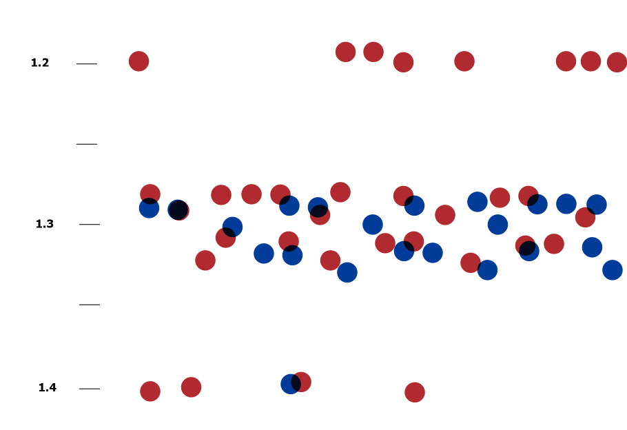
As mentioned in one of the crits for this project, I decided to throughout the book, focus on the older generation who are getting sucked into the social media phenomenon as well as the younger members. For this reason, I decided to use facts and figures on senior members which I found online and transform these into visual information.
I used dots on a basic graph to represent percentages or amount of people who use the website. The key is found at the bottom and linked to the number sections so you can decipher the information this way.

Leave your comment