Task
Packaging and brand identity refresh to visually strengthen the brand architecture creating ownable equities.
Scope
Brand strategy, identity design, graphic design.
Solution
A refined identity with a color coded, embossed pill shape to make the overall brand architecture visually stronger, giving better stand-out. Nathan Frank, Founder of Help Remedies comments, “our packaging is our most important piece of communication. Pearlfisher has done a great job in enhancing our identity so that it communicates everything we have to say without having to spell it out, literally.” Winner of American Packaging Design Award.
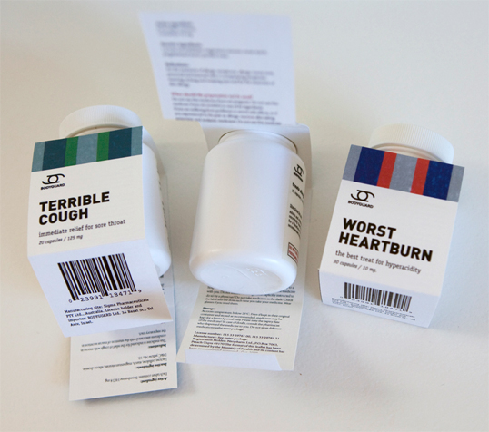
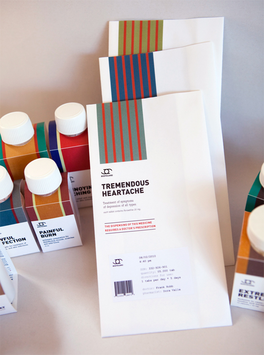
Bodyguard Medicine
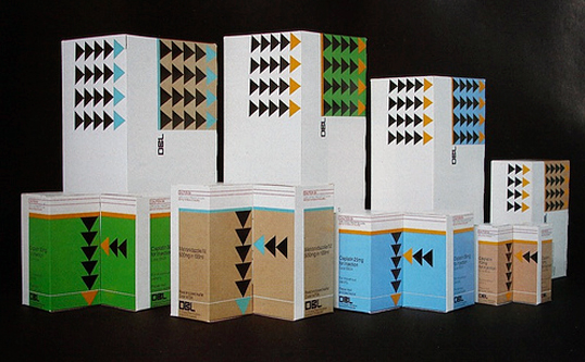
Vintage Packaging
Vintage medicine packaging from the 1960s-1980s, most of which originate from the (out of print) 1984 publication Graphis Packaging 4.
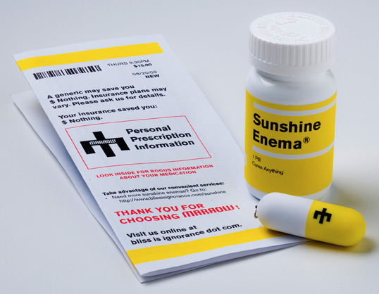
Sunshine Enema
“The face of Marrow is three people. But behind the scenes there are about twenty of us with a strong background in branding and design from all disciplines – from naming and writing, to print and packaging, to interactive and animation (not to mention music production, which is really what this is all about!)
We realized that it was essential for us to bring the same kind of inspiration to the branding of our own work as we would expect ourselves to deliver to any of our clients. Our first CD, ‘Quiet Desperation’, was beautifully designed, but it was still just a CD – and CD’s aren’t enough anymore. Thinking outside of the CD case was liberating.
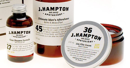
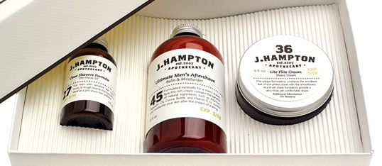
J.Hampton Apothecary
Designed by Jim Hargreaves
“I developed the J.Hampton Apothecary packaging and brand as a high-end line of mens shaving products. Inspired by the industrail era and the days of apothecaries and patent medicine, the design expresses a sense of tradition and genuine quality – the perfect fit for todays discerning gentleman,”
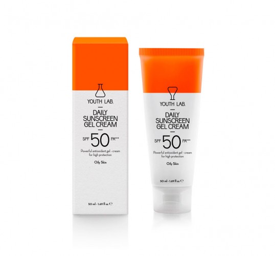
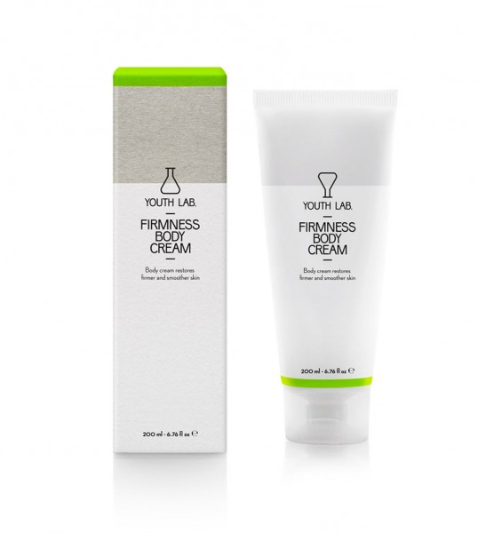
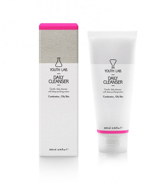
Τhe brief: we want our high quality products to become the preferred choice for beauty concious women.
Τhe target audience: women who are well informed and prefer not to spend on highly advertised products.
The design: what we needed to convey through the identity and packaging design of this range of products was trust and intimacy. It targets women within the very environment of beauty care and we decided to make this environment part of the design concept. Youth Lab is, by language and symbol choice, a straightforward reference to a personal laboratory, a place where each individual is treated specially and with the proper, tested materials. The retro futuristic character of the lab tube and the thin, elongated type font speaks of scientific seriousness, while the choice of fluorescent colors on rough carton paper, suggests calculated boldness and personality. The result is a product that is familiar but not boring, trustworthy but also linked with research and experimentation.”
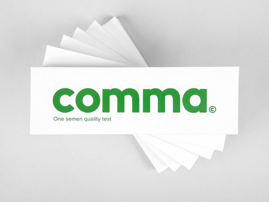
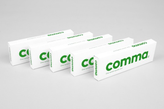
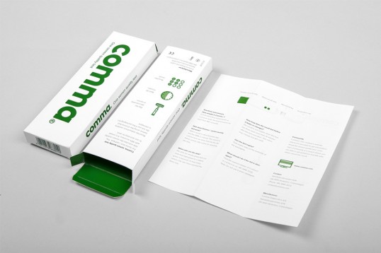
Comma - Semen Quality Test
“A small entrepreneurial company from Denmark is currently preparing to launch a new innovative mens product, a semen quality test for home use which indicates the semen mobility with 98 % accuracy! The appearance and use of the product is similar to a pregnancy test.
We went after a minimalist no-bullshit package design, which gives the consumer nothing but the relevant. Furthermore will the package design be a necessary part of the advertising concept.”
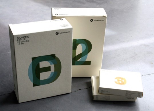
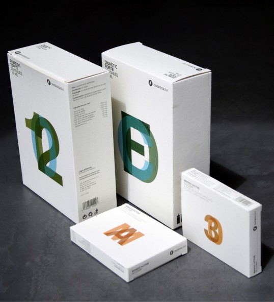
Botanicadiet
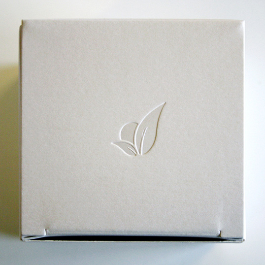
Packaging design for natural dietetic line Botanicadiet, from Botanicanutrients brand.
A simple and elegant design, where information, overprint details and the paper used (Antique Vellum Ivory, from Torrspapel brand) determine the final outcome.
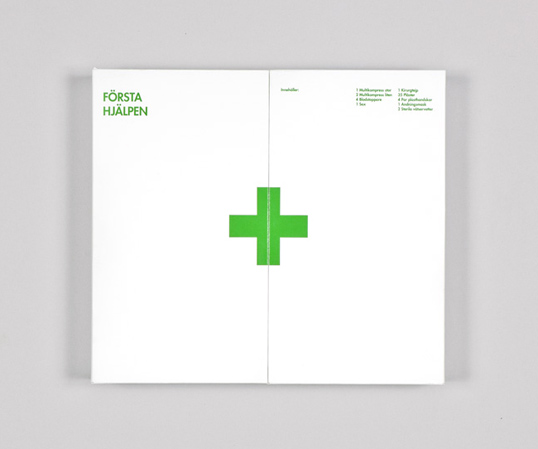
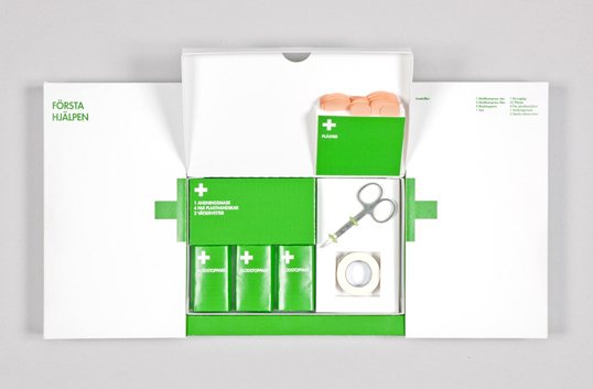
First Aid Kit
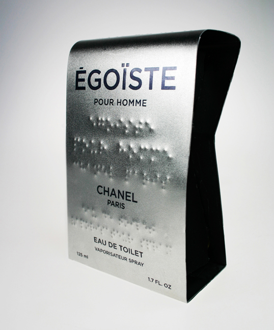
Egoiste (brail emboss)
A package design assignment to make a package for the perfume Ègoiste by Chanel.
The package was to be informative, available and appealing to blind (with braille text), visually impaired and people with regular eye sight.
The package is made out of steal to underline the masculinity and sophistication. The design itself is meant to be clean, and the braille text, along with being inclusive to blind, works as a decorative element in the design.
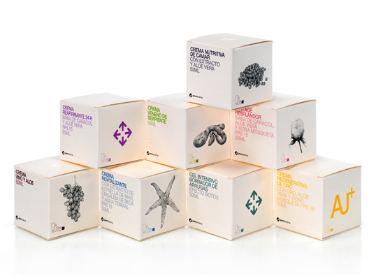
Greenpharma
Packaging design for natural cosmetic line Greenpharma, from Botanicanutrients brand.
A simple and elegant work, where information and ornamental details determine the final outcome. Examples are the illustrations, the text in bold colors, blind embossed or the paper used (Curious Metallics, from Arjowiggings brand).
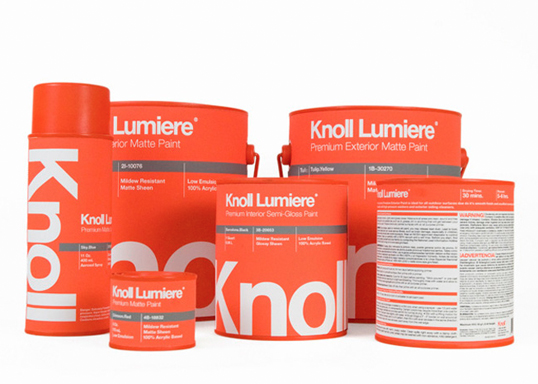
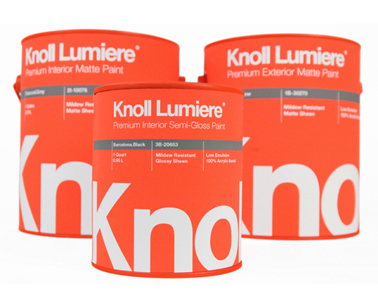
Knoll Lumiere Paint
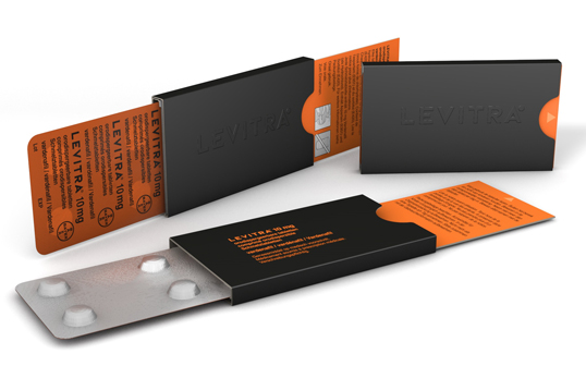
Levitra
“Thomas Proske, Global Brand manager for Levitra® at Bayer Healthcare says: “We chose the Burgopak design for our new Levitra formulation because it’s pocket-friendly, discreet and gives the product a playful edge over its competitors. While it is patient safe and compliant, it also looks stylish and will appeal to our customers.”
With its packaging for Levitra® 10 mg ODT, Burgopak continues to strengthen its presence in the pharmaceutical industry
Tim Clarke, CEO of Burgopak Healthcare & Technology says: “The innovative packaging design adds significant value to the brand as it’s slick, unique, and appealing to consumers, while supporting patient safety and compliance. In a highly competitive market, it offers differentiation and we’re delighted to continue working with Bayer.”



Leave your comment