We also felt that the unusual approach and packaging for this would be a great response to the brief, as the company are asking for something a little different, creative and outside of the box.
We initially started researching into medicine packaging, as well as standard perfume packaging to see where we can merge the two;-
Alchimia


This is the first related project that I came across, and is really succesful. you can see a lot of money has been spent in building up the full idenity. Getting the right products and casing for the product. I feel that this is an important aspect to consider when creating our product. it needs to photograph well and create a larger identity, through props and packaging.
Side effects - OTC drugs packaging


This is on the opposite side from the 'ancient' alchemy theme. It is much more medical and clean cut. This is packaging for medicine. Paracetamol and such, but we had ideas of applying this aesthetic towards perfume in a innovative way. The Brief is asking for something a little bit different so we feel by linking the medical aspect of hormones and brain chemicals to the perfumes. I like the simplicity of this design. Very clean cut with little aspects of colours introduce to separate products.
Medicine packaging
Cariprazin/Curiosin/Vitalio Occulo Plus


This is one of my favourite pieces of branding for medicine that I have come across. A little bit more colour introduced here and a really nice concept of using the pattern and gradients to symbolise the illness leaving your body to full health with the bright white. Again, the packaging is quite simple, black on white with hints of colour. Seems to be a successful approach.
RoAndCordials


This is another favourite project of mine I found through behance. This is actually the branding and identity for a design studio, packaged and sent of in a very different way. It sort of resembles medicine again but I like the structure of this one in particulr. The use of the grid lines works well to break up the different elements in the design.
Medicine Packaging


Another medicine packaging I have found here. I particularly like the bottle shape of these one. We are going to send off for some bottles online, so it's a good idea to research into different bottle shapes, colours, sizes, etc. I also like the colours used to separate the different products.
Mood Lab


Moodlab is a similar concept to the brief that we have been given. The scents are meant to change your mood. I particularly like the use of the droppers with the bottles. This brings the 'medical' side across which is what we want to push further. Juxtaposing the perfume and mood concepts.
Others
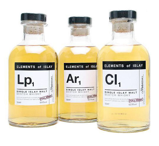
Whiskey Packaging 'Elements of Islay'. Uaing the Periodic Table style of design. Very clean cut. works.

Vintage Medicinal Packaging - 1970's. I really like this, one of my favourite designs I've come across. Using very bold clean lines and shapes with equally as bold colours. An interesting approach that stands out and instantly looks intriguing and almost dangerous, relating to the hazardous signage.

Use of Statistics & Colour Coding? Possibility within the information that we are gathering about each hormone.

The Inner Body - Perfume based on Body Parts. This is a clever idea but I don't really like the final result of how it has come out.

Sources in a Restaurant - with a Medicinal Feel. This is again applying a similar medical aesthetic to a range of food sauces. Unique and creates a set of imagery.

Lierac Prescription, Paris - The Dieline - PIPET!

More Pipets and Strange Bottles!


United Colours of Benetton - Sex Perfumes. Bursts of colour work well in these.
Materials / Products
Since we didn't have too long on the project, we needed to order some thing to help our ideas turn into reality.
We decided to go with the medical theme and ordered some 50ml bottles for the perfume to be housed in. These come with a dropper which will be a very interesting and unique way of applying the perfume.

We also ordered some 2ml syringes. These will be used in store as testers as a quirky little addition. We can also use these in our product photography set up to build up and identity.

We also bought some white medical gloves which we can use as part of the photography and promotion of the item. Our idea was to have a metal medical tray with some medical equipment around the fragrance. This would be held by a man in white gloves and white shirt and would be a interesting way of photographing the product.


Leave your comment