I decided that I wanted to use some bright neon colours within my work to help the festival stand out and to give it a solid identity through the use of two consistent colours. I chose pink (this isn't set in stone) because it's something a little bit different to the norm which will keep it fresh. It's easy to match the colour along a range of products, because neon pink is often one set colours. Pink and black also represents some old punk scenes in Britain, which much like the 'mod' logo, is influential across a lot of British Independent Film.
Posters / Publications


Also looking at how the illumines pink can transfer across web and print. Websites look aesthetically pleasing when the black white and pink is used.


Looking at how pink and black can be used across printed material and publications. A Spot colour can be used to make the ink really pop. Screen print methods can also be used as well as using flourescent pink as the stock, and printing black on top of this.


Using paper craft to enhance the promotion of the festival on a smaller and inexpensive scale. A combination of neon pink and black is used strongly here.
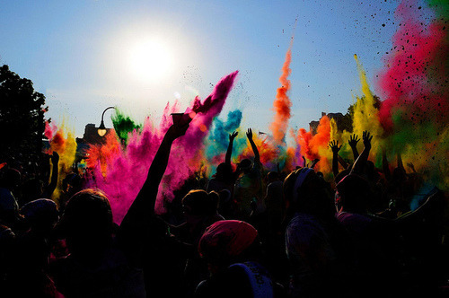
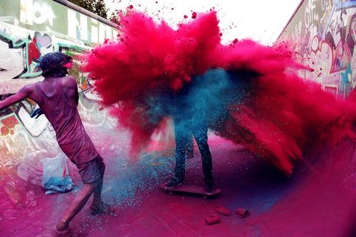
Paint Party
paint party to promote the festival? Starting to think outside the box a little bit, emphasising the identity of the festival and promoting it through unusual events that are something a little bit different which would leave a lasting impression.


Interior/Exterior
Starting to collect imagery that could be representative on the interior and exteriors of the exhibition. I want the colour to become and integral part of the identity, so this would work if taken to the complete extremes.


Using a projector and neon tape to create the 3D wall murals as an installation, but also part of the exhibition/festival.


Richard Mosse
I was really impressed by Richard Mosse's 'Infra' series of photographs that I came across. He shoots using Infra-Red film to create these vibrant pink sections within imagery. The photographs were set in
North Kivu, Eastern Congo, 2011. I invision the festival to be this bright on a smaller scale but made in real life. This is something that would be on a large scale which is probably impossible to recreate in a studio environment, but the idea is there.
I could propose this through digital mock-ups and research.


Products
I looked in to some products that might relate to my chosen theme that I could think about purchasing. I can use neon pink stock to print with, paint and UV Paint for 'glow in the dark effects' , tape to crate the 3D mural...

Floursent Gaffa Tape. This can be used to create the wall mural as well as display purposes.

Lanyard. Can be used for entry and ID cards to the festival.

Pink Fluorescent stock can be used to print onto for promotion.

Glow in the Dark Paint
Glow in the Dark and Fluorescent Spray Paint and Screen Printing Ink.

Neon Pink.

Fluorescent Pink (Glow in the Dark)

Glow in the Dark Screenprint Paint

This is a great post it shows some information and best advice I needs for a blog. Thanks and keep on posting. Please visit http://goo.gl/CLOnZN
Leave your comment