

Swiss Design in Packaging
Geigy
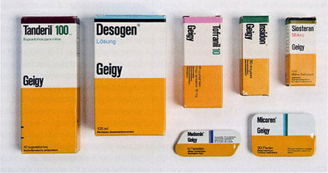
The design studio at Geigy was crucial for the development and, subsequently, for the international reception of Swiss Style in graphic design,’ explains Janser. ‘Geigy’s typography was as playful as it was controlled, and its design department was known for its use of scarce but strong visual elements, as well as bold colours – unsurprisingly, given that colours, in the form of fabric dyes, were some of Geigy’s most important products.’ Geigy’s packaging, produced in the late 1950s, also broke new ground: ‘It promoted the company brand instead of the product brand, which was a revolutionary step at the time.’


BoraBora is a design concept for a sunlight pill by Quentin Vaulot and Goliath Dyèvre of French design duoVaulot&Dyèvre. The concept was part of the Miniflux exhibition by Gallery Tator for the 2011 Lyon Festival of Lights.

"Moodiness, flaccid skin, looking dull, tendency to depression! You are obviously in lack of sunshine. Our range of supplements Kelvin Lumen restores the vitality you need. Sunset Laboratories offers a wide range of solar radiation, Borabora, the Maldives, Haiti and the Bahamas, ask your pharmacist. Read the instructions carefully. Do not exceed the recommended daily dose. This additional Solar should not totally replace natural exposure. Avoid abusive use."
How cool would it be if these pills actually worked!?

Use of gridded lines to divide up the information.

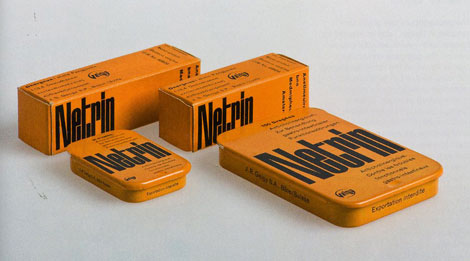
Unusual Packaging, using bold colours and sans serif typefaces.
Bold sections of colour to split up the information.
Possibly using imagery of medical implements? This could work well to get the point across.
Highlighting areas of the body to which the 'medicine' is perscribed for. Using clean lines and bold colours.
Close ups of certain bone and joints. Creating quite abstract bold shapes that are still recognisable to the body part. This could be good playing around with chemical make ups and linking this to shapes.
Again, another good use of medical imagery. This time, the image almost looks like a photogram, a nice effect.
Bold sections of colour with sans serif typefaces is what Geigy are most well known for. This is so simple but so effective.
Also looking at some of the designs printed onto the pills, this is something that we could look into for the 'prefume pills'. Interesting to see which typefaces are used and also the name of the company 'Geigy' with the strength of the pill printed on there too.
Ikea Packaging
I also decided to look at Swedish company Ikea, as i'm a massive fan of how they promote and package their products. The design is very much swiss minimalist and is applied across a wide range of product packaging successfully.
Inkjet Paper, Just a simple circle which is colour coded for the different weights.
food packaging. The bold colour on white theme is continued throughout their food packaging. The clean lines of the illustrations make it easy to see what the product is straight away, without even having to read it.
cheese. Thinking outside the box using the cheesgrater as the symbol. clean illustration.
sardines. This is a really innovative idea. Thinking about how the packaging can be part of the illustration used to promote. great idea.

labels
pasta. This is black print on clear plastic, letting the content of the packet do the talking.
The Sunlight Pill
BoraBora is a design concept for a sunlight pill by Quentin Vaulot and Goliath Dyèvre of French design duoVaulot&Dyèvre. The concept was part of the Miniflux exhibition by Gallery Tator for the 2011 Lyon Festival of Lights.
"Moodiness, flaccid skin, looking dull, tendency to depression! You are obviously in lack of sunshine. Our range of supplements Kelvin Lumen restores the vitality you need. Sunset Laboratories offers a wide range of solar radiation, Borabora, the Maldives, Haiti and the Bahamas, ask your pharmacist. Read the instructions carefully. Do not exceed the recommended daily dose. This additional Solar should not totally replace natural exposure. Avoid abusive use."
How cool would it be if these pills actually worked!?

Great post I loved it I now know much more about eventbrite! Very well written keep up the good work. Please visit http://goo.gl/fndyLv
This blog resolved all my queries I had in my mind. Really helpful and supportive subject matter written in all the points. Hard to find such kind of blogs as descriptive and accountable to your doubts.Catering supplies
This is not obligatory that you select out high-quality a constrained vicinity like college or college or your location to make bigger your writing artwork. You need to go browsing to spread your competencies to loads of latest parents which can be genuinely in need of such type of potential. Enamel Signs
I have become happy to have a look at this newsletter after searching at google, after reading I have written a chunk of the article about dr. ryan shephard : Thank you for the thing and supporting me.
Food and Nutrition
Remedies
Skin Care
Hair Care
Eye Care
Thanks for sharing this article with us. Packaging Industry in India
Leave your comment