____Glasfurd & Walker
____Meat & Bread


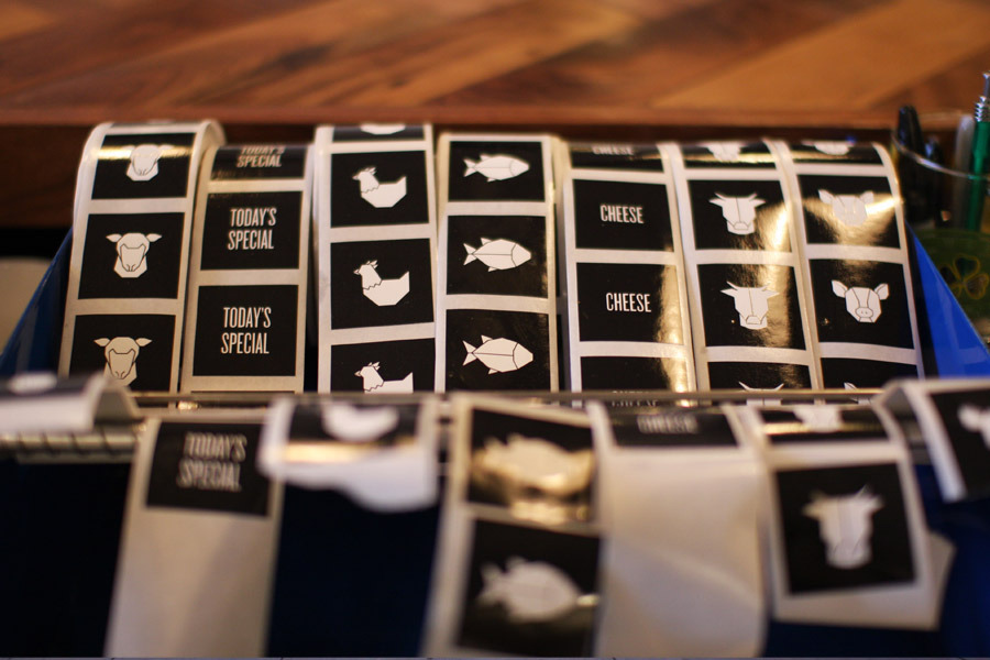
Clean branding using a limited colour palette, in this case, white and black. This works as a negative, for example printed black onto white for the packaging, and white onto black for the window signage.
_____Beta 5

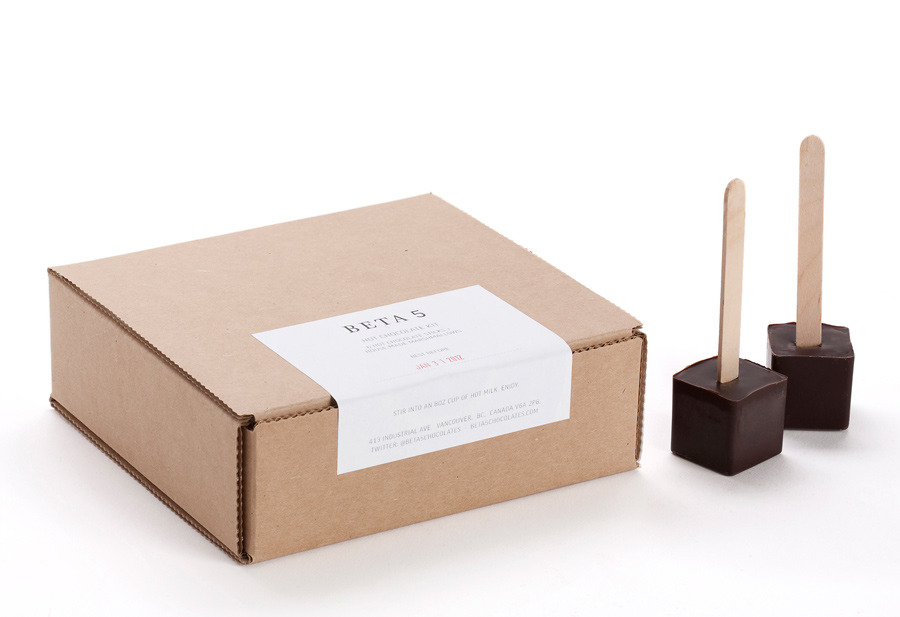
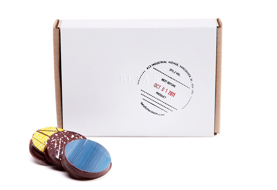
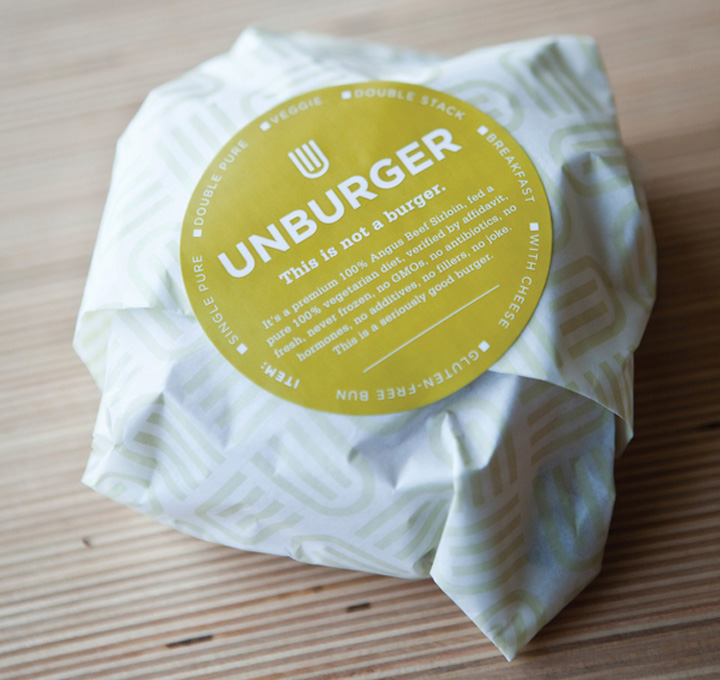
One of my favourite branded piece of packaging which I came across recently. I love the idea of applying stickers to packaging and also using a stamp to brand the products.
_____L'abattoir


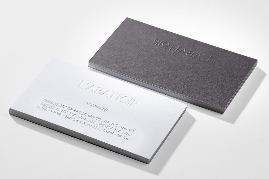


L'abotoire Branding is clean and proffesional. Gives the Restaurant a high class look in my opinion. I like the binding technique used for the menu's and also the other processes such as embossing on the stationary. Gives the brand an extra added touch of class which is something that could possibly make my product range pop.
____OAT Creative
____Saloon Bar


____Island Creek


____Fletchers BBQ


Oat Creative's Branding is probably the best iv'e seen around. I love how the product range interacts with each other seamlessly to work as a set and I also love the design style. The branding in this case really makes the restaurants appealing which is something that's important to consider. The use of colour accents, stock and print processes combined with the relationship between printed products and web really works well.
____Starlight Lounge


____Design Ranch
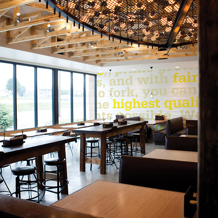
_____UN
_____Foreign Policy Design Group
_____Table No. 1


Your Information is so informative.
Restaurant Branding
Leave your comment