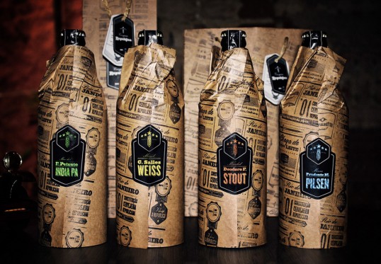
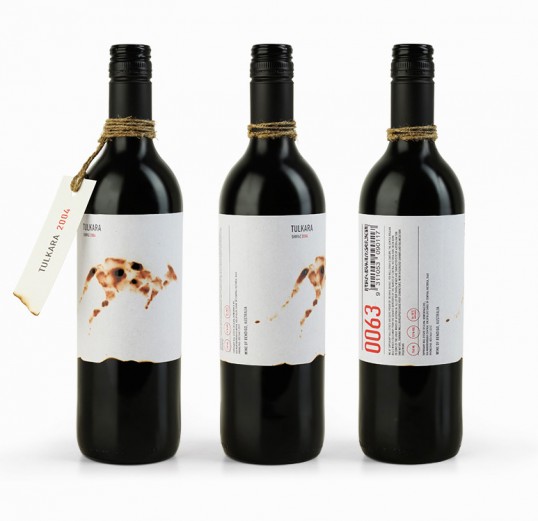
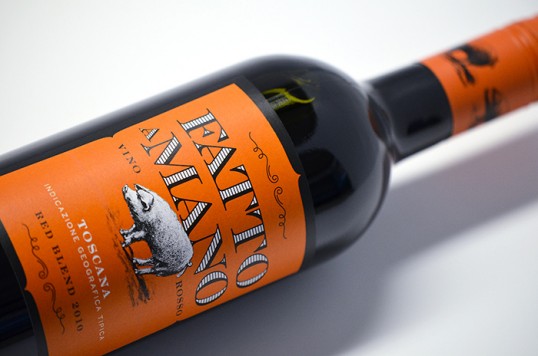
I started this project with collecting initial visual research to help get the creative juices flowing. These are mainly what i have collected over a period of time through my pinterest. I took influence form a couple of these designs in particular and have written underneath why...


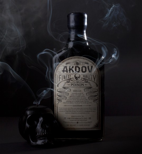
I particularly like the use of old english style black-letter type. I think the use of this with the name of the beer 'Hellfire' might play more on the ancient theme that I will be going for and could create an authentic visual.


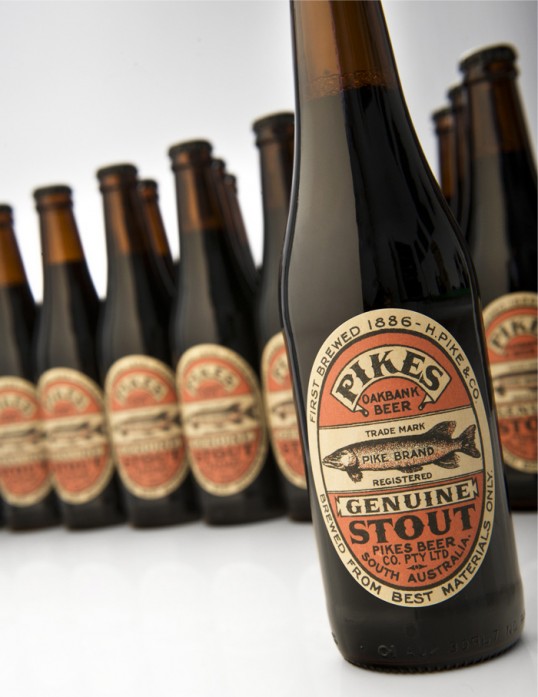
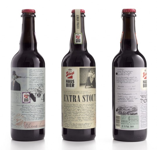
I really like this vintage design for Pacific Lager. Its so simple but works much better than most beer labels today. Something to consider, simplicity is key, especially when designing a beer label for creatives.

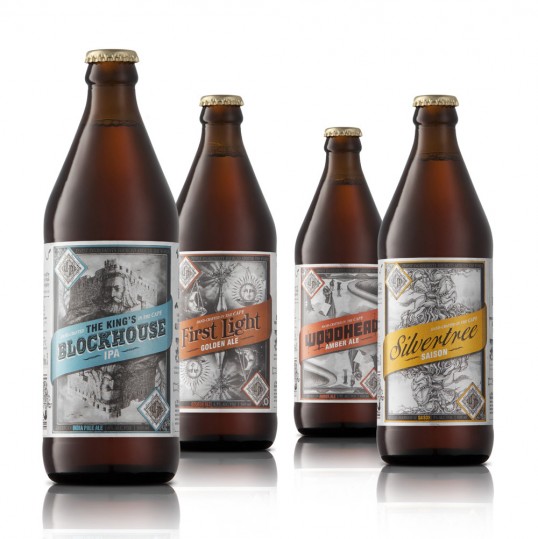
Again, these vintage looking typefaces work well when it comes to branding alcohol.

Creating a contemporary beer label based on traditional layouts and styles, with a modern twist. In this case, it really works.

Again, very simple, but effective. This would probably stand out to me above cluttered labels next to it on a shelf.

Another vintage can of ale that I found. Good use of blackletter type again, I'm really liking the look of this to represent traditions.

Laurel Wreath is really nice boarder for the type in this instance.

Notice the little hand holding the mood at the bottom of this label. i really like this and something like that would relate to my initial concepts for 'Hellfire'.

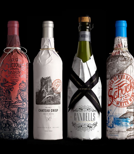
I also like the idea of maybe including imagery overlaid over type.

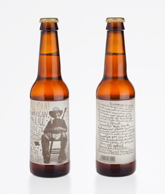
Hand drawn type is also something that works well on contemporary alcohol packaging.
Love the type on this one, something which might fit in with my witchcraft and alchemic themes.
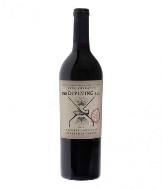
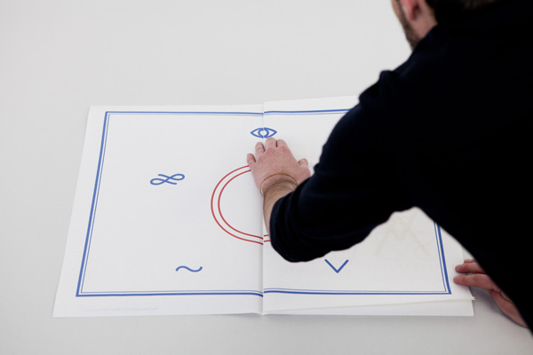
Really like the hand here with the eye in the middle. Could be attractive to a contemporary creative audience if used in the correct context.
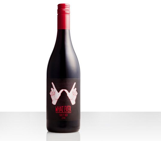
Again, good use of hands here. I like the idea of somehow incorporating a hand into the design.
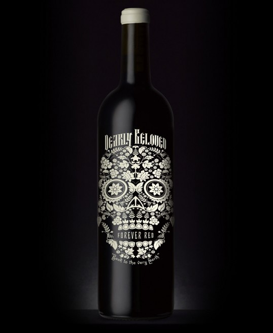
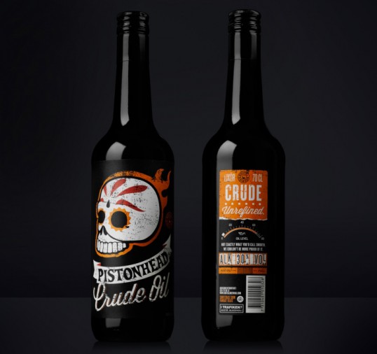
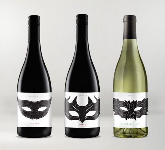
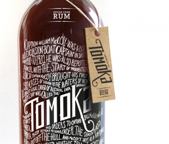
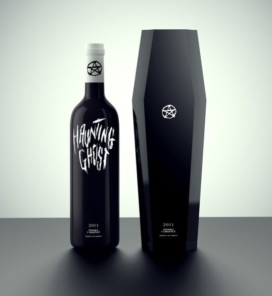
Illustrative designs look nice printed white onto black. Classy, and contemporary.