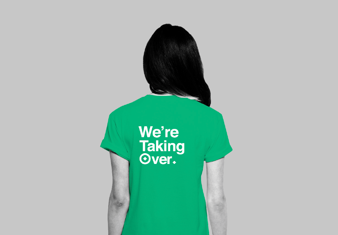
I've been mocking up some uniforms for both official purposes and also for the public. Uniform is important because it helps give the Greenpeace organisation a visual sense of power, especially at all events, giving a sense of power in numbers.
Public Uniform
The public uniform is casual enough for them to want to wear on a daily business in order to promote the brand, but also powerful enough when in groups to work as a brand on the whole. The green colour of the brand will be prominent especially in numbers, as will the primarily logo. The slogan on the back will help tie in the logo with the copy and is also straight to the point and forceful.
Official Uniform
The Official Uniform uses the same basic principles as the general t-shirt for the masses. The Primary Logo is a strong visual and the main colour of green is applied through the jacket. The official uniform will also give a dominant appearance. The padded trousers and boots will give the appearance that the member are always fully equipped for any problems. This emphasises the strength and dominance of the brand, whilst also giving the impression that the group members are safe under the guard of the working force.
Armband / Rank Badges
The Armband is reminiscent of Nazi Germany, but is in fact a complete reversal. The Armband is a symbolic way of showing your dedication to the cause, whilst keeping a strictly official look to the carefully controlled charitable company. The Rank Badges are a way that the masses can interact with the movement, and progress to the top in a series of activist related involvements.
Sea of Green
This image shows a representation of how the groups of people will create a 'sea of green' and powerful presence.


Leave your comment