
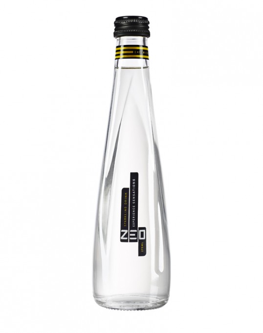
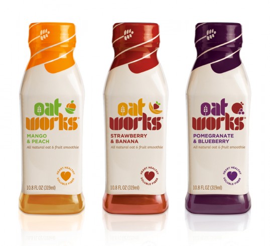
Really nice clear white bottles.

I like th idea in the packaging here. Cutting out shapes to reveal parts of the bottle inside and also relate to the logo.


Simple, but effective.

Really good way of creating a consistent set that is clear, stands out on a shelf whilst also being very design led and aesthetically pleasing.


I also like masked bottles where you can't see the contents or creating elements that show shapes cut out with the contents.

Illustrative imagery could work to help get the message across.


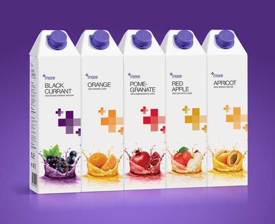
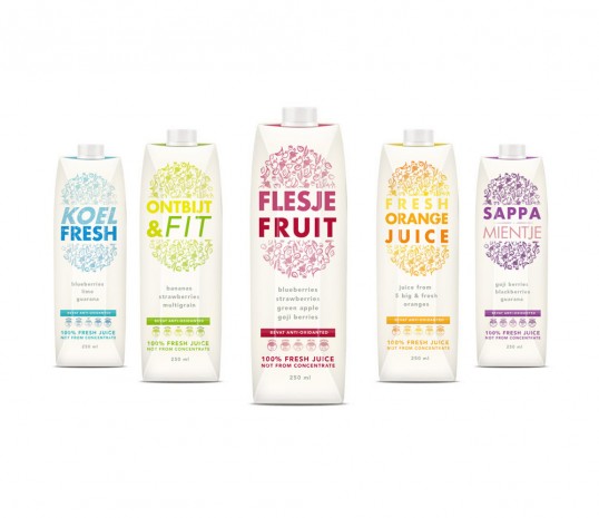
Again, great set of products with innovative packaging. Making the cartons look like segments of fruit.

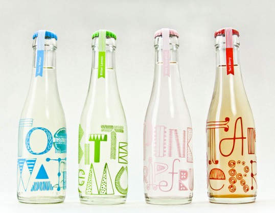
I like the idea of using bold typography to create consistent sets through a range of products.

Very innovative design here making the packaging look like the fruit used in the contents of the drink. The silicone packaging looks and feels like a strawberry. Very clever but also not relevant to my brief. Good inspiration though.

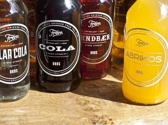
Nice use of type.

Here, the cartons allign side by side to reveal a full image with text. Again, this is an idea that could be used across a range of products on a shelf to make the drink stand out to customers.


Again, simple use of colour indicating flavours on a transparent sticker. Works really well across a range of products.

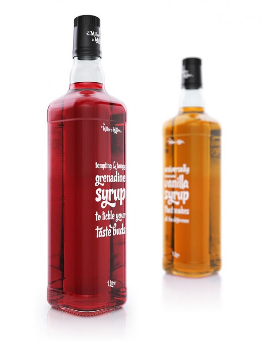
Again use of type prominent in this one. Personally think this is a little too overpowering for what I want so not really of any help.

Illustrative? Possiblity.

i also like the idea of statements used to promote a product. I Particularly like in here 'Wipe that smile off your face'. Its a good way to be more personal with the customer through packaging and helps get attention which is important particularly for feel good.


Really clever idea of having bits hidden within the drink that appear when more of the drink disappears to reveal a message. A possible idea that could be translated with feel good to reveal a message to make the user 'feel good'.

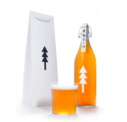
Again, simple bottle showing lots of the contents inside. I like this idea and its probably the route i will take when designing the feel good bottle. Minimal shapes and logos with emphasis on colour of drink inside.
Simple, but effective use of shapes and logo on the clear bottle.
I don't really like the packaging of this, but the plus symbols that alter in colour to represent the different flavours is a great touch. I need to come up with an idea that can translate different flavours in a simple but effective way.
I like the idea of keeping it simple to follow the simple morals of the company. I particularly like the idea of keeping a clear bottle with white ink printed over the top. This way, the colourful juice inside will be the underlying factor that makes the product stand out. I want the natural ingredients to be emphasised and the branding to be sleek, professional but still fun to relate to a broader target audience.

Leave your comment