The Hummer Brand definetely fits with the logo. The typeface is bold and heavy, almost condensed which obvioulsy is a direct link to the sheer size and weight of the car it is representing. The Kerning is perfect because the letters are so bold that they fit together with equal space in between with no upsets. The type also looks quite squashed down which again relates to the qualities of the car.
I decided to look at the Ikea logo because it's quite strange when it comes to the typeface used. I haven't really noticed before but the type is really bold and heavy, much like the hummer logo. However, I don't think this suits the brand at all. I think Ikea is all about minimalist sleek Scandinavian design where as the logo doesn't say this to me at all. The colours work to catch your eye but blue and yellow are fairly garish when put together like this.
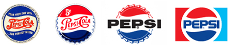

The Pepsi re-brand is also another weird logo. In a way, I quite like it. It brings the brand into the 21st century using very rounded exaggerated san serif letters and the curve of the original logo being presented in the lower case 'e'. The kerning looks okay for some of the word but fall slightly towards the end. The kerning is still perfect but doesn't quite sit right well with my eyes. The first three letter are the same shape so role well into each other and work as a logo. But when we look at the 's' and the 'i' they are obviously not as wide which makes the logo to look a little bit imbalanced in my opinion. As for the logo suiting the brand, I would probably say yes. A carbonated beverage in this generation suits this kind of contemporary style.

The typeface logo for 'Fed-Ex' breaks some conventions. There is a negative kern on the letters which usually clutters the logo up but it really works in this case. I really like how by simple kerning the letters, the arrow shape has been created between the 'E' and the 'X' which is a really clever take on keeping text for your logo whilst also containing some sort of imagery relating to your brand inside the type without it being too obvious. Because the name is just two small words 'Fed' and 'Ex' the brand works really well, especially with the 'E 'being stuck to the end of the 'd'. The simple san serif works well for this contemporary delivering company.

Leave your comment