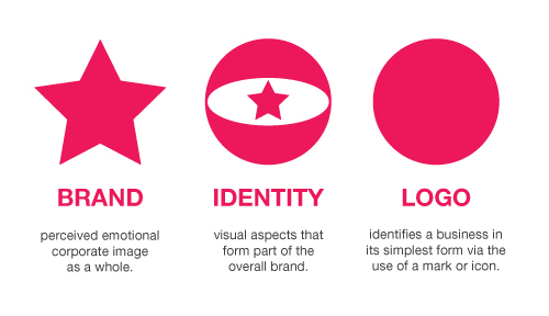
A brand is a "Name, term, design, symbol, or any other feature that identifies one seller's good or service as distinct from those of other sellers."Branding began as a way to tell one person's cattle from another by means of a hot iron stamp. A modern example of a brand is Coca Cola which belongs to the Coca-Cola Company.
Marque or make are often used to denote a brand of motor vehicle, which may be distinguished from a car model. A concept brand is a brand that is associated with an abstract concept, like breast cancer awareness or environmentalism rather than a specific product, service, or business. A commodity brand is a brand associated with a commodity. Got Milk? is an example of a commodity brand.
Great article to read on Branding, Identity & Logo at Just Creative - HERE
Here is my Pinterest board for branding and identity - HERE
I have been collecting peices of branding that are of particular interest to me through pinterest and tumblr over the last year or so. Here are some of my favourites...
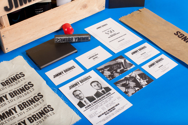
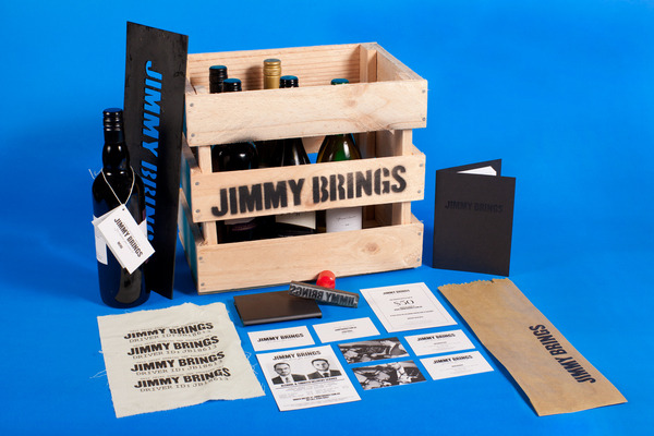
Jimmy Brings Branding
By Studio Sammut.
Jimmy Brings is an alcohol delivery service based in Sydney's eastern suburbs. The identity system is based on the links between the service and that of the bootleggers in the 1920's prohibition era. The project involved identity creation and extensive application.
Sushi Time Branding
By Studio Sammut
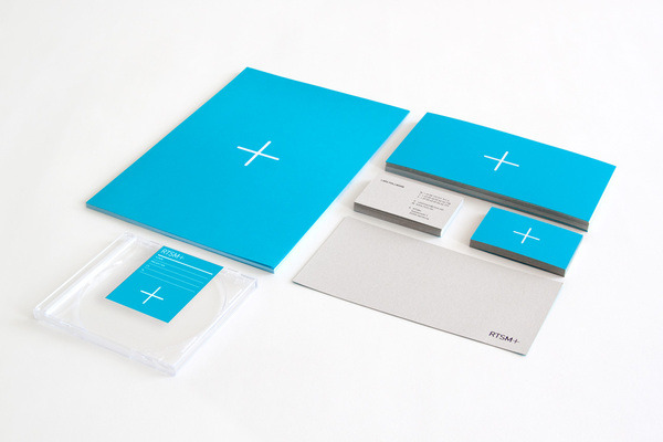
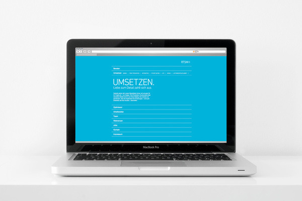
Branding and Indentity for STSM+.
I'm unsure who designed this but it's really clean, simple and works as a company re-brand.
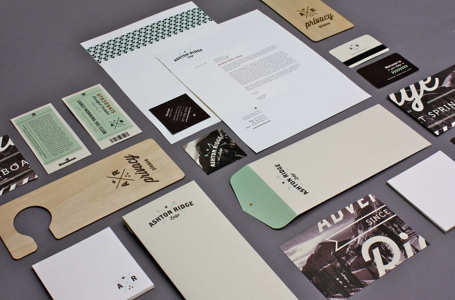
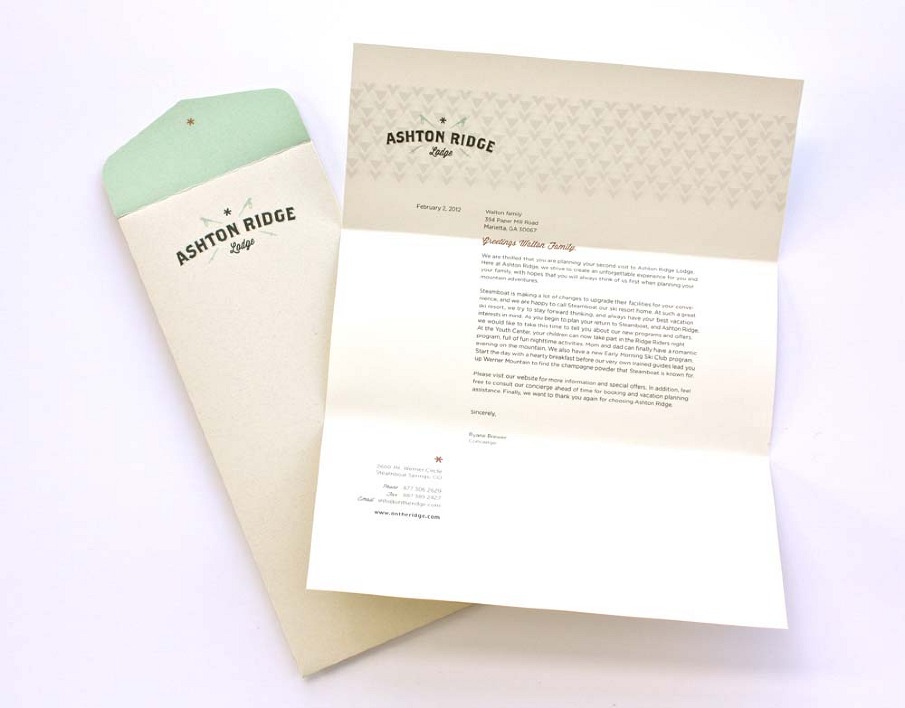
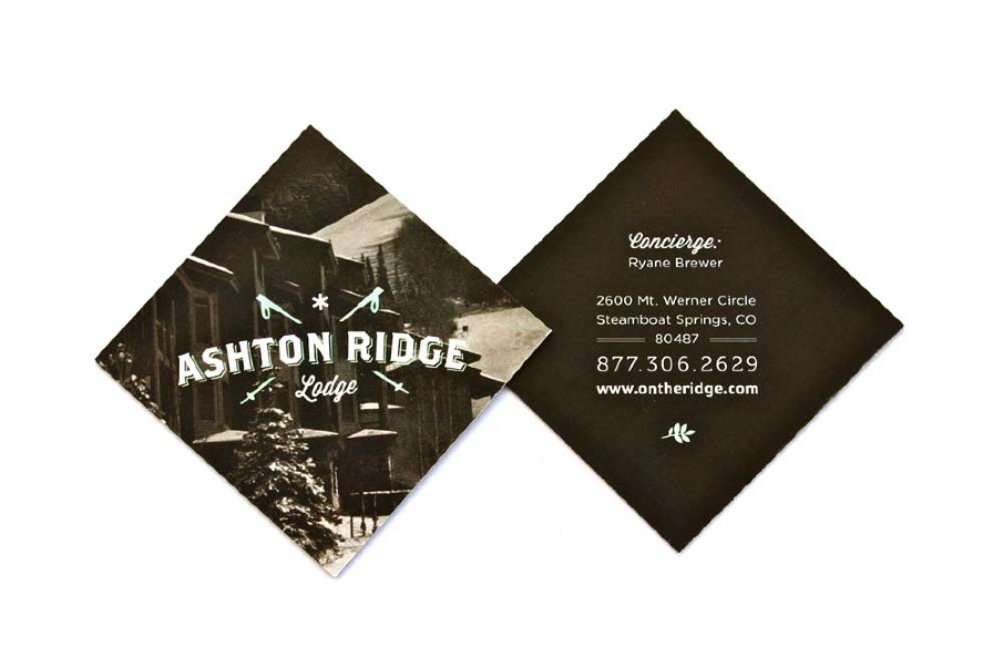
Aston Ridge Lodge Branding
By Kristen West
The following work summarizes the brand development for my graphic design senior project, a ski lodge named Ashton Ridge. The Ashton Ridge vision is a boutique style, family oriented hotel located in Steamboat Springs, Colorado. In my research I was overwhelmed by a tired monotony of graphic designs for resorts, especially in the Colorado area. My goal was to set Ashton Ridge apart.
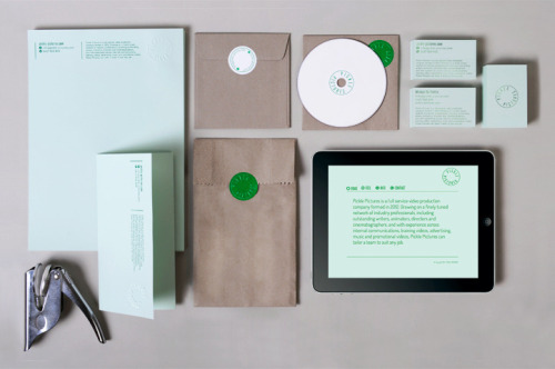
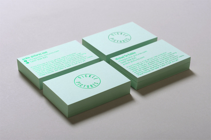
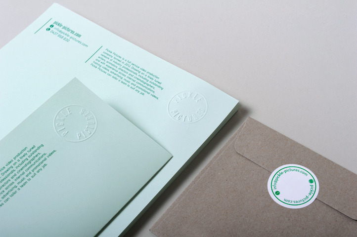
Pickle Pictures Branding
By Liqourice Studio.
Key to our strategy was developing a logo that embodies Mike’s bright, friendly and personable approach when animated whilst acting as a crisp and corporate mark of trust when printed.
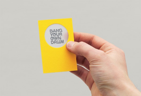
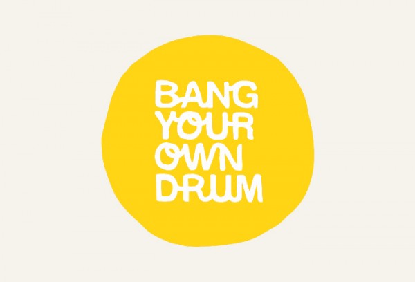
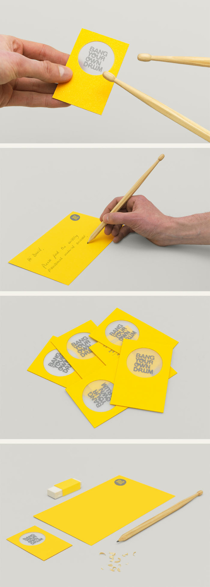
Bang Your Own Drum Branding
Design By The Consult.
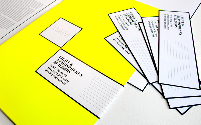
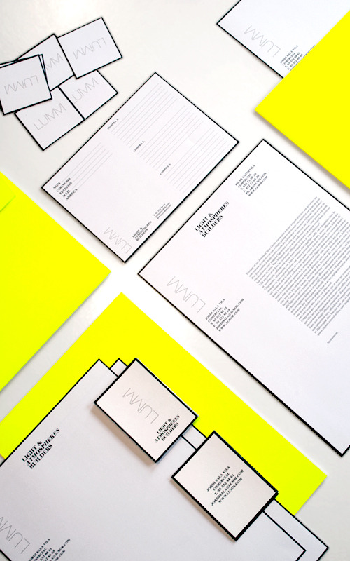
LUMM Branding
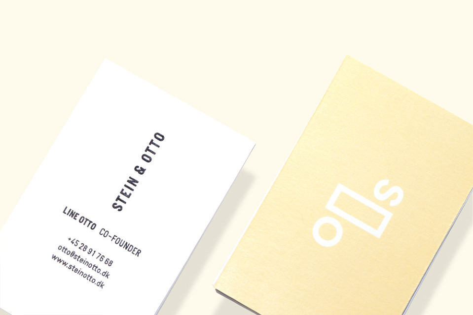
Stein & Otto Branding
Identity design for Danish design studio Stein & Otto
(a collaboration between Daniel Stein andLine Otto)
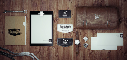
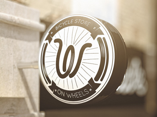
Wooters Bicycle Store Branding
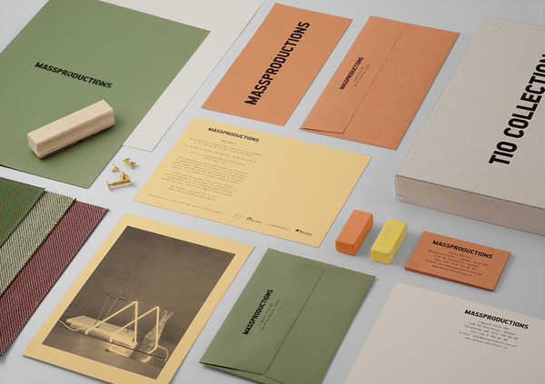
Mass Productions Branding
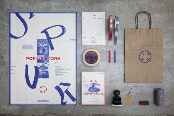
Spur Pop-Up Shop Branding
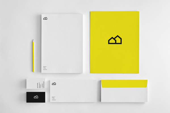
'JS Nieruchomosci Branding'
Designed by Mateusz Makala
Branding of ‘ideo architekci’ studio by Artenkiko.
The idea behind the logo is ‘maximum of flexibility’ & adjustable logo size and shape based on the ‘Cross Grid’ system. The basic logo shape expands on different media. The logo becomes a living form, filling out the space & adjusting itself to the ID area.
The ‘Cross Grid’ system gives also a great possibility to create a ‘text fields’ inside the logo ID structure. It might be used for various purposes within ID or any other promotional materials.
On the basis of the new flexible logo system, we have designed all necessary corporate materials plus extra elements such as tape, marking spray & yellow markers.
The most characteristic element of the new identity is the design of business cards. They’re made of 3mm transparent material in which the refracting light creates interesting logo reflections depending on the angle of looking at their edges.
The whole branding process was complemented by a web design and brand manual standardizing the use of the new identity.
S O F I A Branding by Anagrama
Classy branding which uses gold foiling on a beautiful blue and cream paper.
sour wafer boxes
Package Set
Bermellon Branding by Anagrama
Bermellon is a Mexican hot candy confectionery shop, whose products are very popular in the country. The company's main objective is to claim these types of traditional treats found on Mexican streets and markets.
Caramela Branding by Anagrama
Caramela is a chocolate boutique located in Monterrey, Mexico.
This city differentiates historically for having an industrial golden era in the steel manufacturing. As part of the concept, we considered these historical values to inspire the brand to simulate a high-end handcrafted chocolate factory.
Bricos Brandind
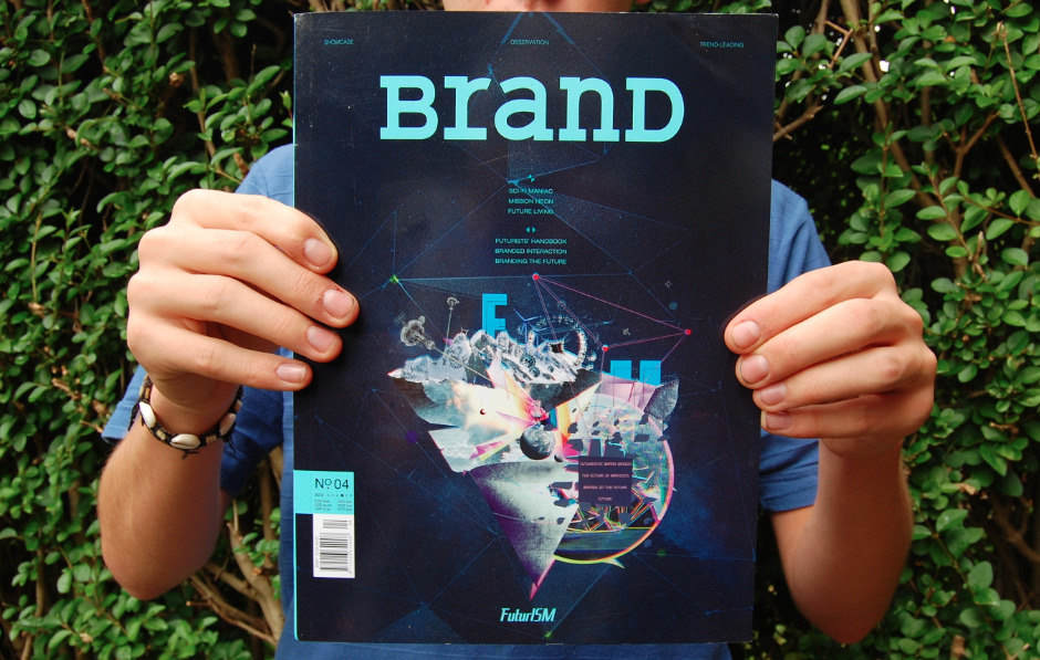
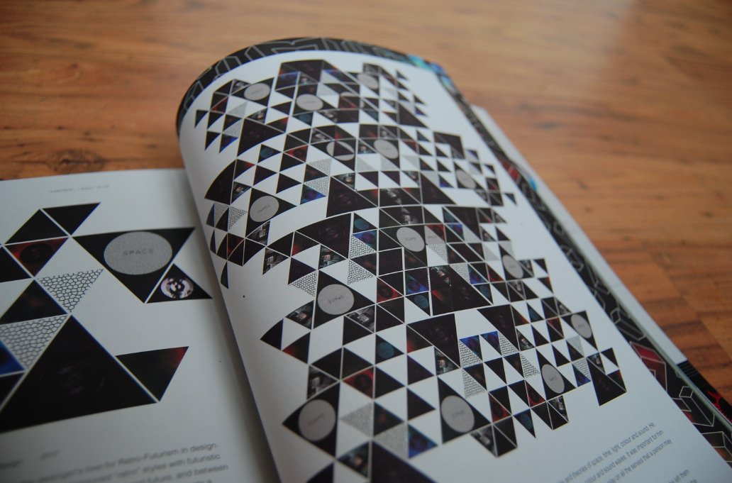
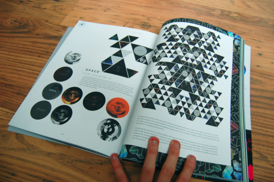
Finally, The Asia based design magazine [BrandD] approached me a few months back and asked if they could use some work i created last year. The work was a re-brand of a fictional nightclub called 'Space' and the magazine focussing mainly on Branding and Identity Work. It is distributed mainly in Asia but also in Europe and here are some images i took of my work in there when i received the magazine recently...
Here is some other branding that i did over the summer for a removal company. The client asked for designs for vinyls on the side of his van as well as business cards and letterheads. This is what I came up with and they was really happy with that!















Hi, I have just visited your site and the info you have covered has been of great interest to me. Some of the suggestions you have given have enabled me to apply my own thought process to afford a greater understanding of the issue. Some info that is provided on the Web is not very useful but yours has been worthwhile. Some of the points you have raised will assist me greatly. Incidentally, I like the way you have structured your site,
it is super and very easy to follow. I have bookmarked you and will be back regularly. Thank you
Creative Agency
Oh! Nice blog. Your blog is too good. I appreciate your blog. Thanks a lot for sharing this blog with us. http://www.brandharvest.net/brand_identity_design.htm
Leave your comment