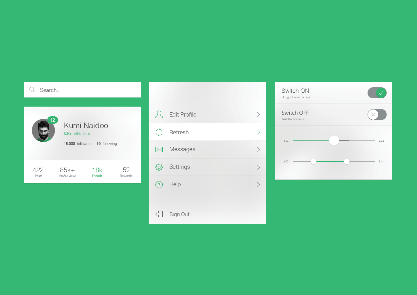
I've been working on some design elements that will make up the Iphone Application for the Greenpeace Organisation. I felt that an App was vital to the re-brand, as it's a way to integrate the brand within the modern day masses. Social Media and Smart Phones are integral to the everyday life of the public so by creating an Iphone app, this means that the Greenpeace brand can be constantly with a person - sending push notifications straight to their phone and resulting in a beep or buzz in their pocket, making them respond quickly.
Visual Style
The general visual style of the Application will be seamless with the style of the Iphone Interface. The use of Helvetica is prominent both in the Iphone interface and also the Greenpeace Brand Campaign meaning that the design is seamless from one product to another. You can see from these diagrams that the buttons, sliders and icons are always following the green and greyscale colourscheme. The background picks up this light grey colour which relates to the standard Iphone interface, but also applies with the Greenpeace brand colour scheme.
Profile Page / Group Interaction
As you can see form these closer Screenshots of an example profile page, this will follow a similar structure to other Social Media sites, such as Facebook or Twitter. The profile page contains a profile image which is contained within a circle. This profile image must confide to the upload rules. It must be passport photo in style - straight on which helps reassure the sense of strength and regimental unified existence within the groups. Everybody looks the same. The image must also be converted into Black and white in colour and can be modified to add pop colour, using the coded green.
As you can see form the bottom screenshot, You can sync the Greenpeace Application to other social media website and pick out friends from your contacts and other profiles which can help gain a larger number of members on board with Greenpeace.
Calendar & Events
By having an in-built calendar within the Greenpeace Application, this means that any Greenpeace related events, particularly rallies, can be kept track on by each individual. This will make sure that the attendance to each event is maximum, resulting in a outward appearance of strength. When looking closely at the event pages you can see that at the bottom is the date, how many people are attending and liked the event, followed by comments on the event. These are linked back to a yearly calendar.
Instant Messaging
The instant messaging platform that is built-in within the application means that member of Greenpeace can become friends depending on their location which makes it easier and more efficient when organising events and taking part in activist activities.
Statistics
Stats within the app help the user show which pieces of media are 'trending' and getting the most attention online. This will mean that they can keep up to date with all the leading articles and shared pieces of media. As you can see, the colour scheme within the statistics viewer relates directly to the Greenpeace brand.
Greenpeace Stream
Realted to the statistics, The Greenpeace Stream is the place where all the latest news is segregated into different sections of media. Image, Video, Articles, Etc. The screenshots help show how the media is displayed in a scrolling Motion, followed by what an individual vide article looks like. As you can see, everything fits in with the general theme of the Greenpeace Application.
Promotions
Promotions for products could be snet through the application. Here you can see an example of using the T-shirts and the DIY Propaganda Pack as a sales promotion through the App.


Leave your comment