Seminar 1 - What Is Typography?
Visual Literacy
Visual Communication
Key Elements Of Design
- The solution to a problem of communicating through design.
- The effective delivery of a message through the use of visual language.
Visual Literacy
- The ability to construct meaning from visual images and type.
- Interpreting images of the present, and range of cultures.
- Producing images that effectively communicate a message to an audience.
Visual Communication
- Is a process of sending and receiving messages using images and type.
- Is based on a level of shared understanding of signs, symbols, gestures and objects.
- Is affected by audience, context, media and method of distribution.
Key Elements Of Design
- Frame
- Format
- Figure/ Form
- Ground
- Composition
- Visual Dynamics
- Type
- Image
- Colour
- Layout
- Legibility
- Readability
"All that is neccessary for any language to exsist is an agreement amogst people that one thing will stand for another"
Materials
- Stone
- Sable
- Bone
- Wood
- Lead
- Silicon
Images From The Seminar
In this seminar we was looking at the Anatomy Of Type...
This term is applied when a part is used to represent the whole, or vice versa. Quite simply, the main subject is substituted for something that is inherently connected to it. This substitution only works if what the synecdoche represents is universally recognized and understood, rather than taken at face value for its literal meaning.
x Height and Cap Height.
Body Parts.
Serifs.
Sans Serif = 'Without Serifs'
Bowl
Stem
Seminar 3 - Visual Literacy
"All that is necessary for any language to exist is an agreement amongst a group of people that one thing will stand for another. "In This seminar we looked at pictograms and how the human race can see things to instantly know what that is - such as a man and women for toilet signs. We looked at wayfinding and infographics too...
We look at this and although they are pretty abstract shapes and pictograms we instantly know which is the mans and which is the womans toilet.
Simplifying the woman figure.
Wayfinding Pictograms - Travel / Food
Simple pictograms to represent taking off and landing.
Animals
Beer - Sales - Plunge - Britains - Stay - Home
Clever Pictograms to tell a story.
The beautiful Game. Love this peice. It represents the swearing and violence in football hooligans.
Symbol, Sign and Signifier
Using the Apple logo to demonstrate...
SYMBOL - Symbolises an apple.
SIGN - A sign for Apple Mac. Computers.
SIGNIFIER - Signifies quality, creativity, lifestyle, independence…
Seminar 4 - Type, Character & Hierarchy
"Type is speech made visible".
The top left is the most appropriate for this word.
a full typeface/font is made up of lots of glyphs. not just letters and numbers.
Different shapes and sizes of typefaces
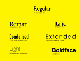
Different weights
Font familysand titles.
Seminar 5 - Visual Literacy 2
Sleek, professional, desirable - Apple Logo
Play on technology with the blackberry and apple logos.
Visual Synecdoche - Statue Of Liberty
VISUAL METAPHOR (Apple Logo)
A visual metaphor is used to transfer the meaning from one image to another. Although the images may have no close relationship, a metaphor conveys an impression about something relatively unfamiliar by drawing a comparison between it and something familiar.
VISUAL METONYM (Taxi)
A visual metonym is a symbolic image that is used to make reference to something with a more literal meaning. For example, a cross might be used to signify the church. By way of association the viewer makes a connection between the image and the intended subject. Unlike a visual synecdoche , the two images bear a close relationship, but are not intrinsically linked. And unlike visual metaphors, metonyms do not transfer the characteristics of one image to the other.
'In trying to separate words from pictures we have to accept that
words are ‘pictures of letters’" - David Crow
subtle bumbs in the b to represent a pregnant lady.
is the degree to which glyphs (individual characters) in text are understandable or recognizable based on appearance
clever arrow in the fed Ex logo.
OGC logo had to be changed because they realised when it was flipped it looked like a picotgram of a person cracking one off.
READABILITY
Tracking
is the ease in which text can be read and understood. It is influenced by line length, primary and secondary leading, justification, typestyle, kerning, tracking, point size, etc.
hierarchy


Leave your comment